Cuckoo My Account
What’s next after signing up? Your online account is where it all begins. It’s your central hub for everything Cuckoo. From there, you can check your bills, manage payments, update details, and stay on top of your broadband with ease, all in one place.
Autum 2024
Team: Senior Product Designer (me), Product Manager, x3 Frontend Develops, x2 Backend Developers
The problem
Customers struggled with a desktop first, fragmented, inconsistent portal. Billing updates, router tracking, and fault reporting were nor existent or buried behind multiple clicks, creating frustration and support tickets.
On top of that, the old My Account no longer reflected Cuckoo’s refreshed brand identity...it felt outdated and disconnected from the vibrant, friendly personality we were cultivating across the site and marketing.
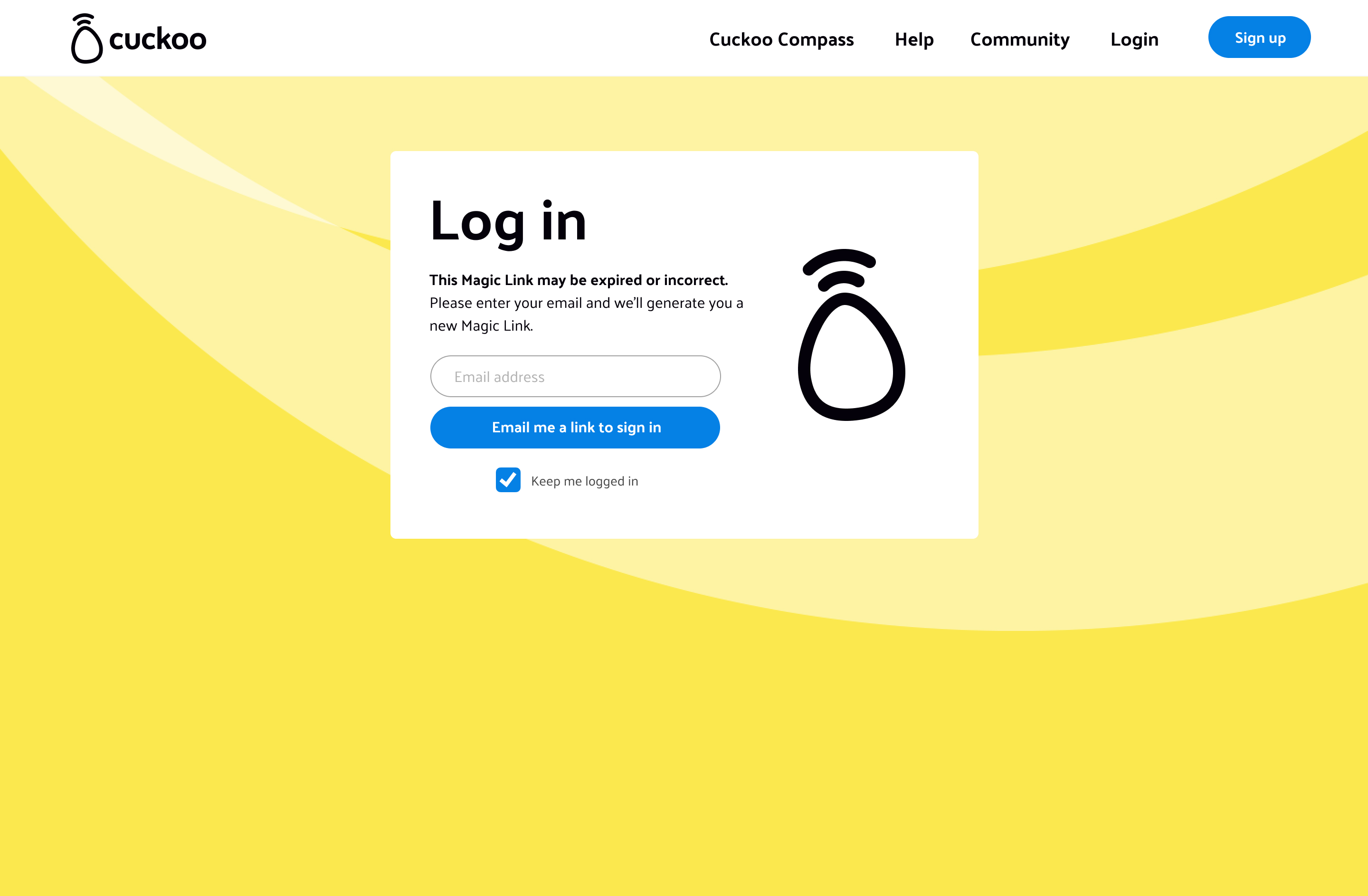
Legacy My Account UI:
The tension
Customers wanted an intuitive, self serve portal that reflected Cuckoo’s refreshed brand. Legacy systems and fragmented features made this hard to deliver, while teams relied on multiple tools that increased costs and slowed resolutions. The challenge was creating a My Account that was simple, efficient, and on brand without adding friction or breaking technical constraints.
The insight & Impact
By analysing support logs and legacy journey drop-offs, it became clear that customers craved speed, clarity, and autonomy, especially when managing billing, faults, or router settings. At the same time, internal workflows needed to stay efficient and scalable.
Results
- 28% drop in customer support tickets within 3 months
- 45% of customers completed key tasks (raising a fault or payments) without needing further help
- Faster delivery of roadmap features thanks to a scalable design system
Process
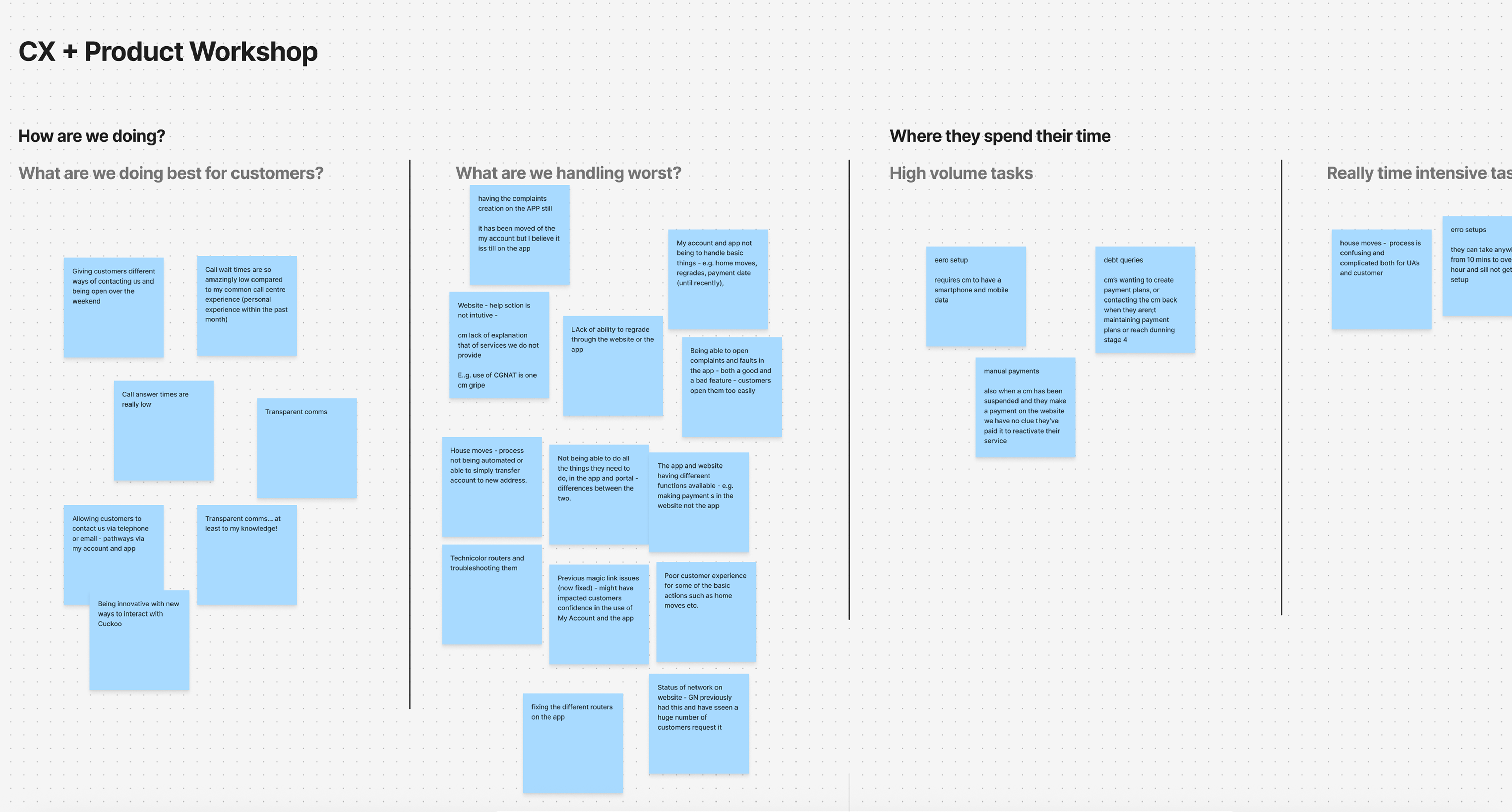
I began by stepping into the shoes of both customers and staff. Workshops revealed the pain points straight away. By examining help centre data, support logs, and customer data usage, we could see the journey in the customers shoes.
Cross- functional workshop:
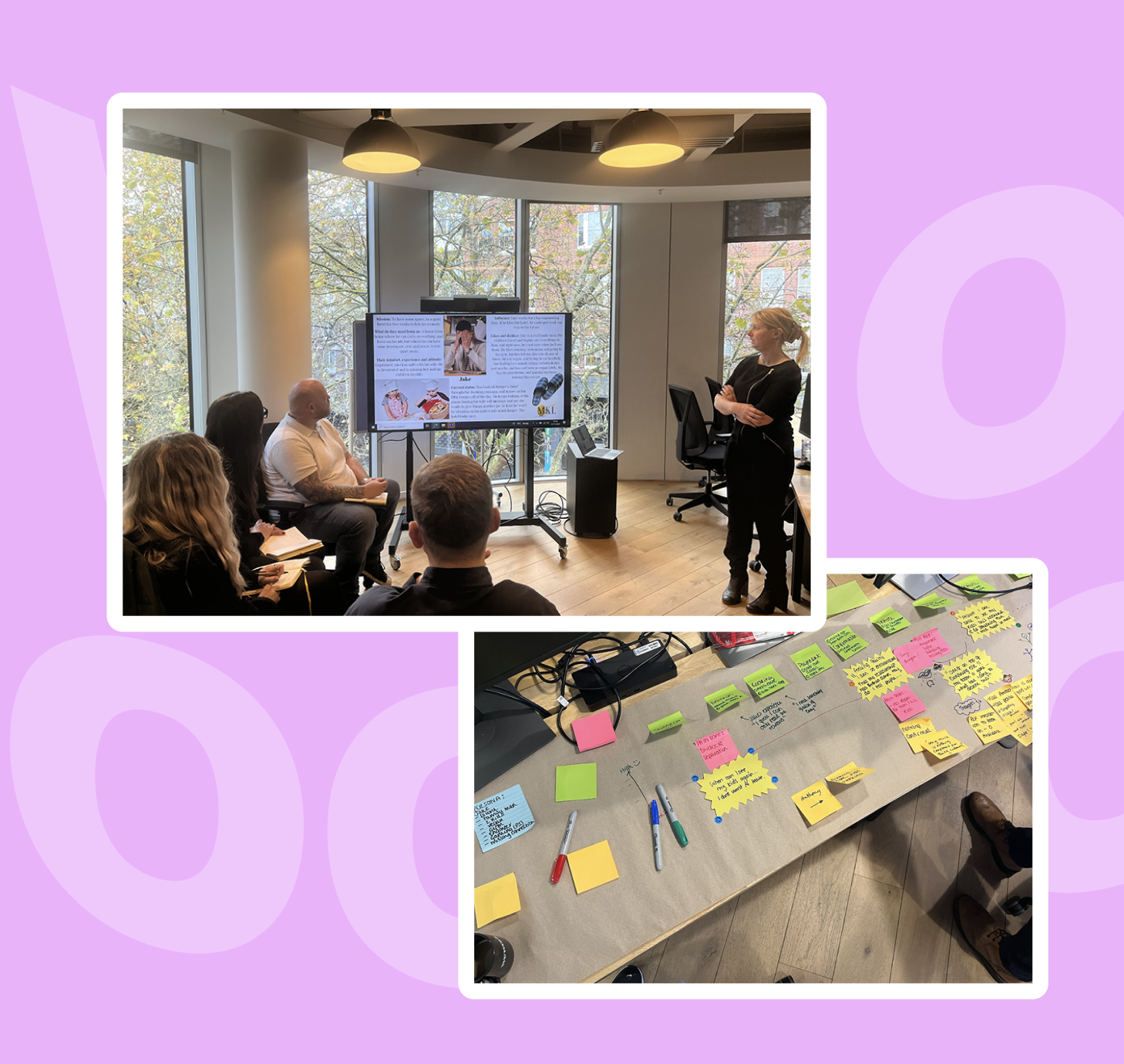
Learnings from the cross- functional workshop:
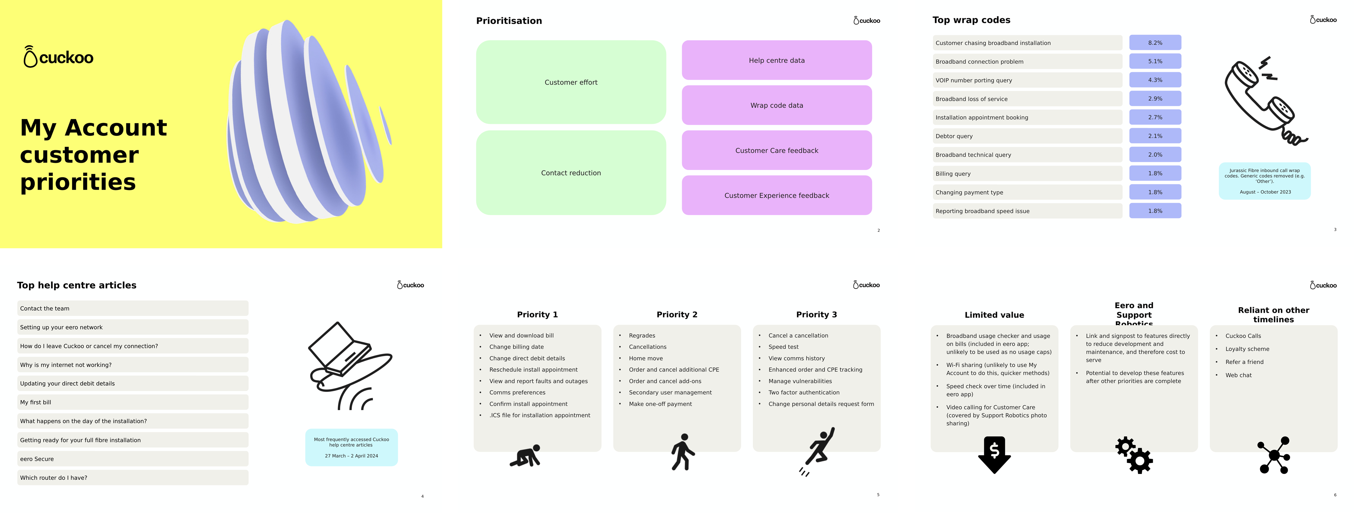
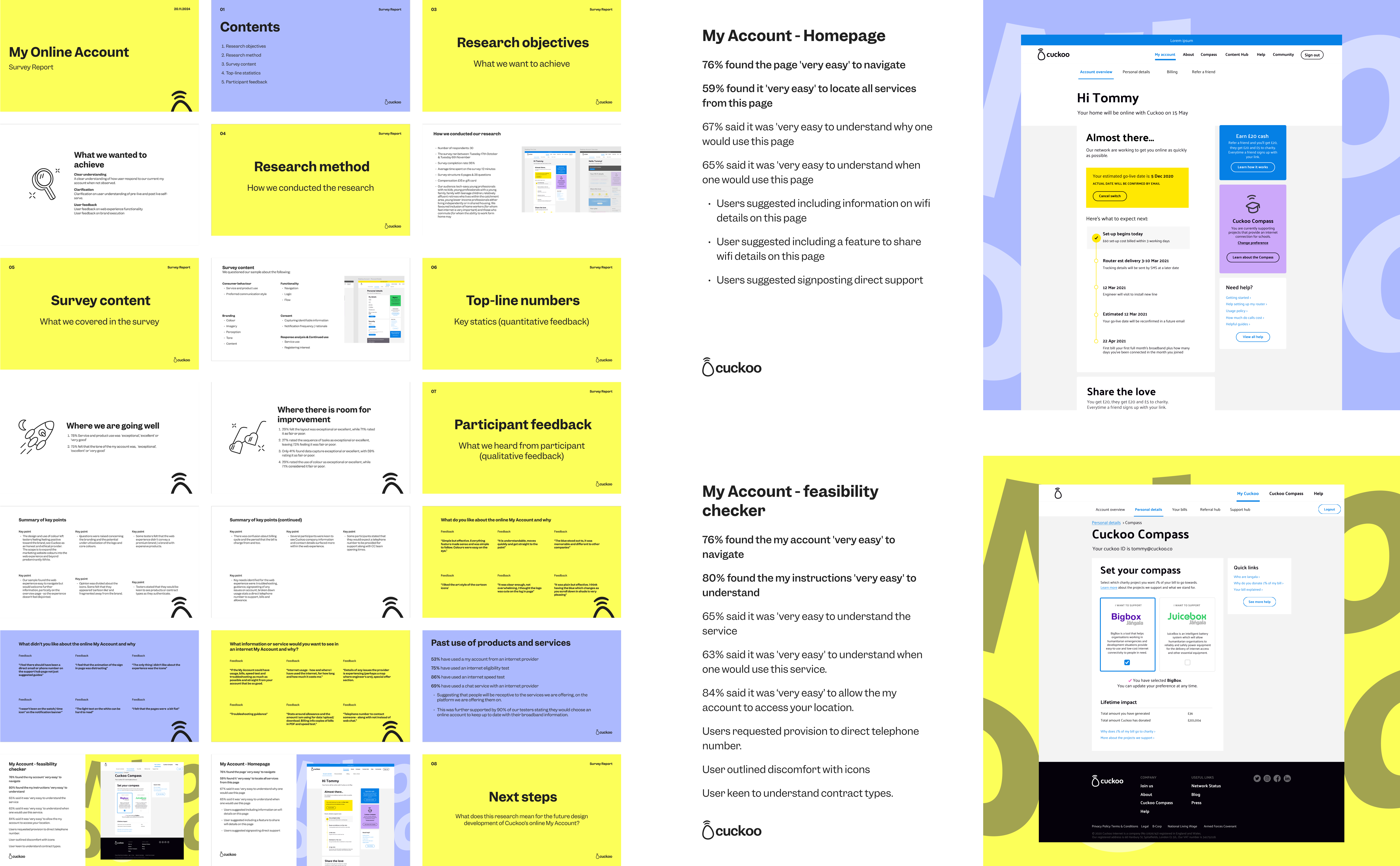
Research survey
We also conducted a survey with 30 participants to understand pain points in the existing My Account experience. The results uncovered key areas for improvement:
- 29% felt the layout was exceptional or excellent, while 71% rated it as fair or poor.
- 27% rated the sequence of tasks as exceptional or excellent, leaving 73% feeling it was fair or poor.
- Only 41% found data capture exceptional or excellent, with 59% rating it as fair or poor.
- 29% rated the use of colour as exceptional or excellent, while 71% considered it fair or poor.
- Users suggested signposting direct support / contacting Cuckoo
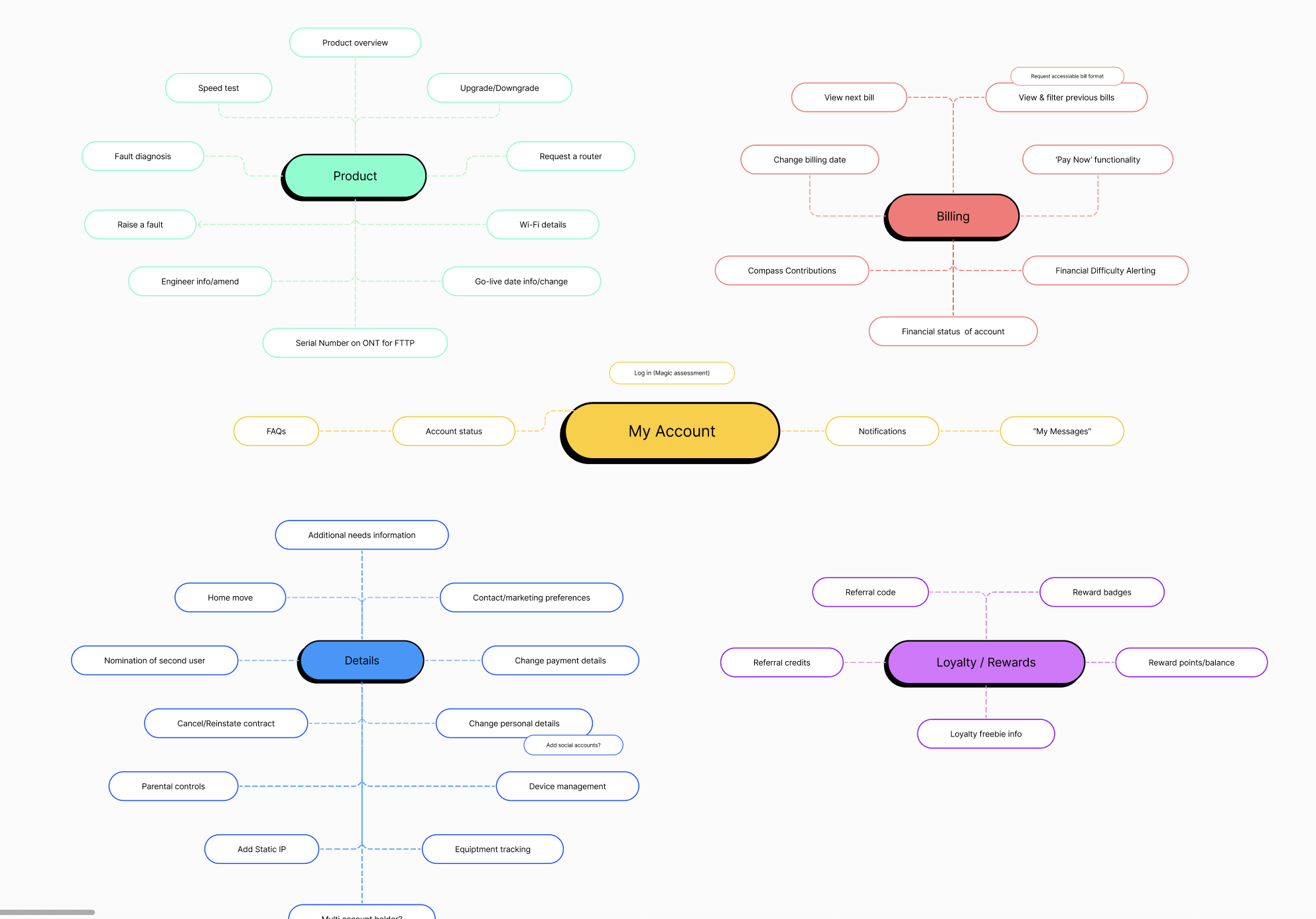
Defining the problem
We mapped every critical action billing, faults, account changes:
Understanding the backend framework
Further workings with the CX team to understand how each customer action (e.g. billing updates, service faults, account changes) is logged in Kraken (our backend system).This collaboration ensured that My Account wasn’t just intuitive from the user’s perspective, but also aligned with backend workflows and support operations.
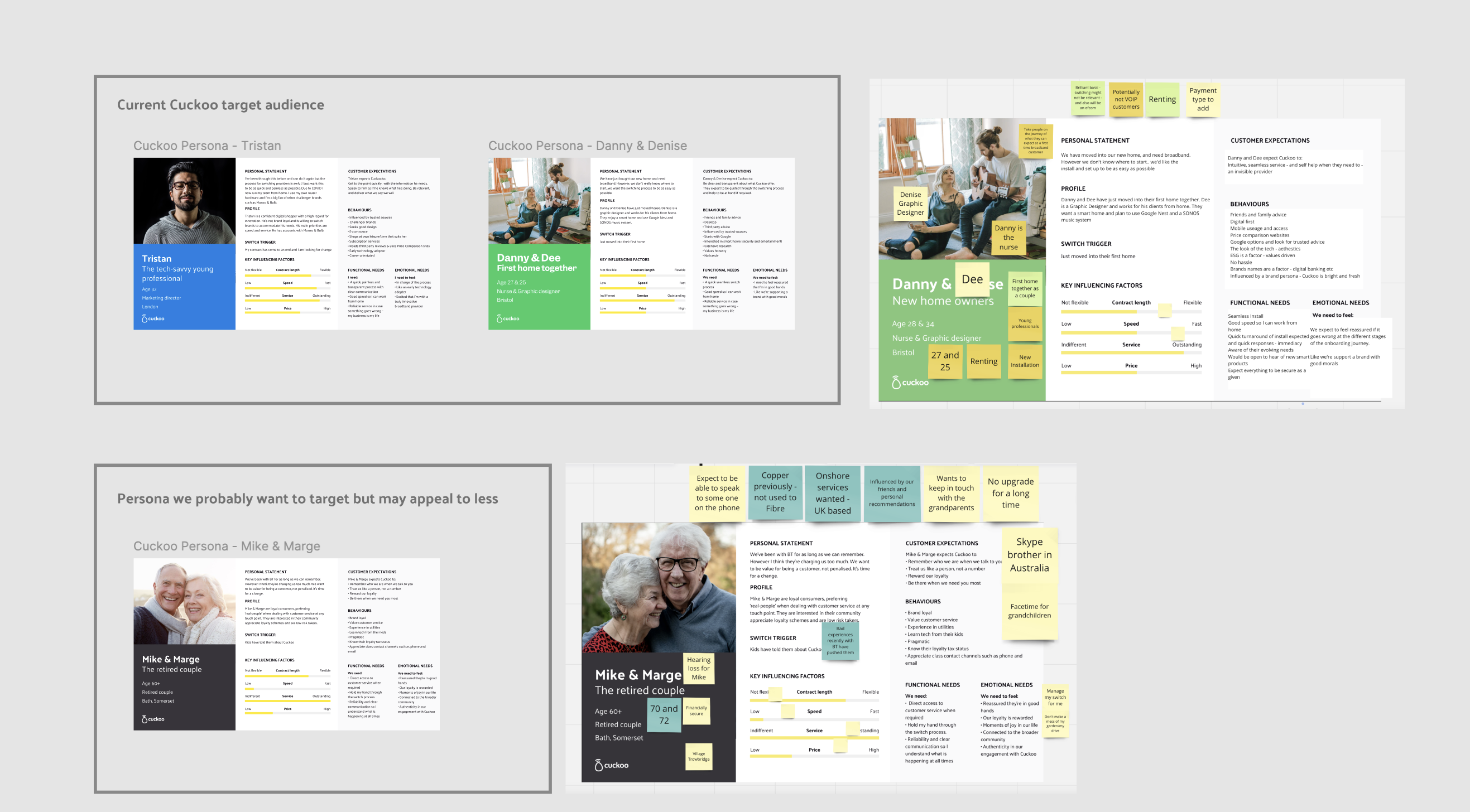
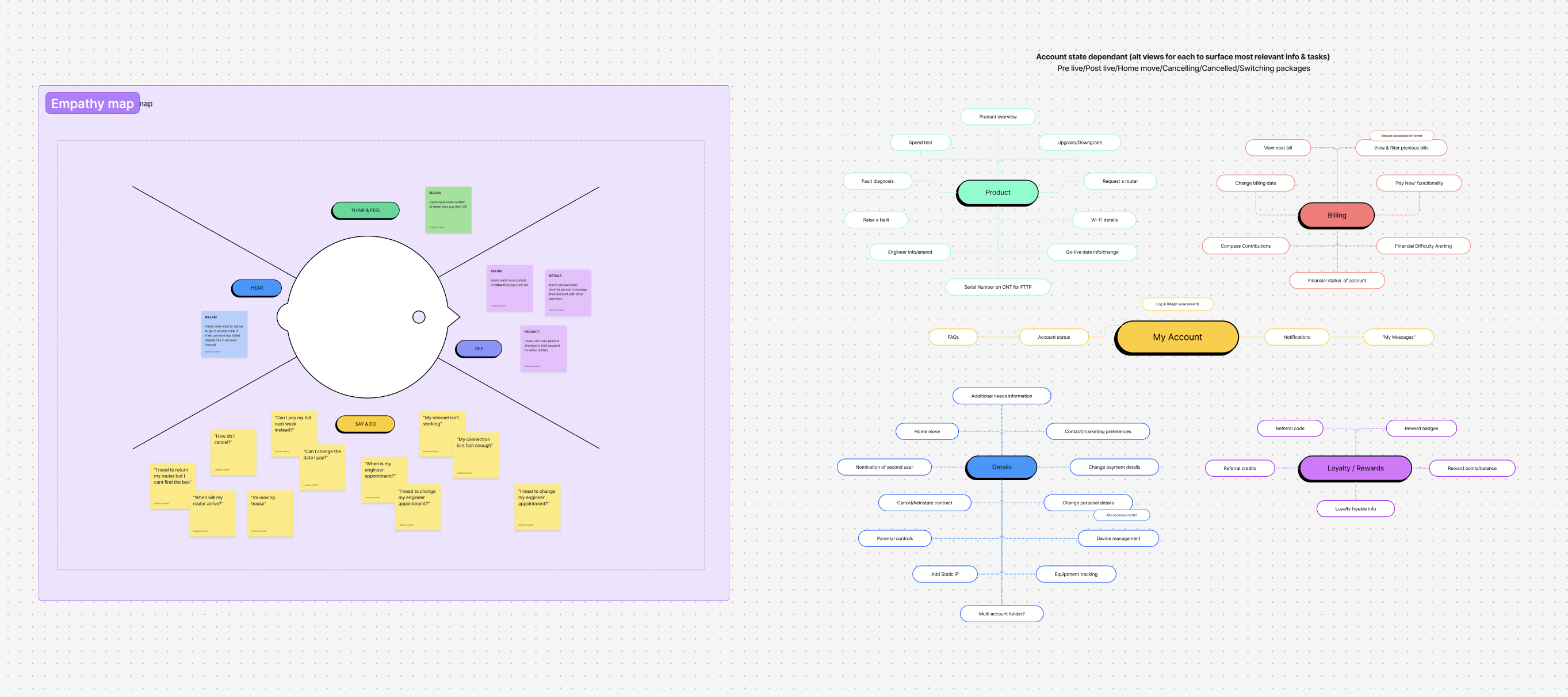
Brand personas and empathy mapping
Legacy drop-offs were visualised, and decisions were grounded in real personas, showing how everyday customers actually interacted with the system.
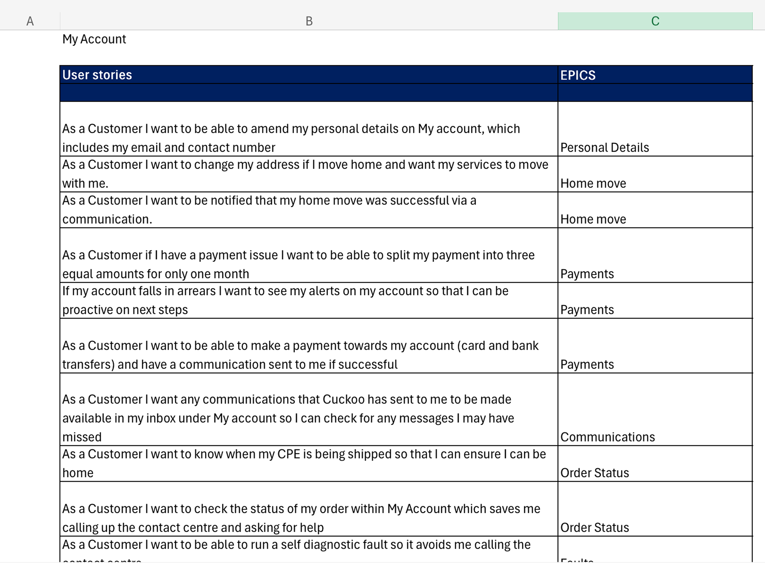
User Stories
From this, we developed user stories that captured core needs and tasks, guiding the design of flows, features, and interactions to truly serve our customers.
Card sorting
Guided by open card sorting tests, we restructured the IA to prioritise high-frequency tasks and make self-service intuitive.
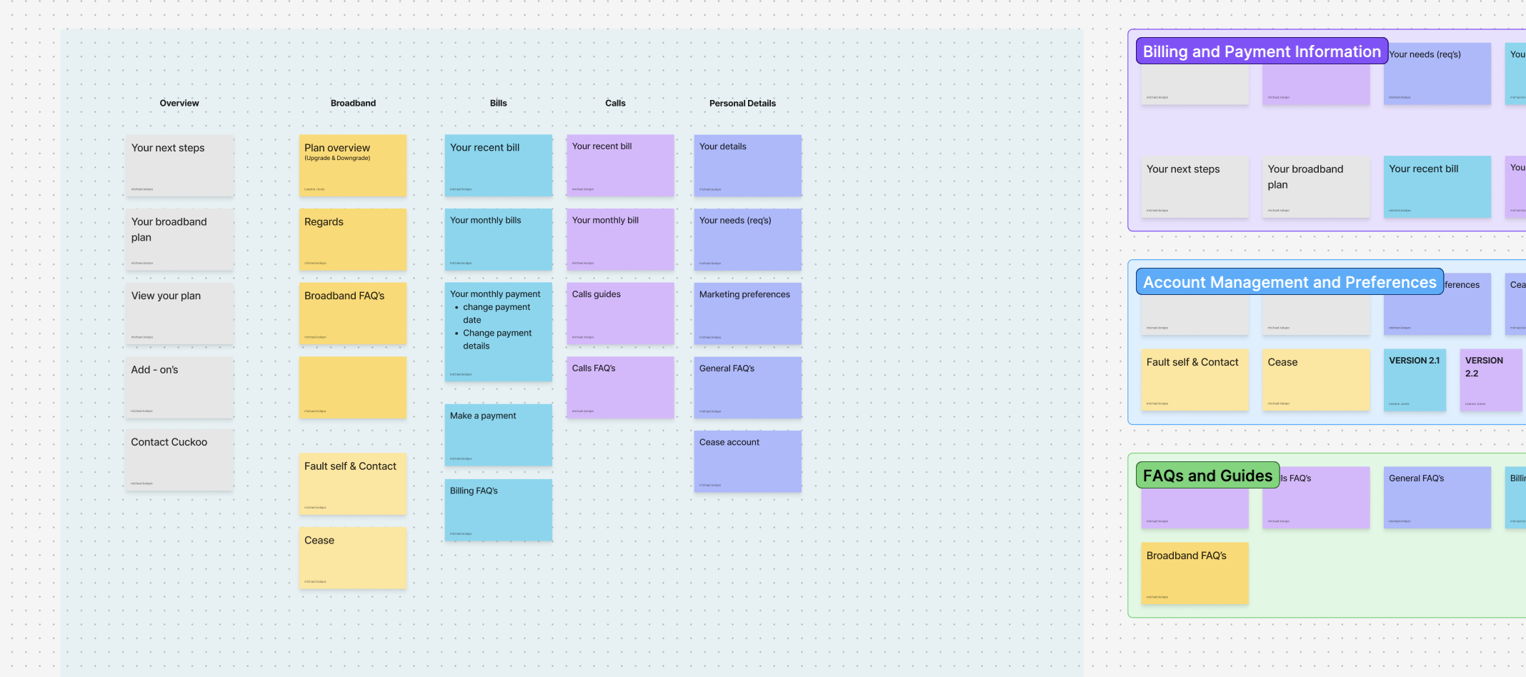
Information Architecture
Categories were grouped logically, labels were tested for clarity, and content hierarchy was refined to reduce cognitive load.

Developing the new my account
Wireframes & Collaboration
I began by sketching early wireframes that captured core user flows, billing, fault reporting, account updates and shared them with both developers and testers.
Early wireframes
High-Fid wireframes
Collaboration with developers
Our developers saw the wireframes early and were able to digest the intended interactions and data flows. In tandem we started preparing scripts and scenarios to validate usability. This early alignment meant the design was grounded in reality from the start and ready for rapid iteration.
Evolving Yolk
High-Fidelity & Interaction Prototypes
Once the structure and user flows were validated, I moved to finalising the high-fidelity designs and interactive prototypes, evolving and leveraging our Yolk design system for consistency.
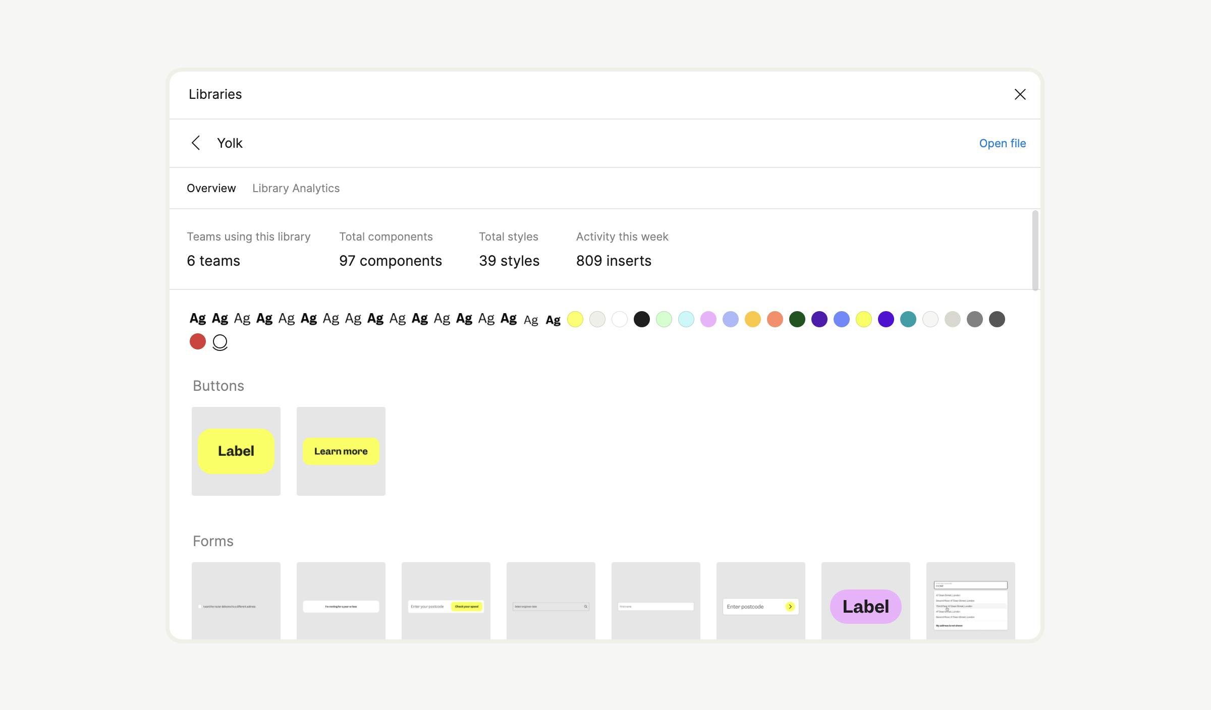
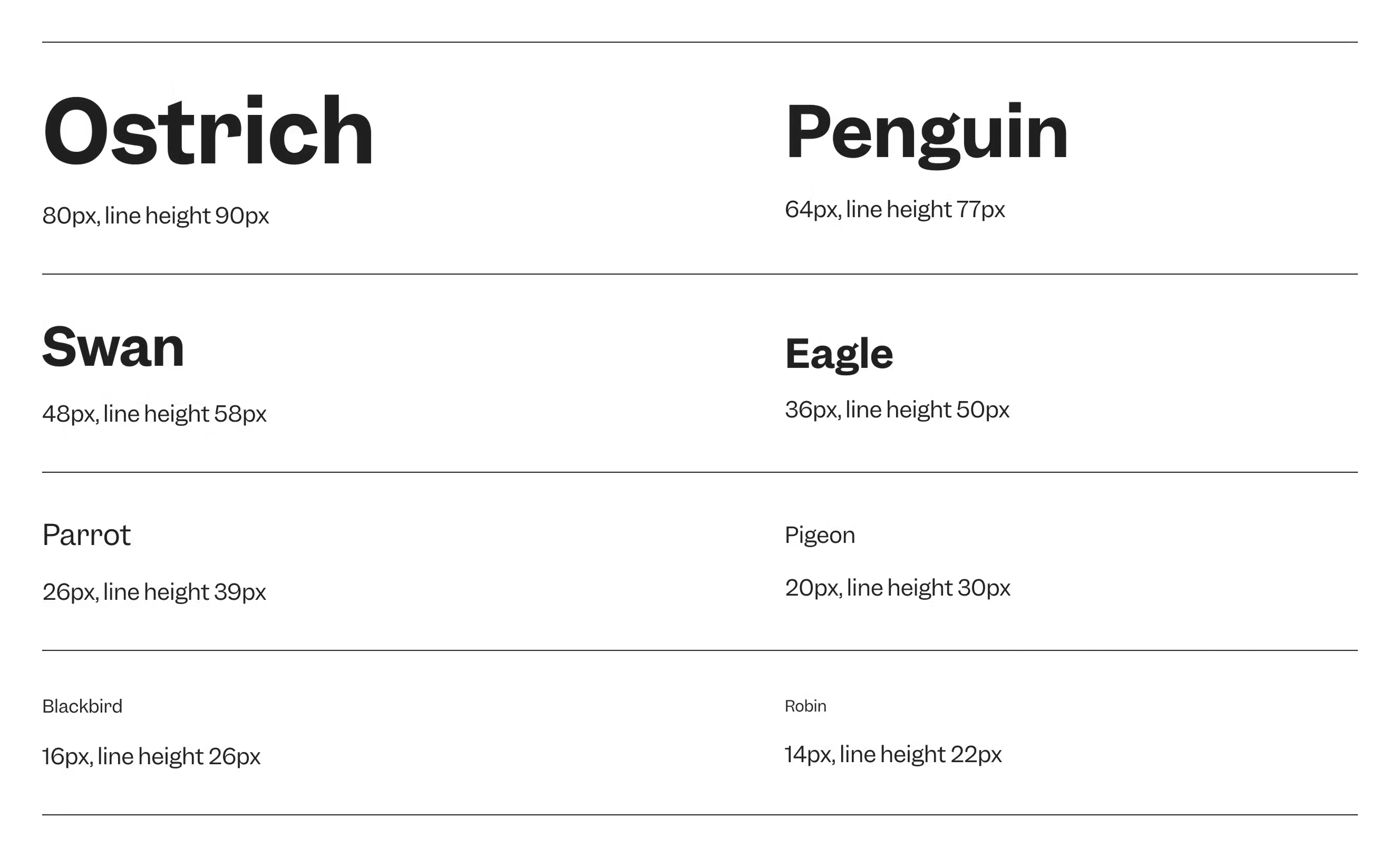
Evolving Components

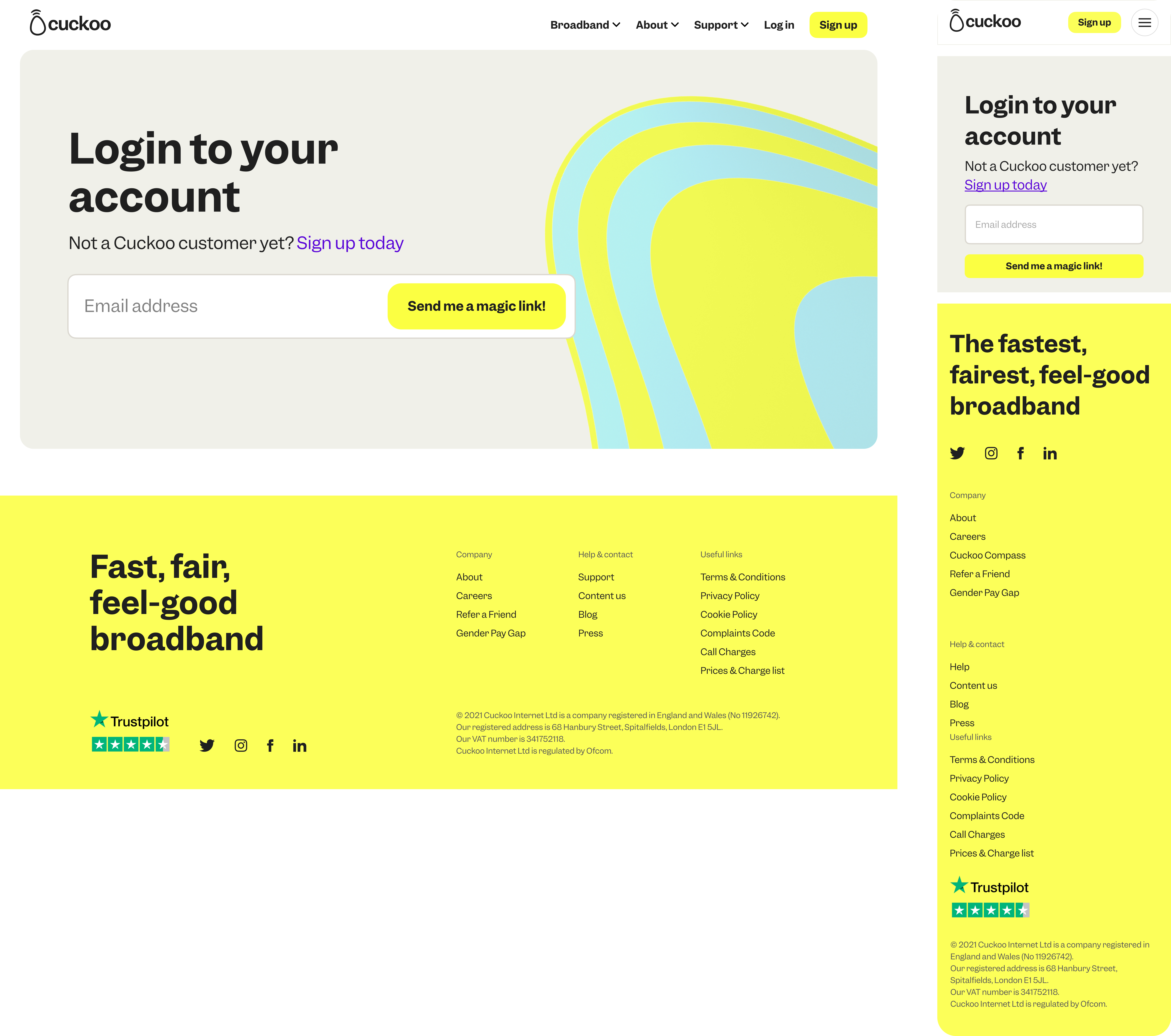
My Account - New Sign in Page
My Account - New Dynamic headers
Bringing in a brand moment and personal touch to my account.
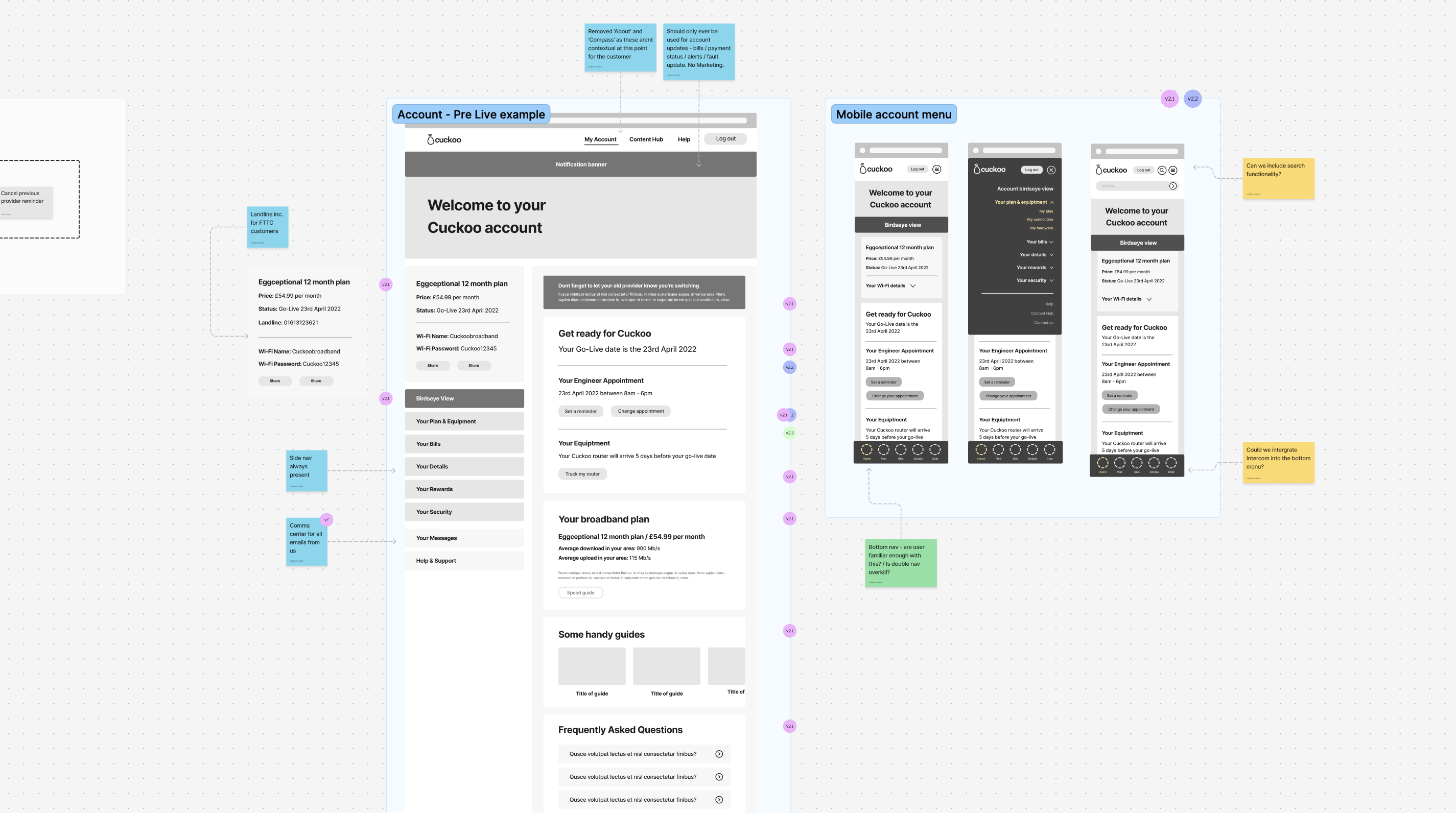
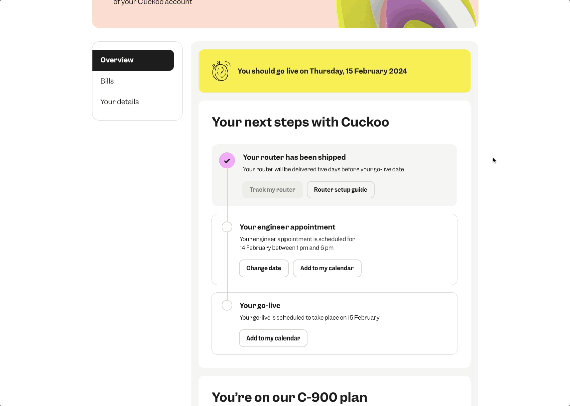
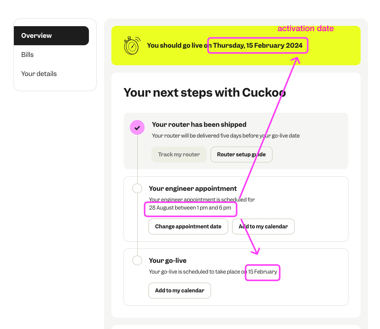
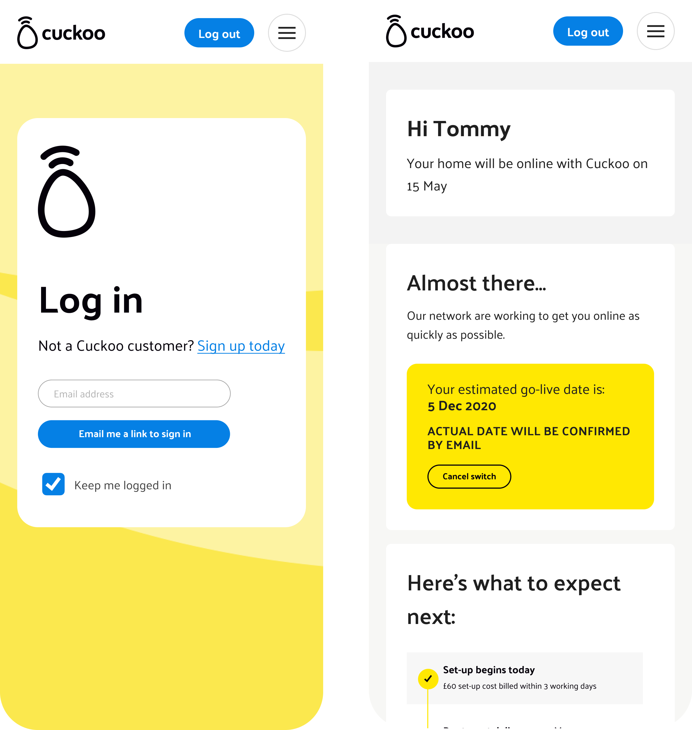
My Account - Pre-Live
Pre live state is the period after a customer has joined Cuckoo but before their service is active. During this time, they are waiting for their connection to go live and for their new eero router to arrive.
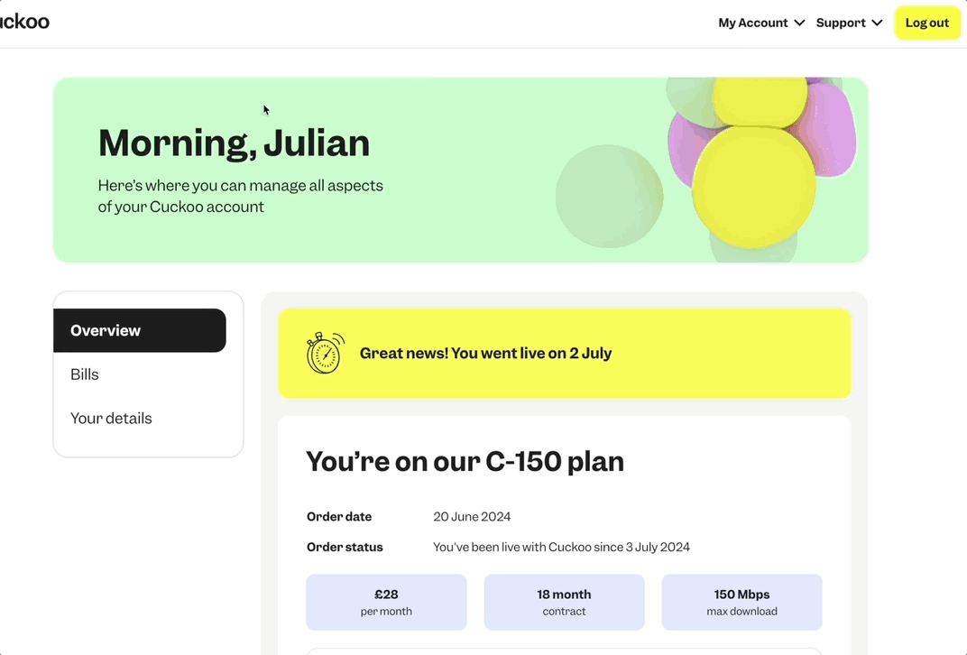
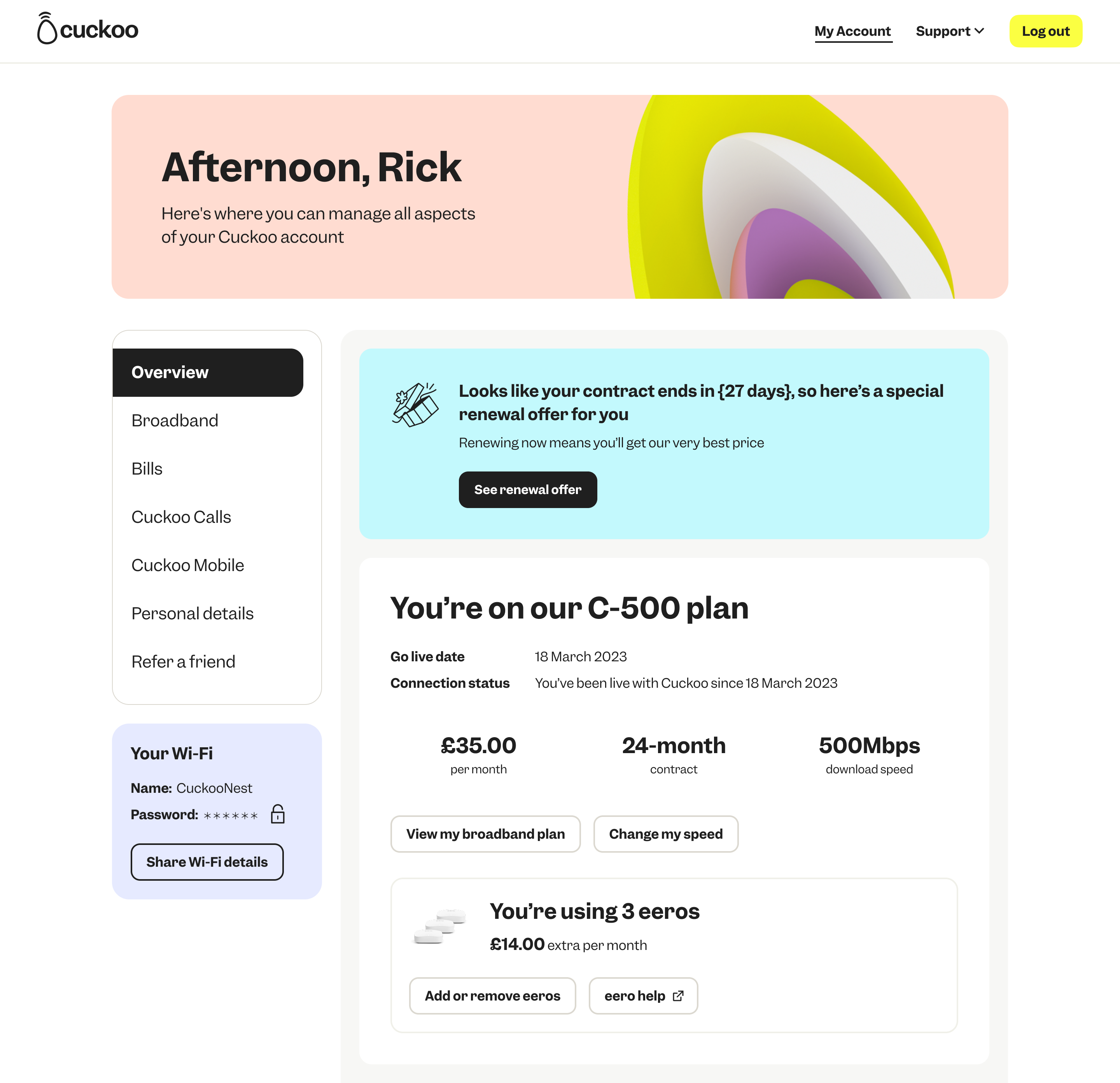
My Account - Post Live
Post live state is when a customer's broadband service is active and their eero router is set up. At this stage, they can start using their connection, explore their account features, and manage their service and self serve through their online my account or app.
Micro interactions
Each micro-interaction to hover states to subtle Pictogram motion in notifications, was designed to guide users, reduce friction and add emotion.
Prototyping each feature
I prototyped each feature and component and discussed them on design reviews with devs to ensure each interaction translated accurately
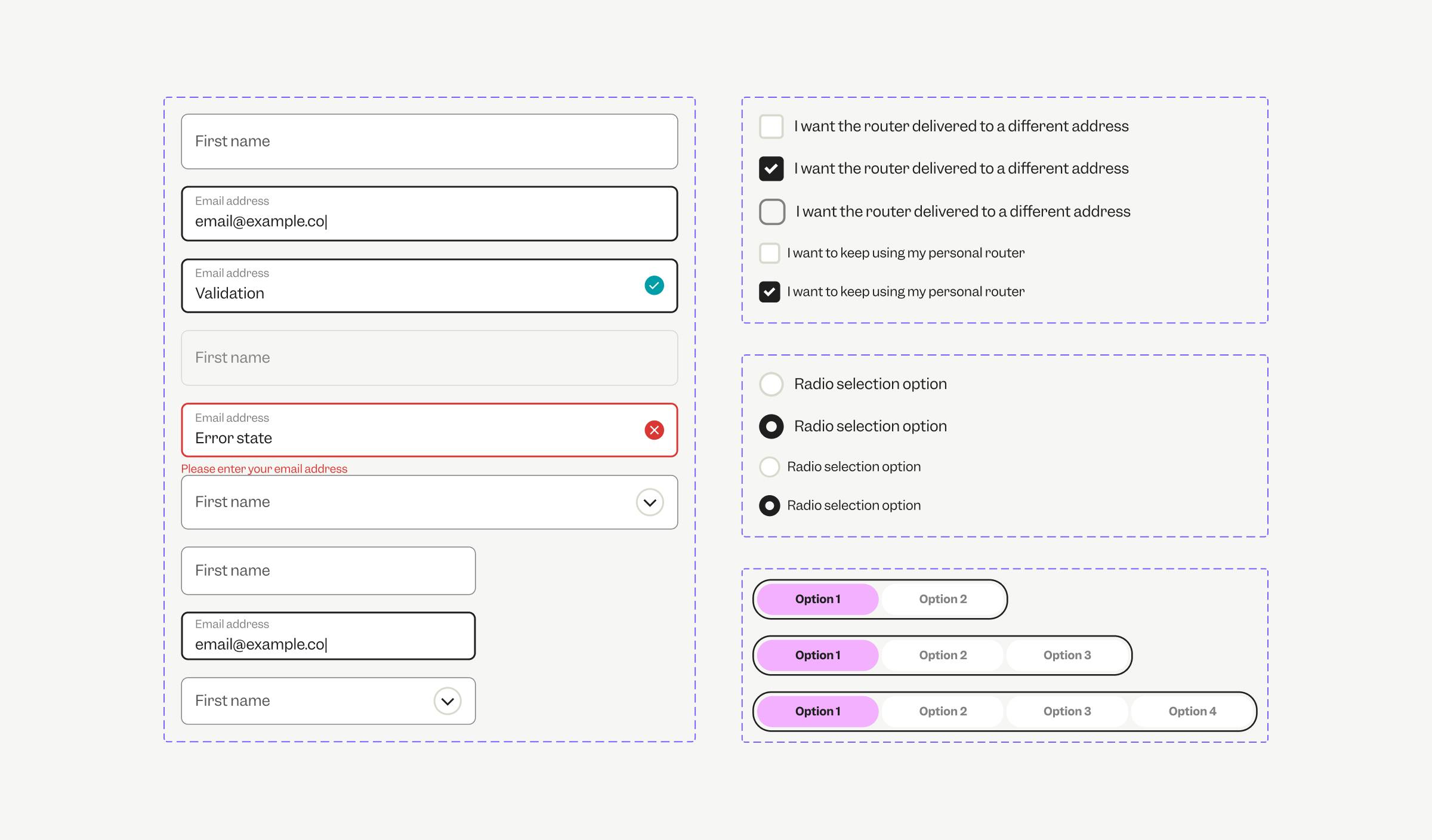
Loading states
CTA interactions
Input fields - validated and error states
Step by step collaboration with FE & BE Devs
I worked closely with front-end and back-end developers to bring the My Account platform and features (built in React and Node.js)
Having multiple design reviews and documenting Figma designs to ensure the UX was accurately translated into customer friendly experiences.
Design and development reviews
Data flows
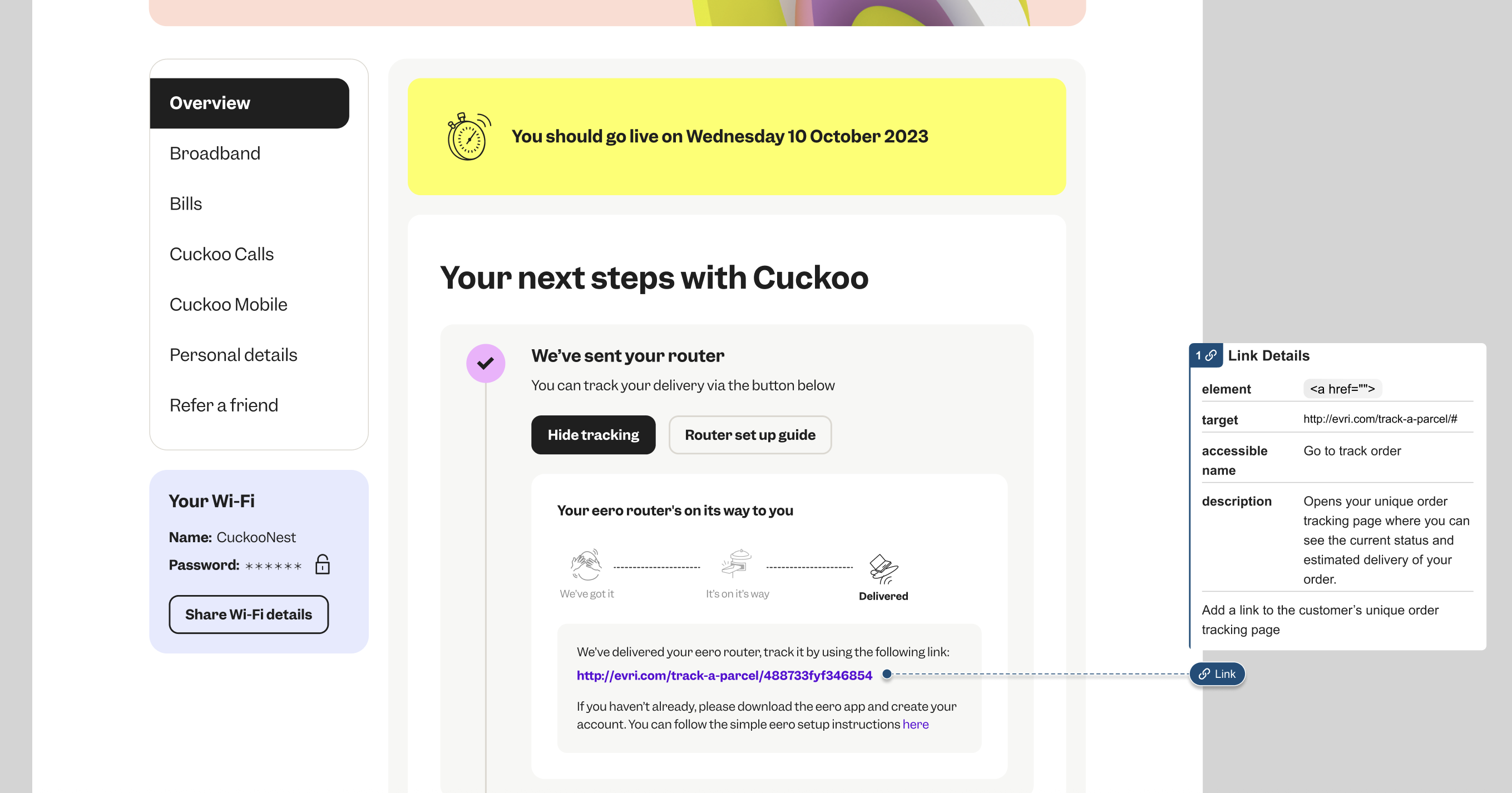
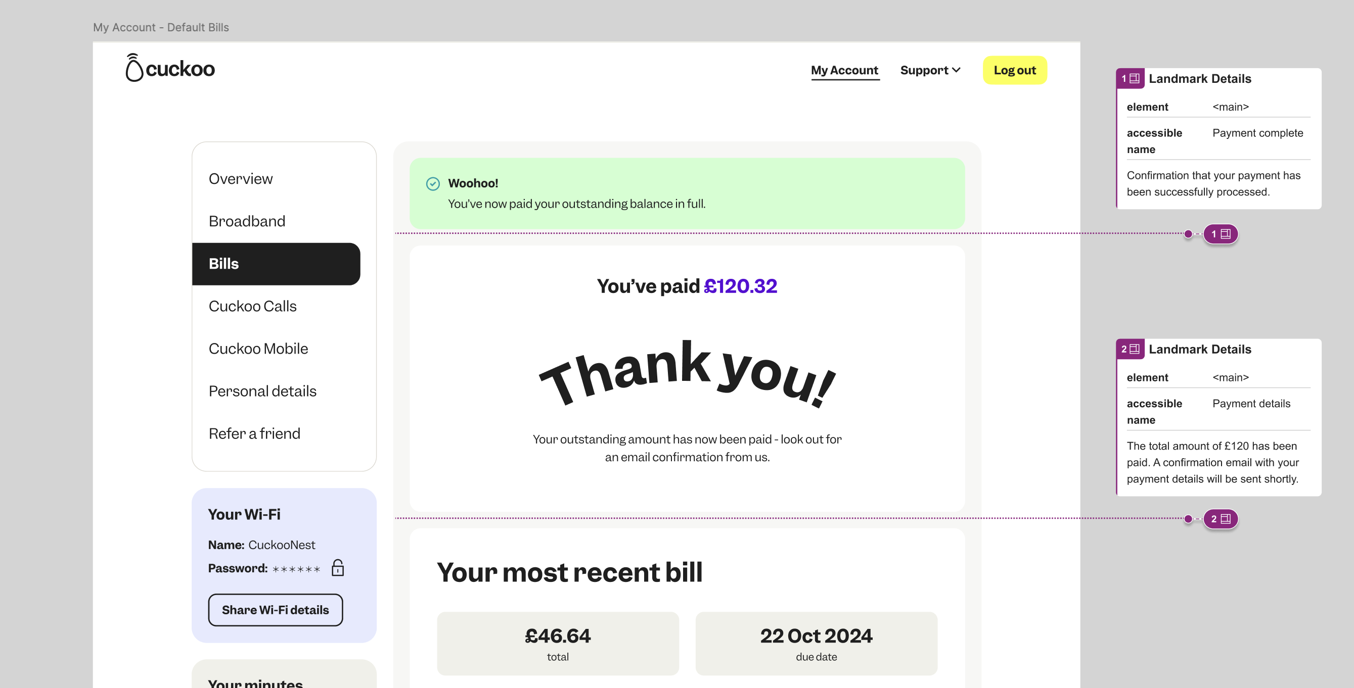
Accessibility
Collaboration extended through to accessibility, working closely with our development teams to ensure an inclusive experience for all users.
Internal Link details
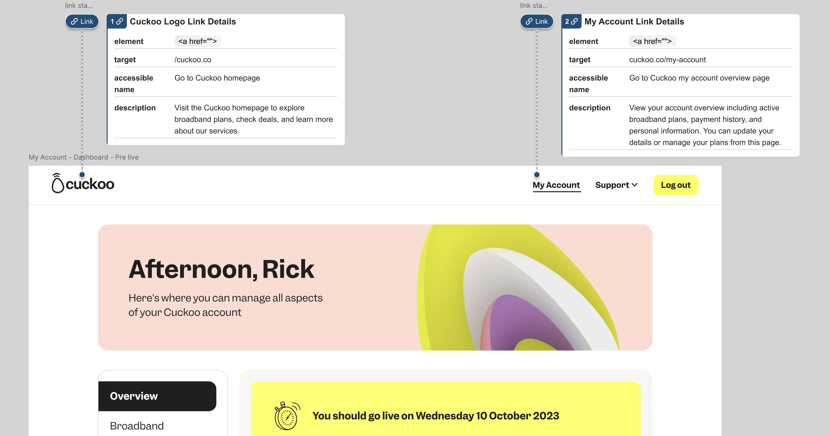
External Link details
Landmark details
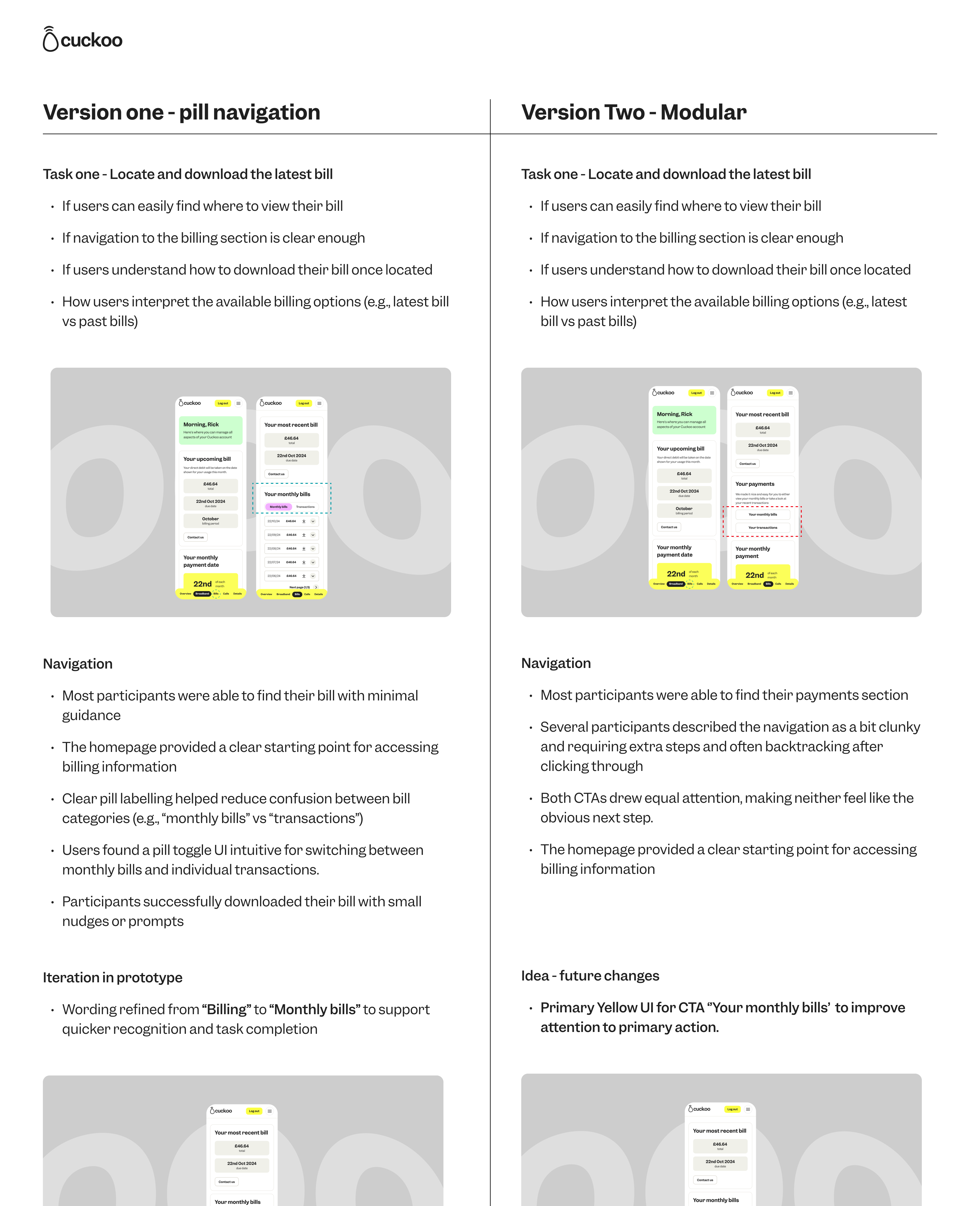
Feature experiments & A/B Testing
To ensure every feature added real value, we ran A/B tests on key elements.
One aspect we experimented on was a pill-style toggle between ‘Monthly Bill’ and ‘Transactions’ versus two side by side CTAs modular layout, testing both with users.
Delivering the new My Account
We finalised a flexible, mobile-first My Account experience, shaped around simplicity and independence. Rolled out in stages, with user feedback informing live iterations.
Previous My Account mobile designs:
New My Account mobile first UI designs:
Testing And Collaboration With The Wider Business
Each feature went through a structured process with product, stakeholders, and legal to ensure compliance and usability. We ran impact assessments, gathered feedback, and tested with focus groups before documenting and validating in Kraken with QA.
This workflow ensured every update met customer needs and business goals, delivering a smoother, more self-sufficient online experience.
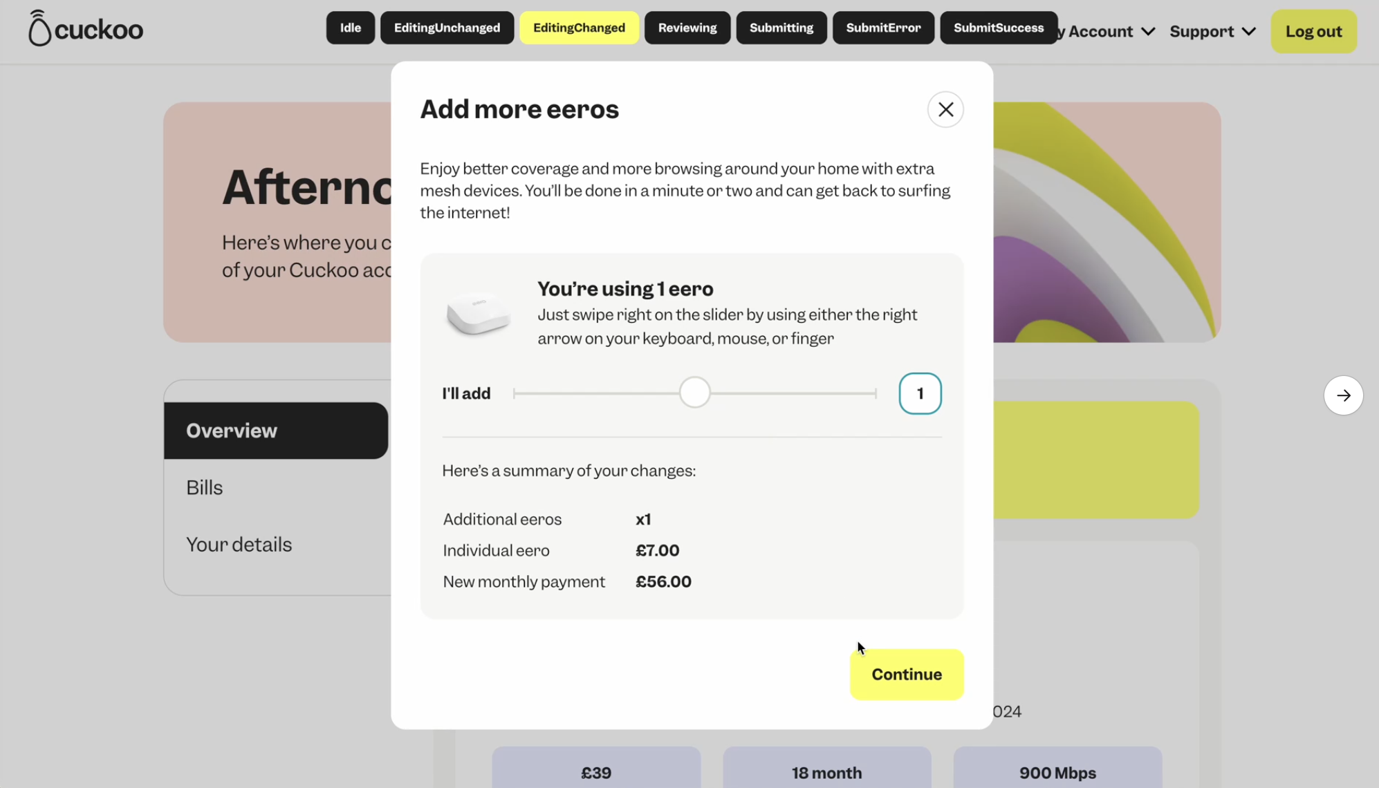
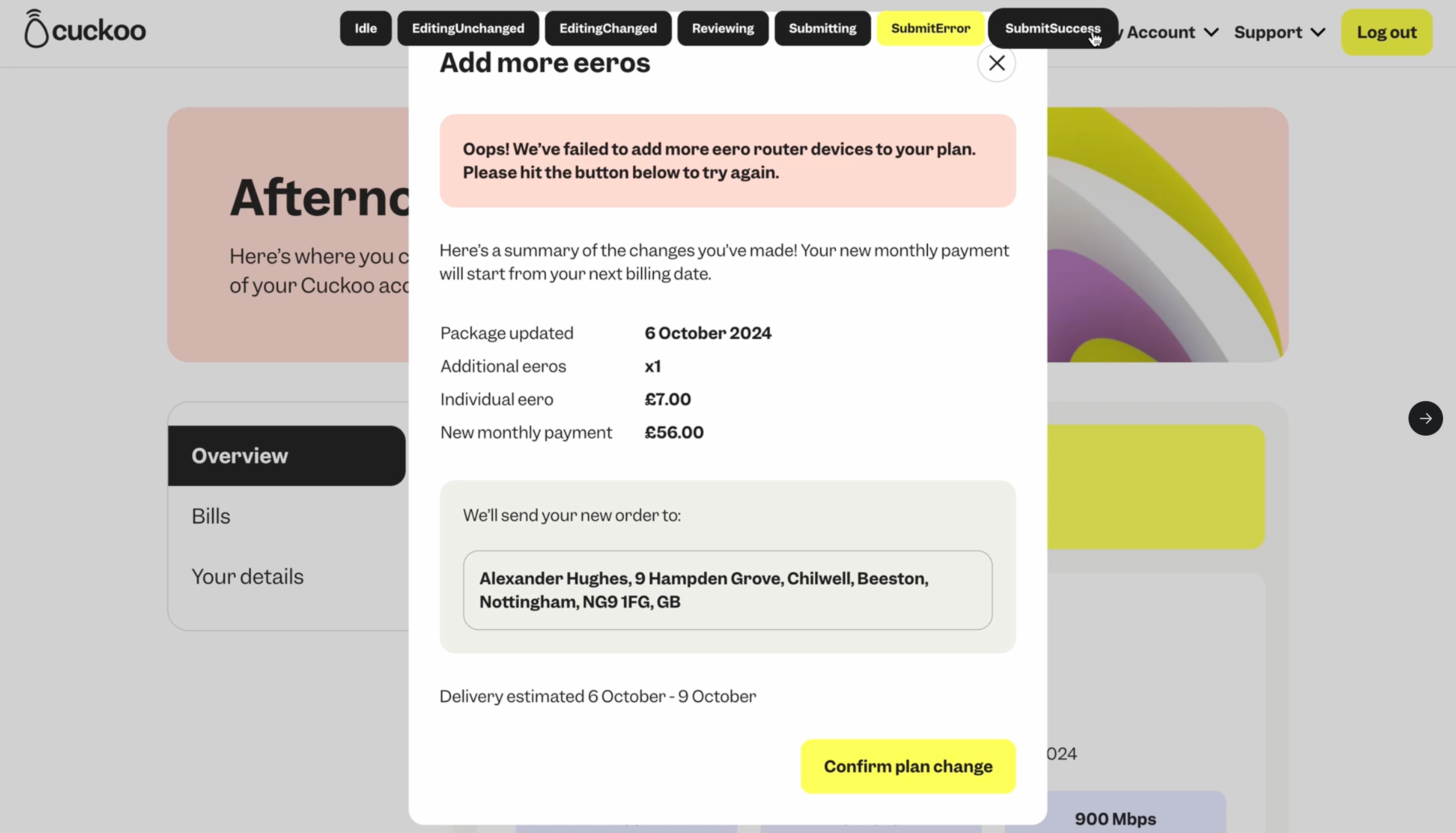
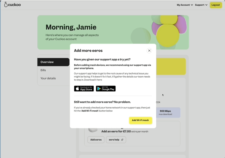
Here's a few of My Account features we've built:
Pre-Live: Raise a complaint
As customers switch to Cuckoo, it’s vital they feel they have an open line of communication with us. We want to be there to step in and resolve any issues or concerns during the switching process. To support this, we developed a feature that allows customers to easily raise a complaint when needed.


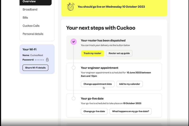
Pre-Live: Tracking my eero router
To ensure customers know exactly when their Eero mesh router is arriving, we built a easy and simple tracking experience that keeps them updated every step of the way.

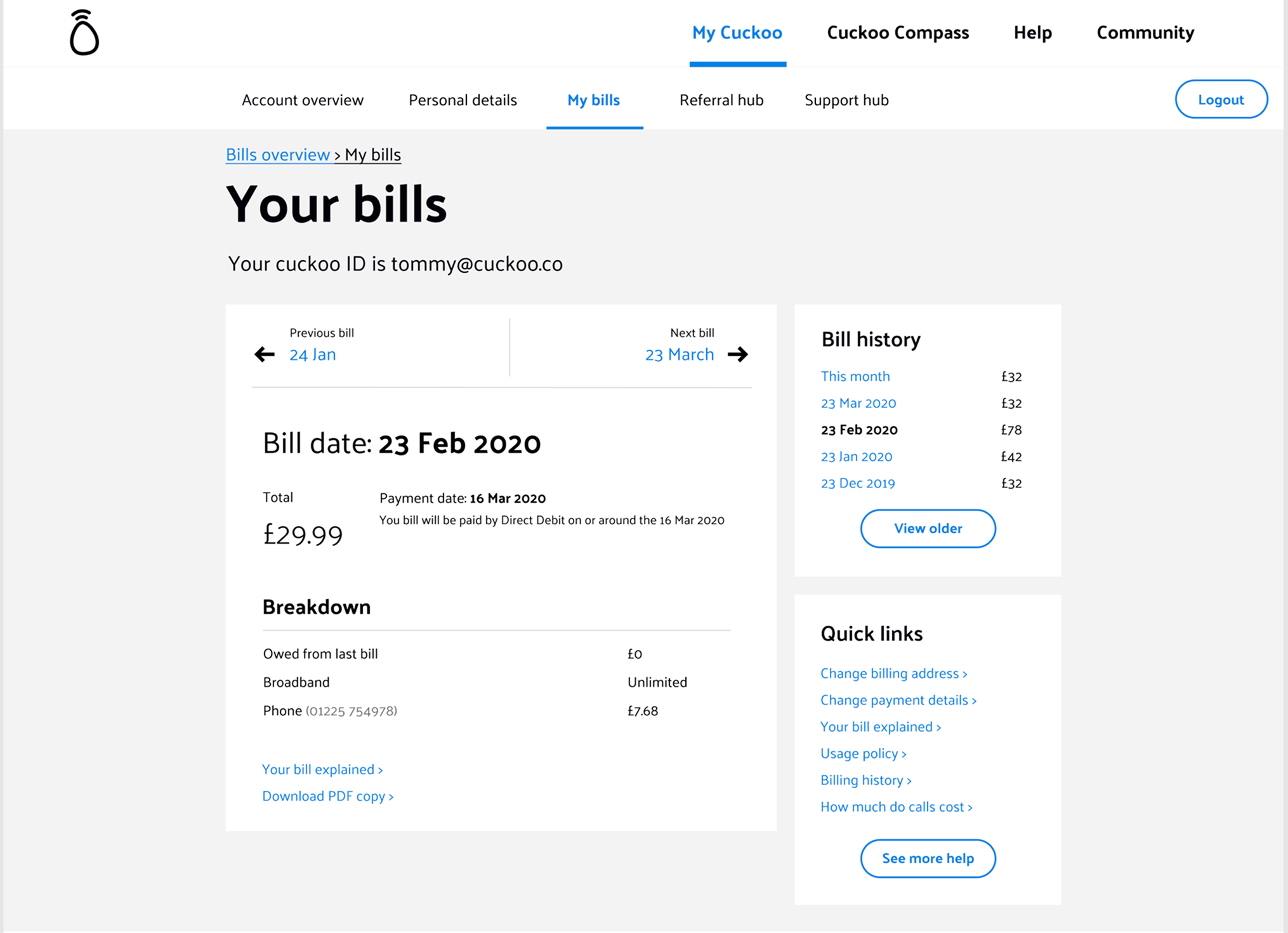
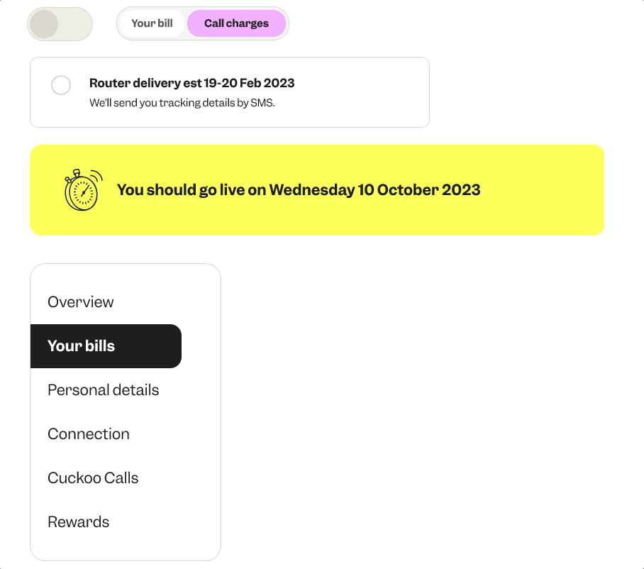
Pre-Live: Billing
When a customer first lands on their billing page within their online account, they won’t see a bill immediately as it’s generated sometime after they go live and start using the service.
To make sure all customers, including those who may be neurodivergent or vulnerable, fully understand what to expect, I created FAQs. These were later refined with input from the wider business, helping ensure customers feel informed and reassured by the time their first bill is available.

Pre-Live: Billing
When a customer first lands on their billing page within their online account, they won’t see a bill immediately as it’s generated sometime after they go live and start using the service.
To make sure all customers, including those who may be neurodivergent or vulnerable, fully understand what to expect, I created FAQs. These were later refined with input from the wider business, helping ensure customers feel informed and reassured by the time their first bill is available
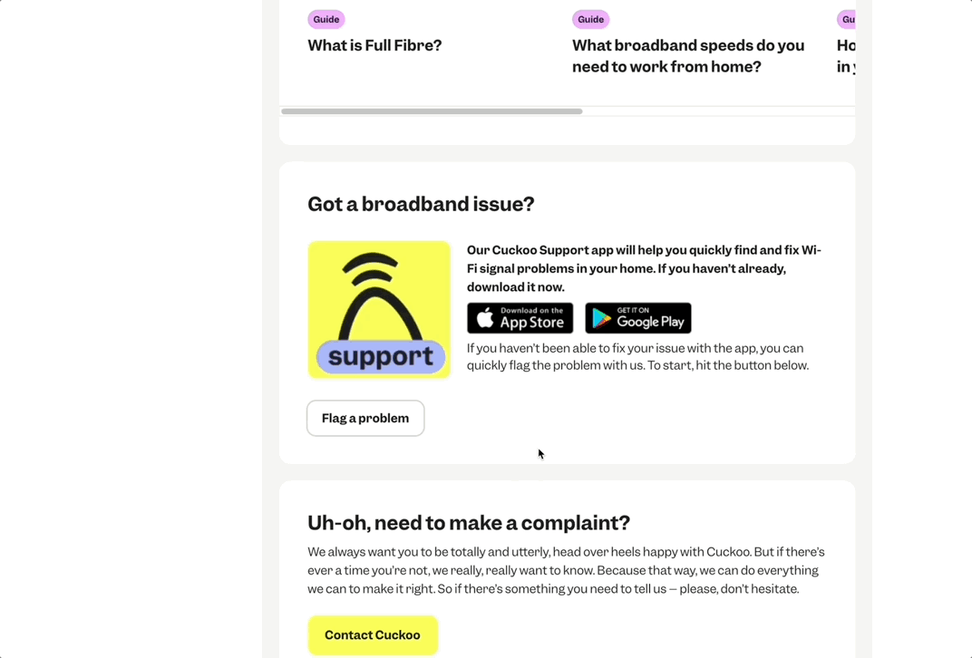
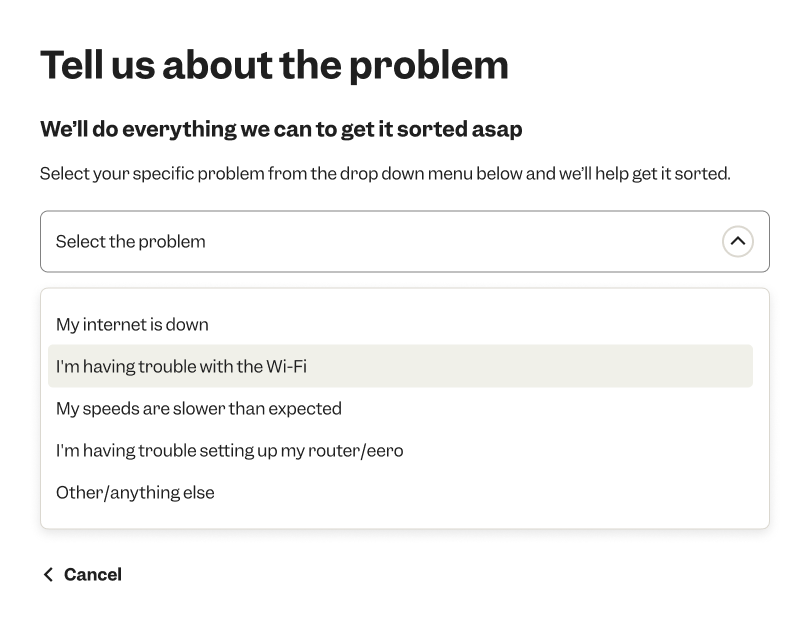
Post-Live: Flag an issue
When customers start using our product, technical faults can sometimes arise. One challenge they face is how to log a clear, detailed issue — that’s where our Flag a Fault flow comes in.
We built this journey to allow customers to self-serve by using our helpful FAQ guides before submitting a fault. We also encourage customers to download our handy app, giving them real-time support from our customer care team whenever they need it.


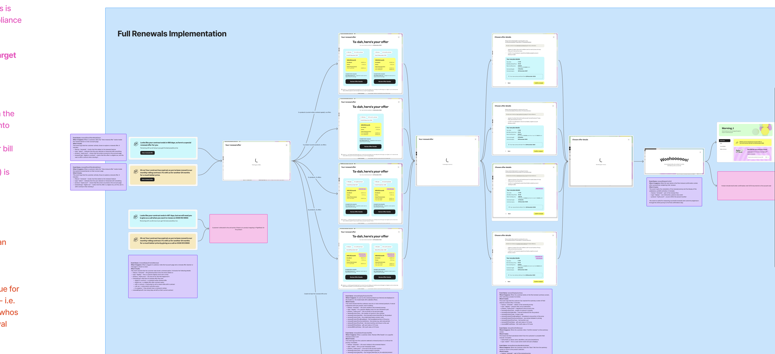
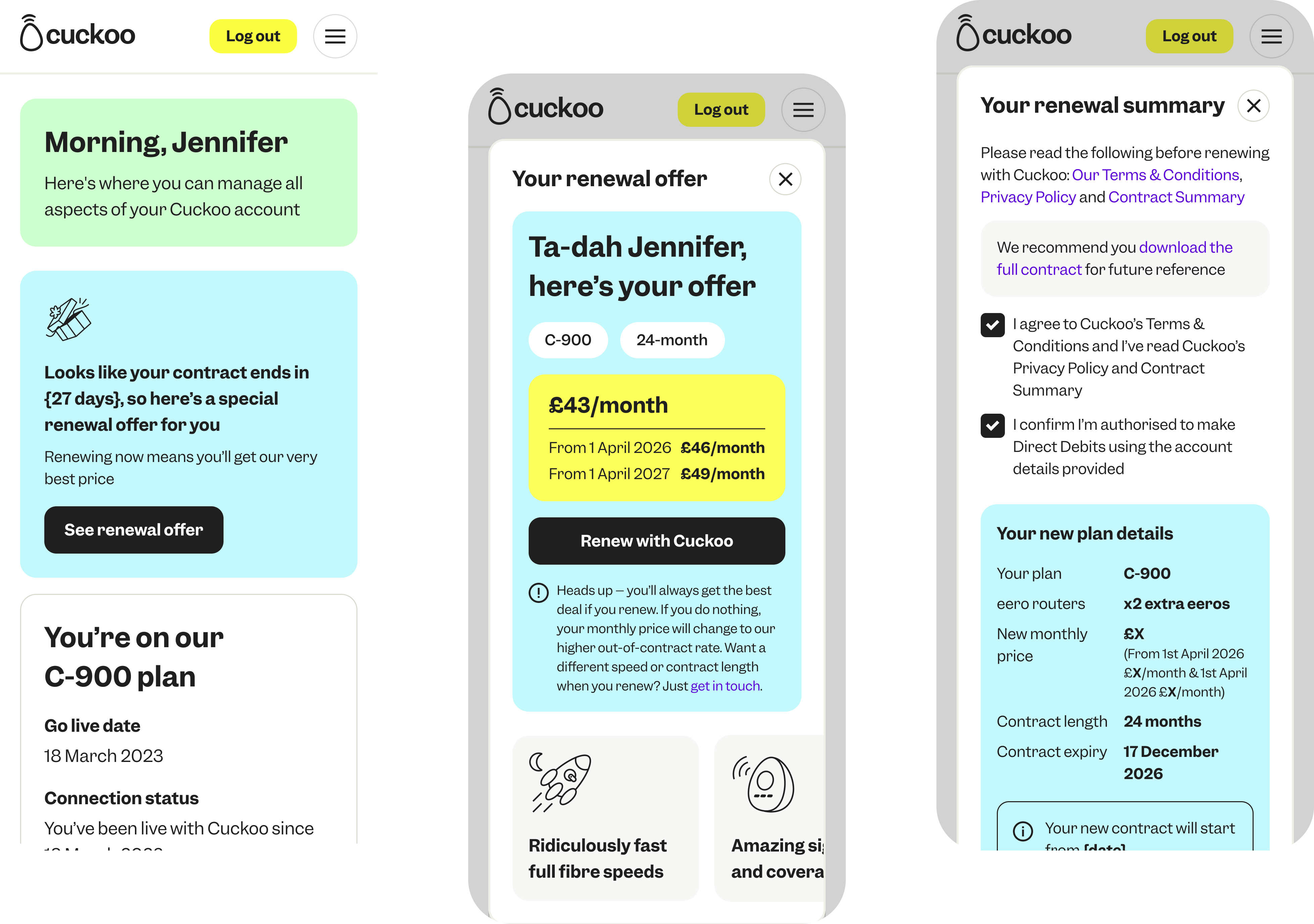
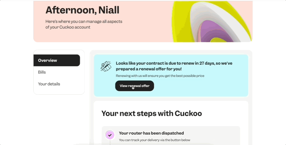
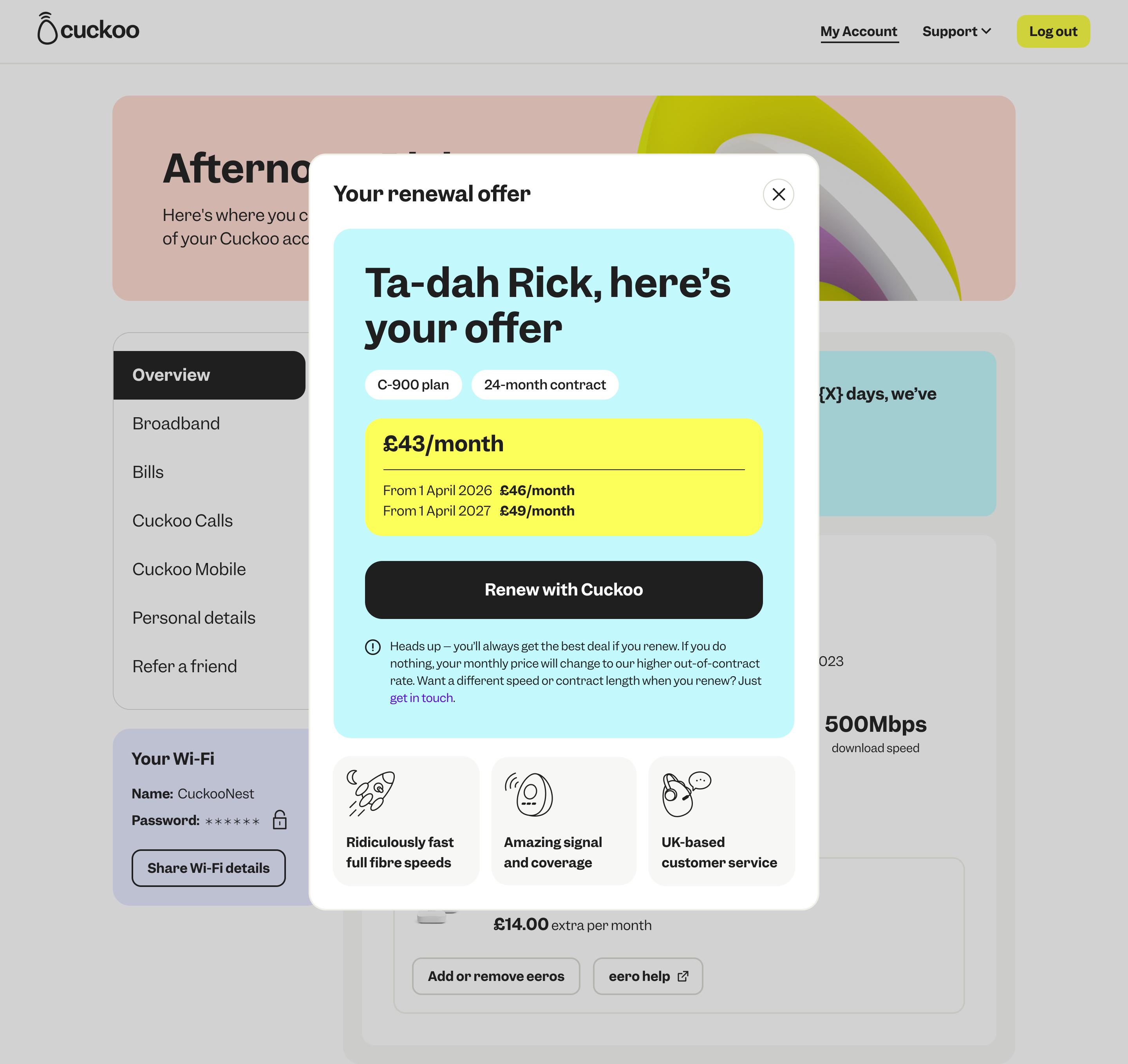
Post-Live: Easy Renewals
To make things simpler, customers can now renew their plan in just a few clicks. The process is quick, clear, and designed to put them in control.
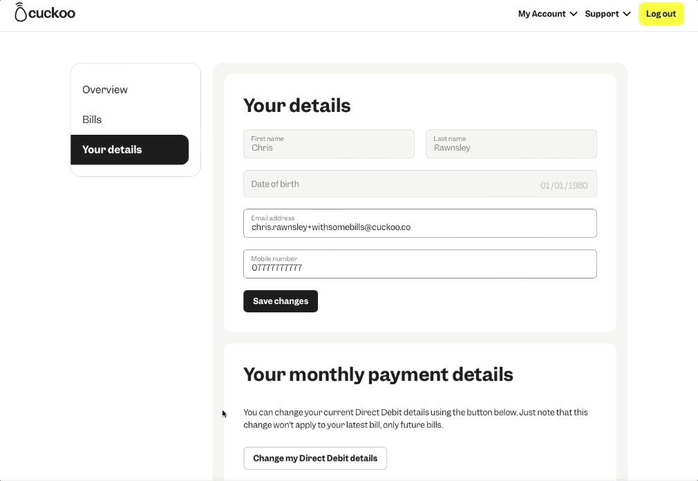
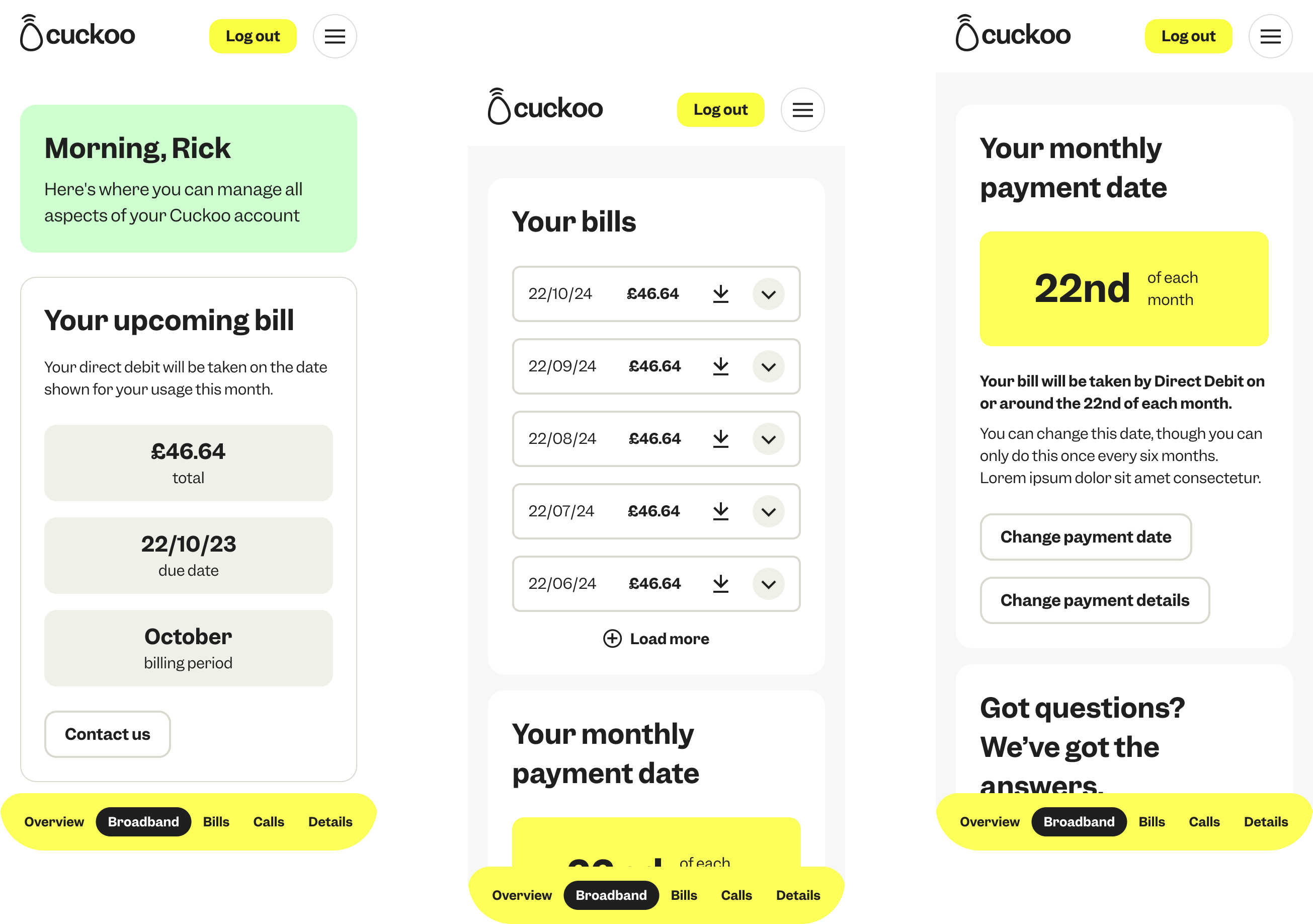
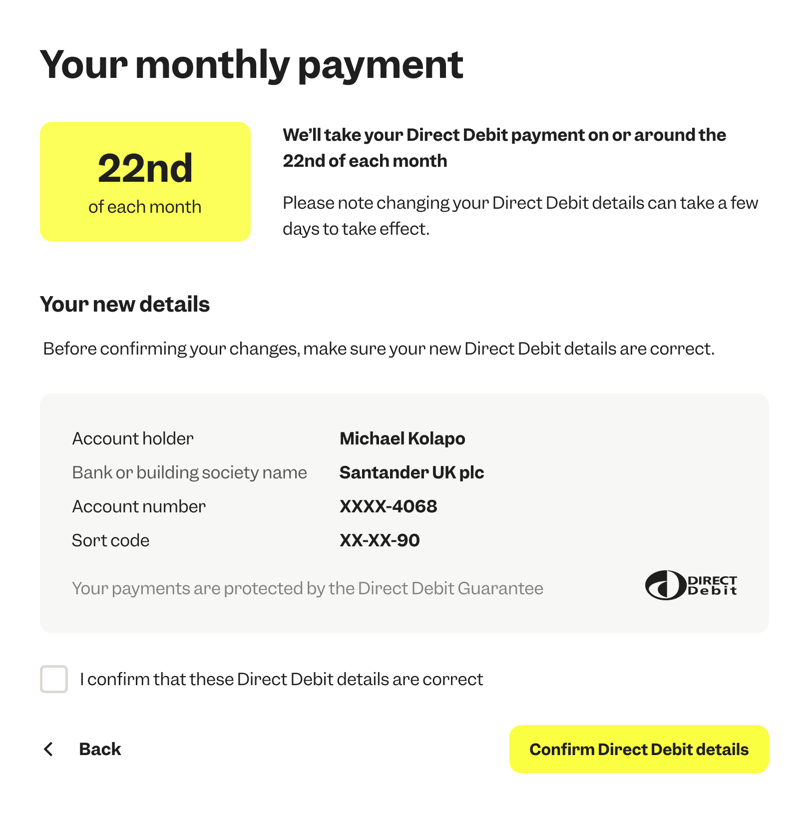
Post-Live: Billing - Changing your Direct Debit details
Customers can now change their payment method directly in their account, with clear prompts and guidance throughout. It’s all about giving them more control, without the need to contact support.
.png)

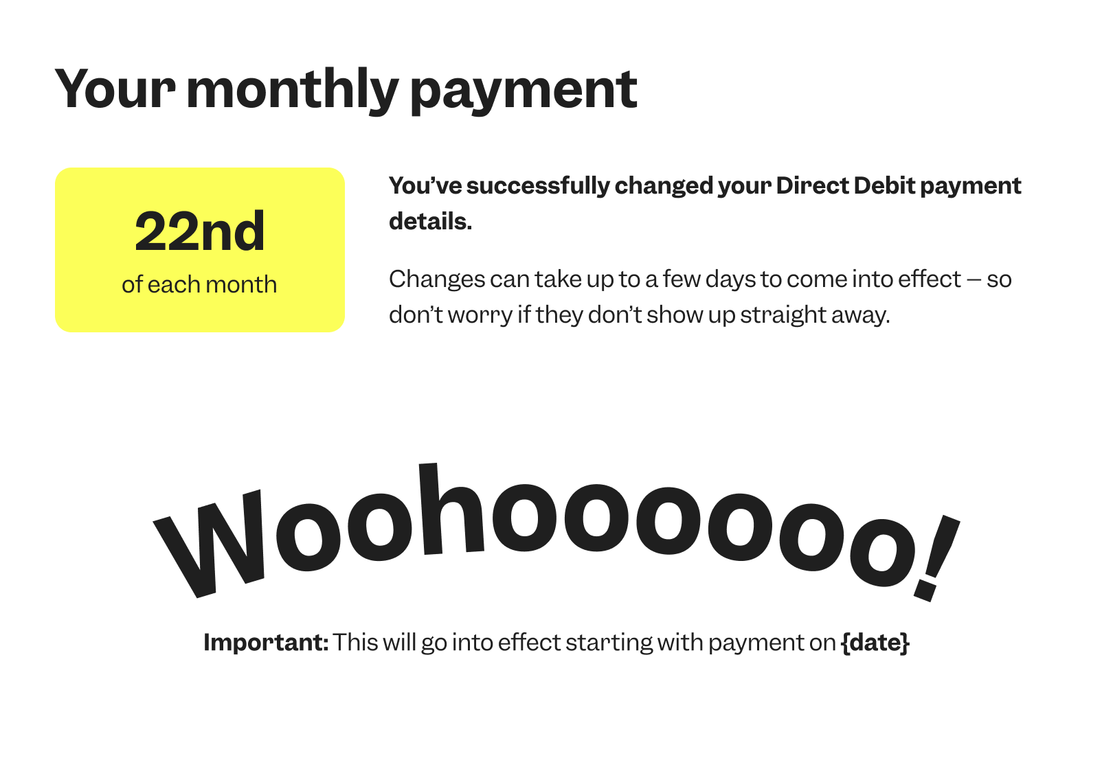
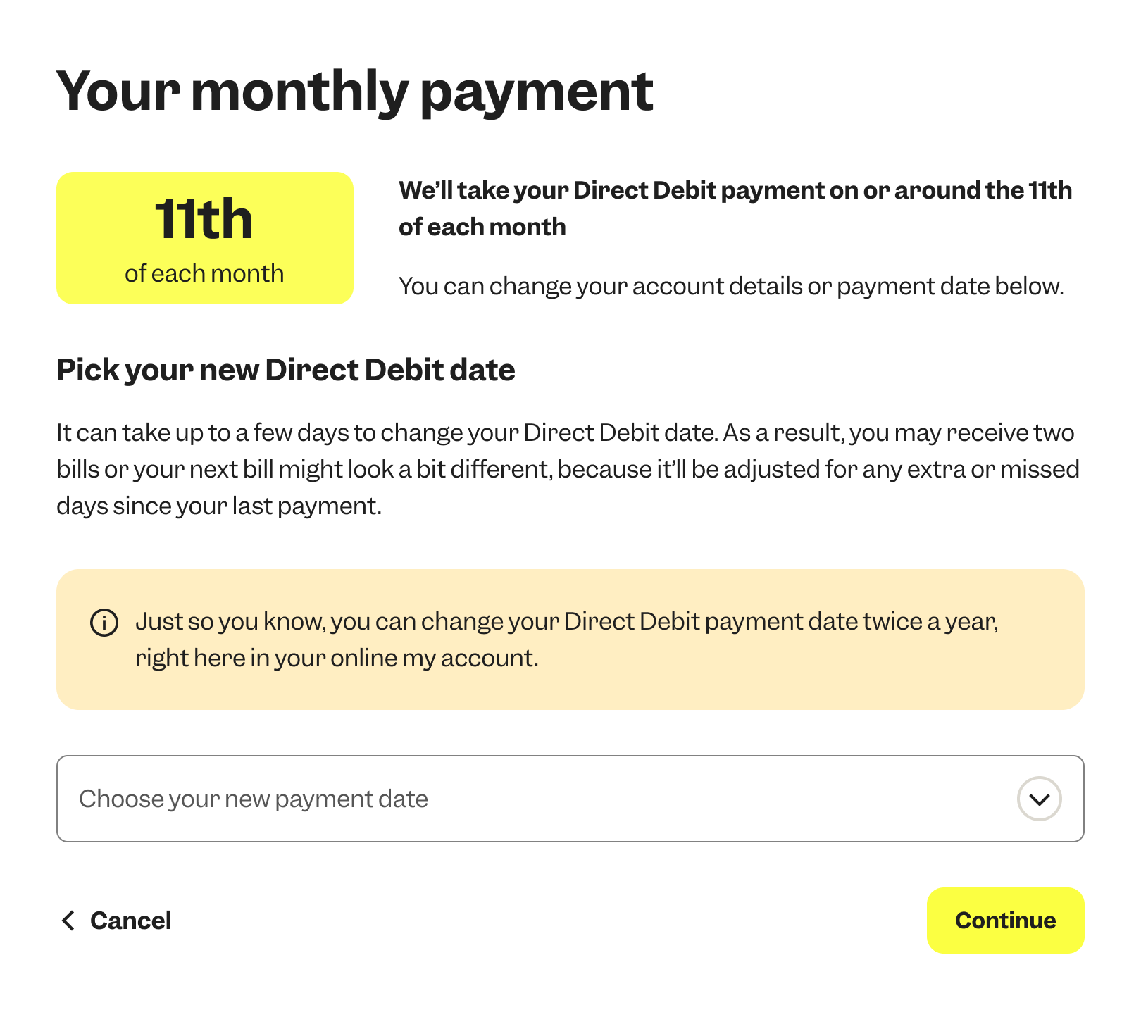
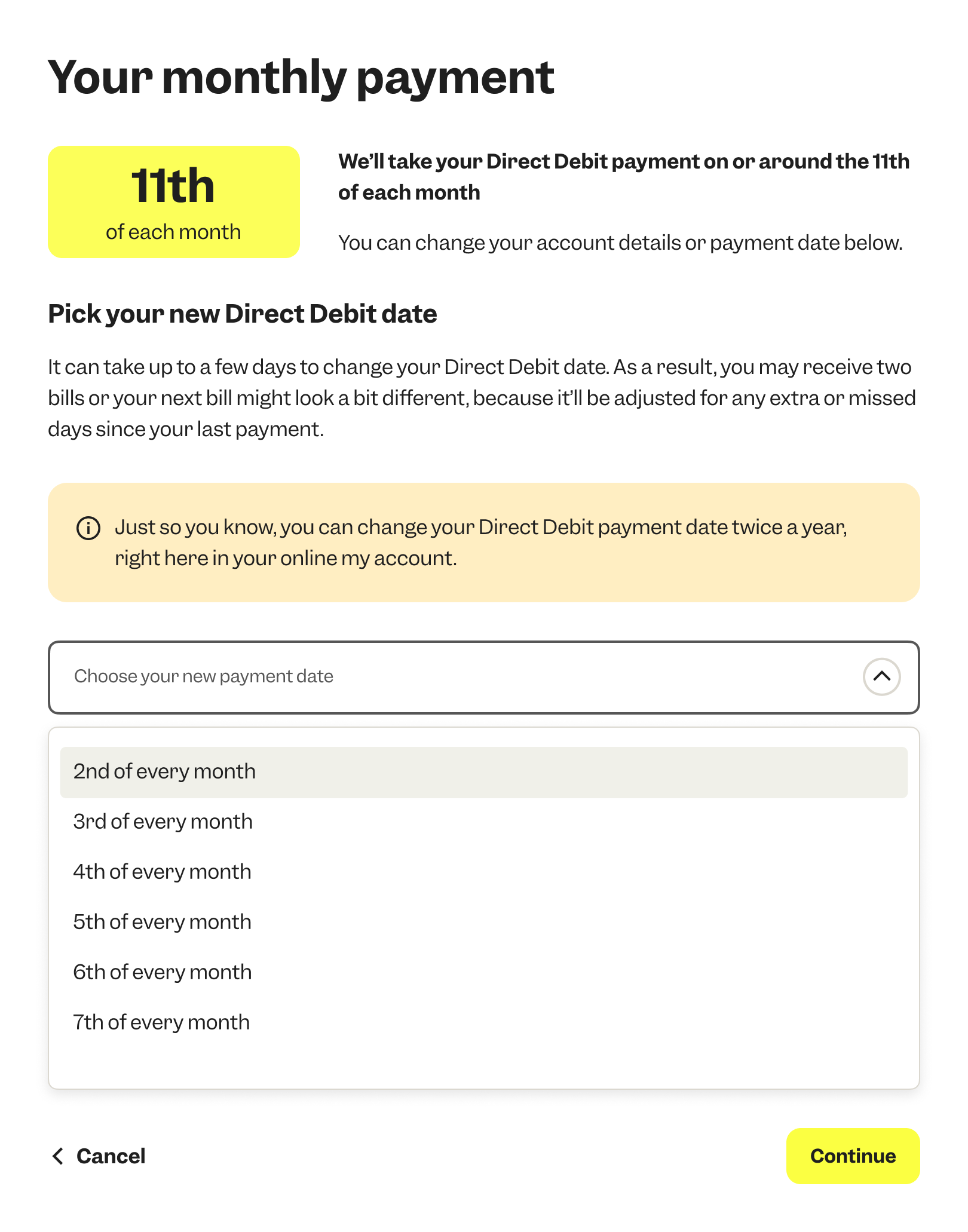
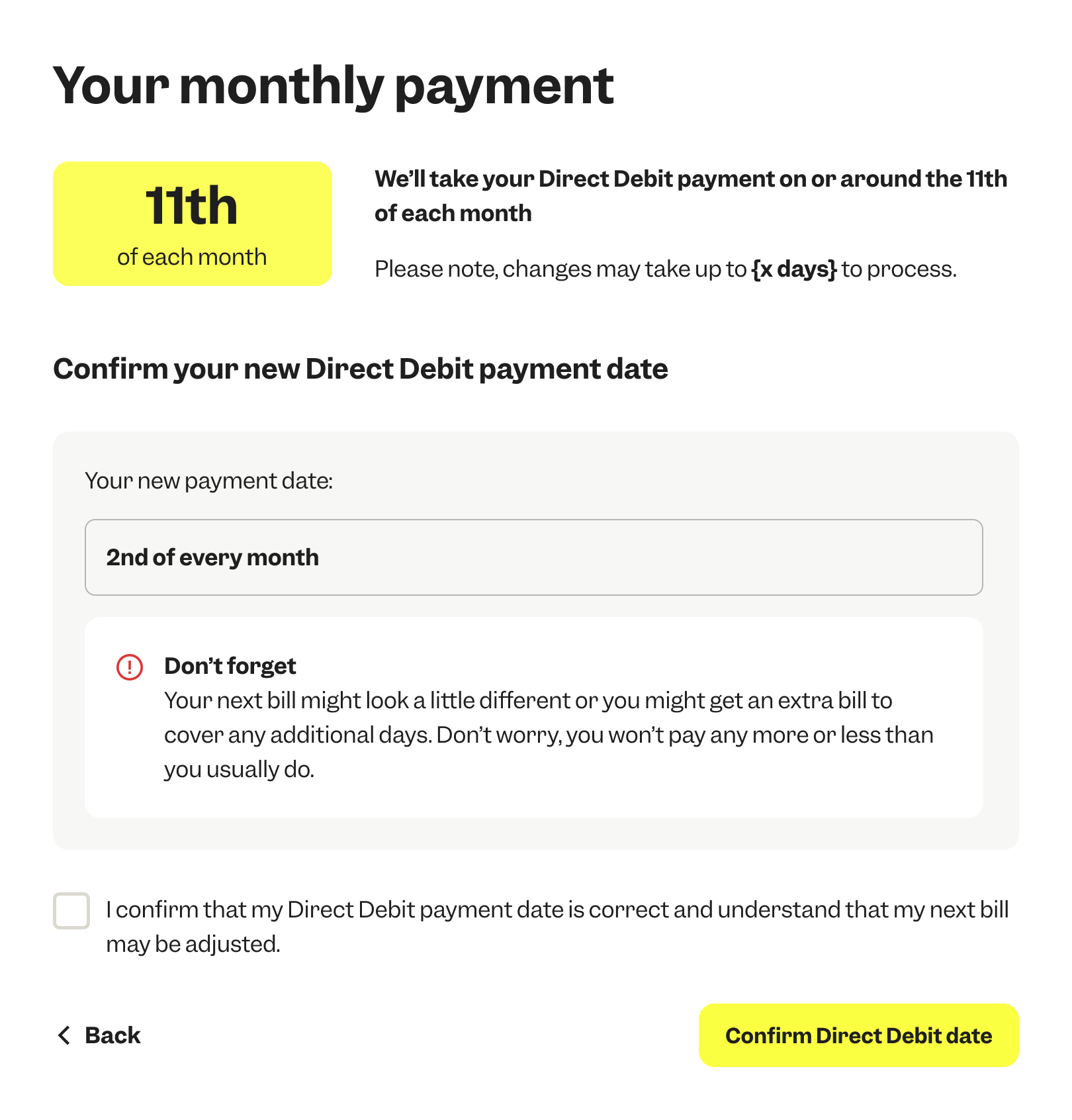
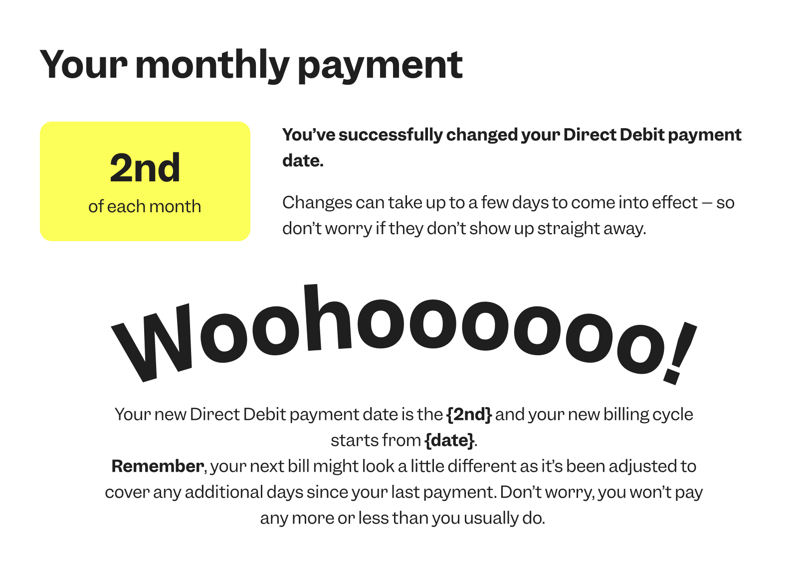
Post-Live: Billing - Changing your Direct Debit date
Customers can now change their payment date directly in their account. While this updates the billing cycle in the background, we focused on making the experience seamless and easy to understand, giving users more flexibility and clarity around when they’ll be charged.
.png)
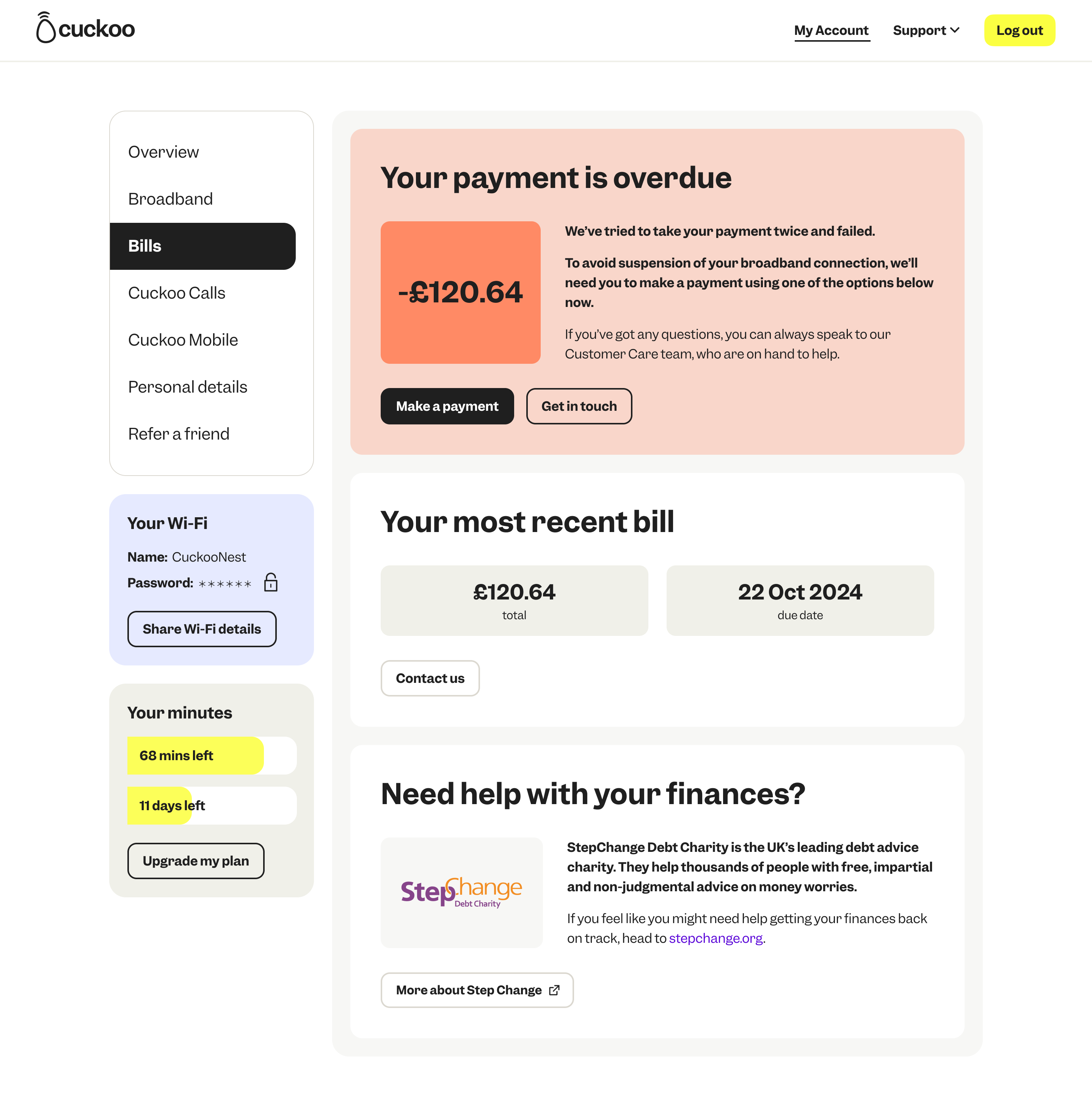
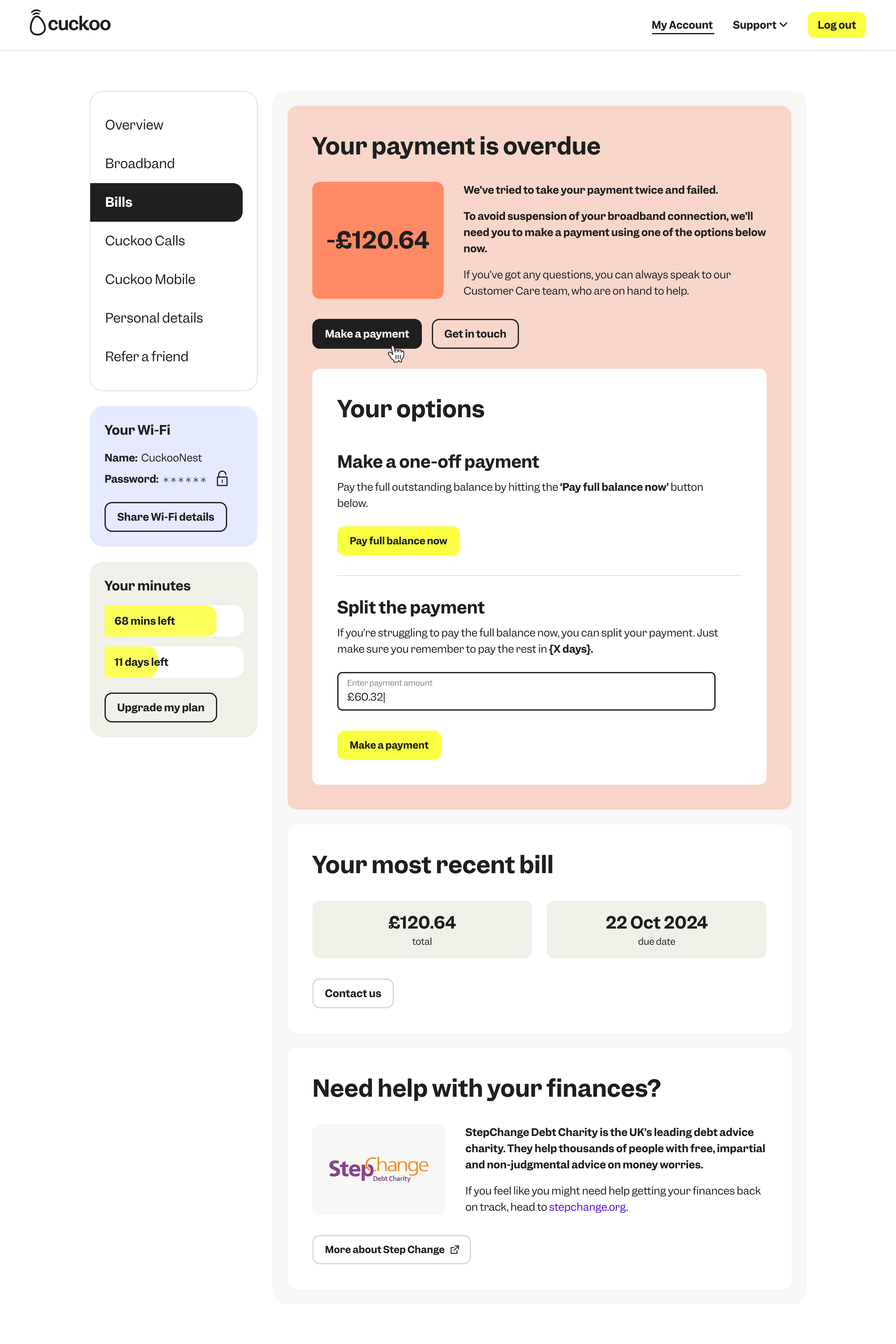
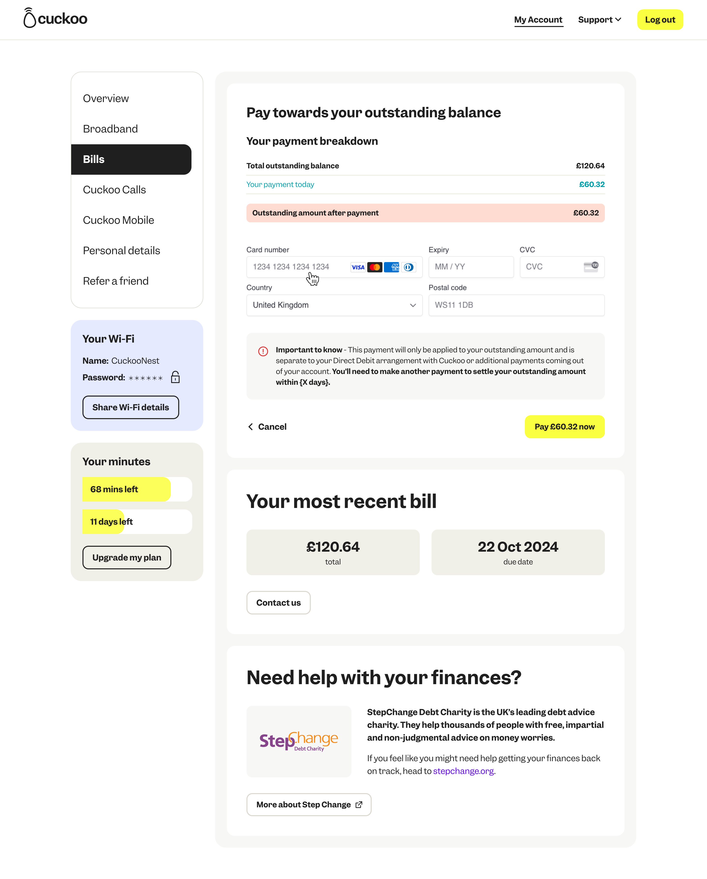
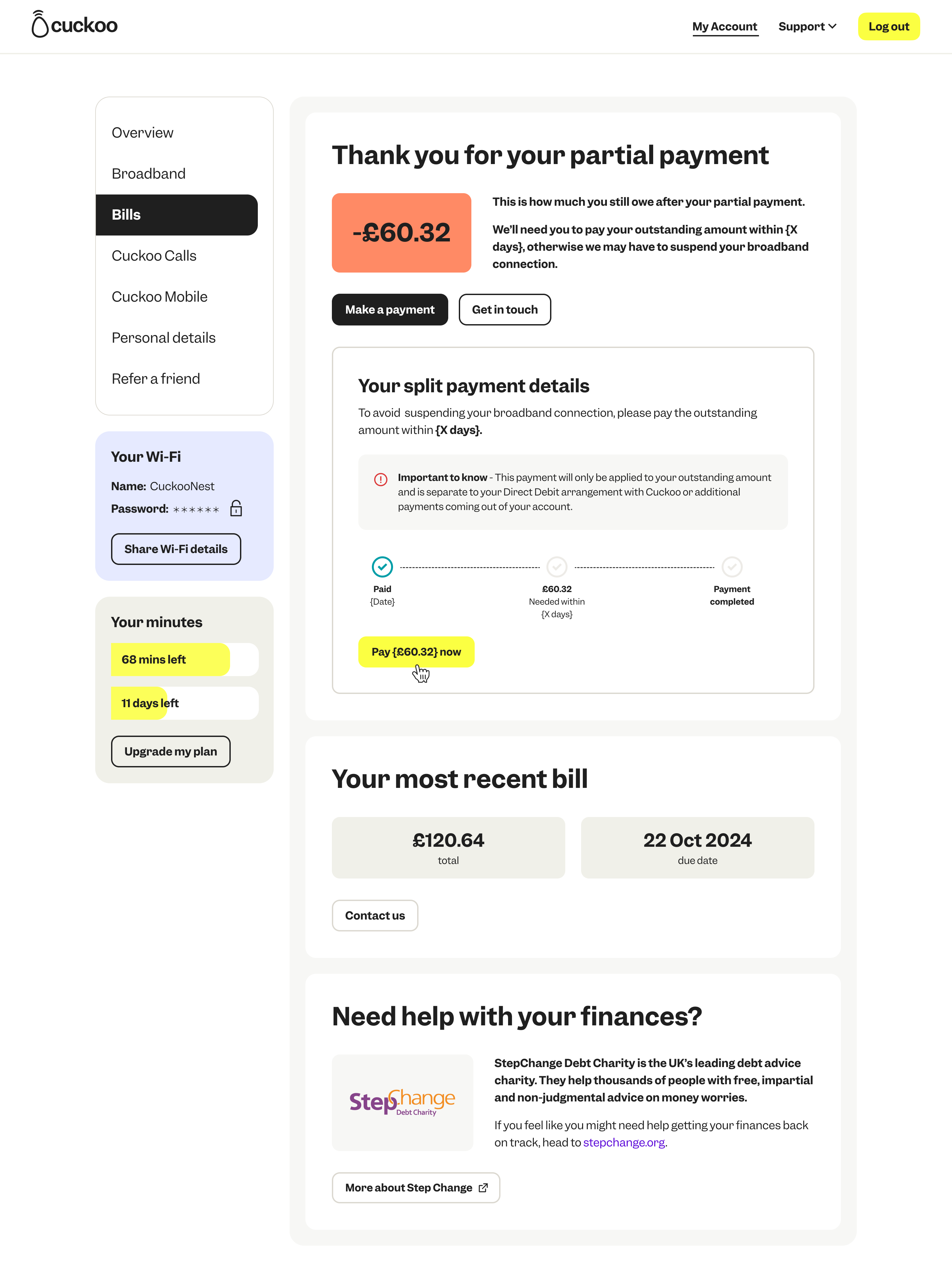
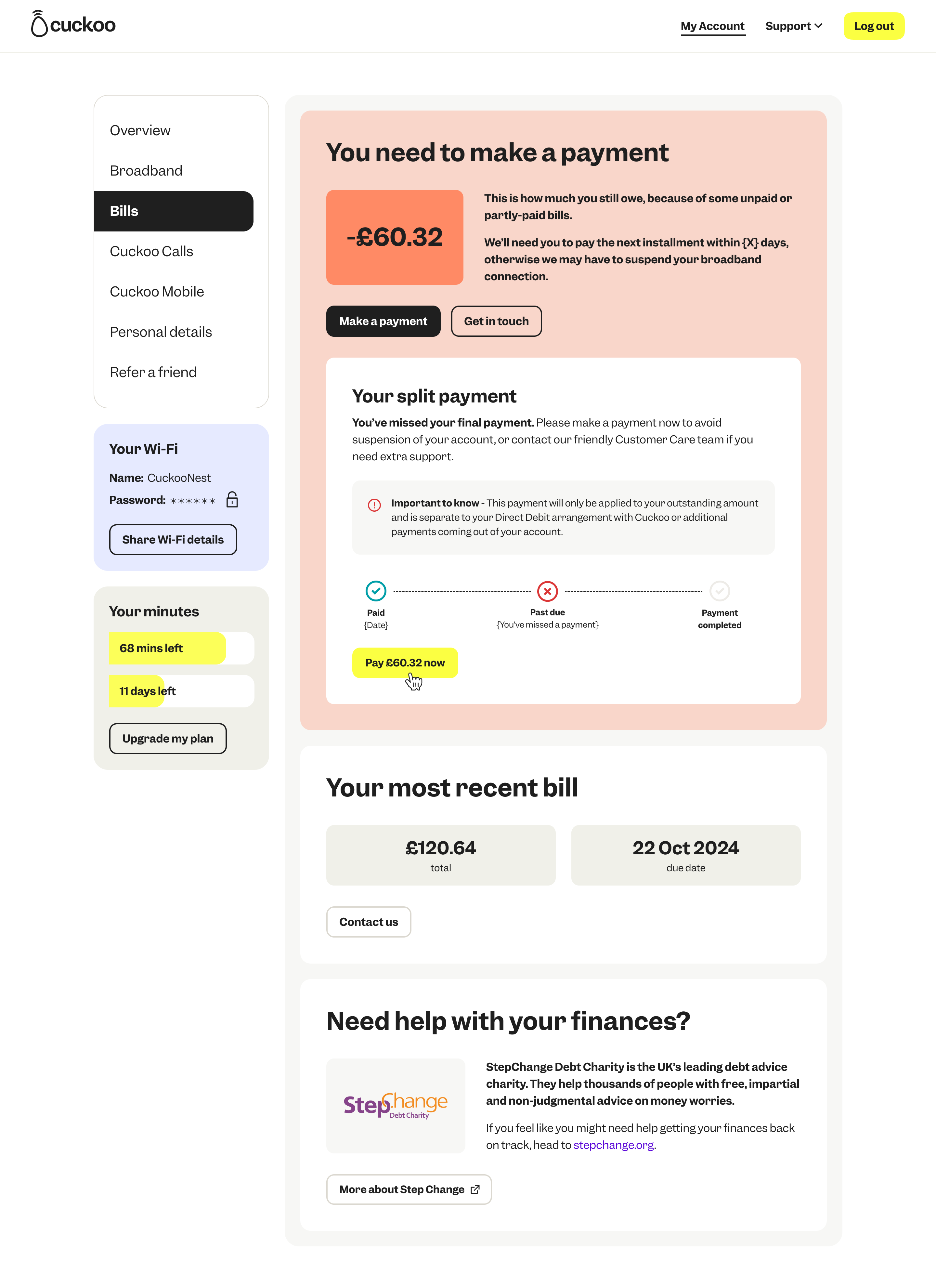
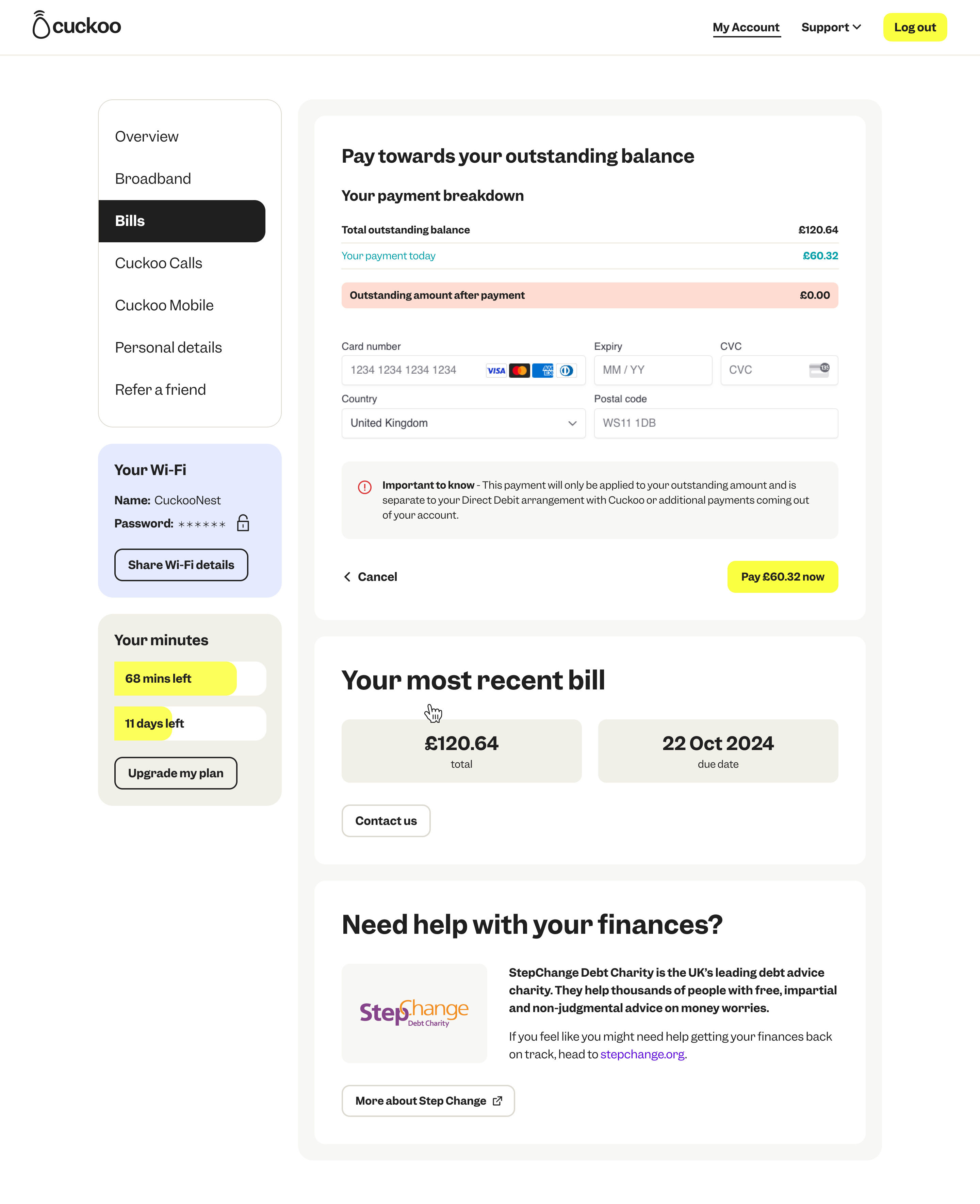
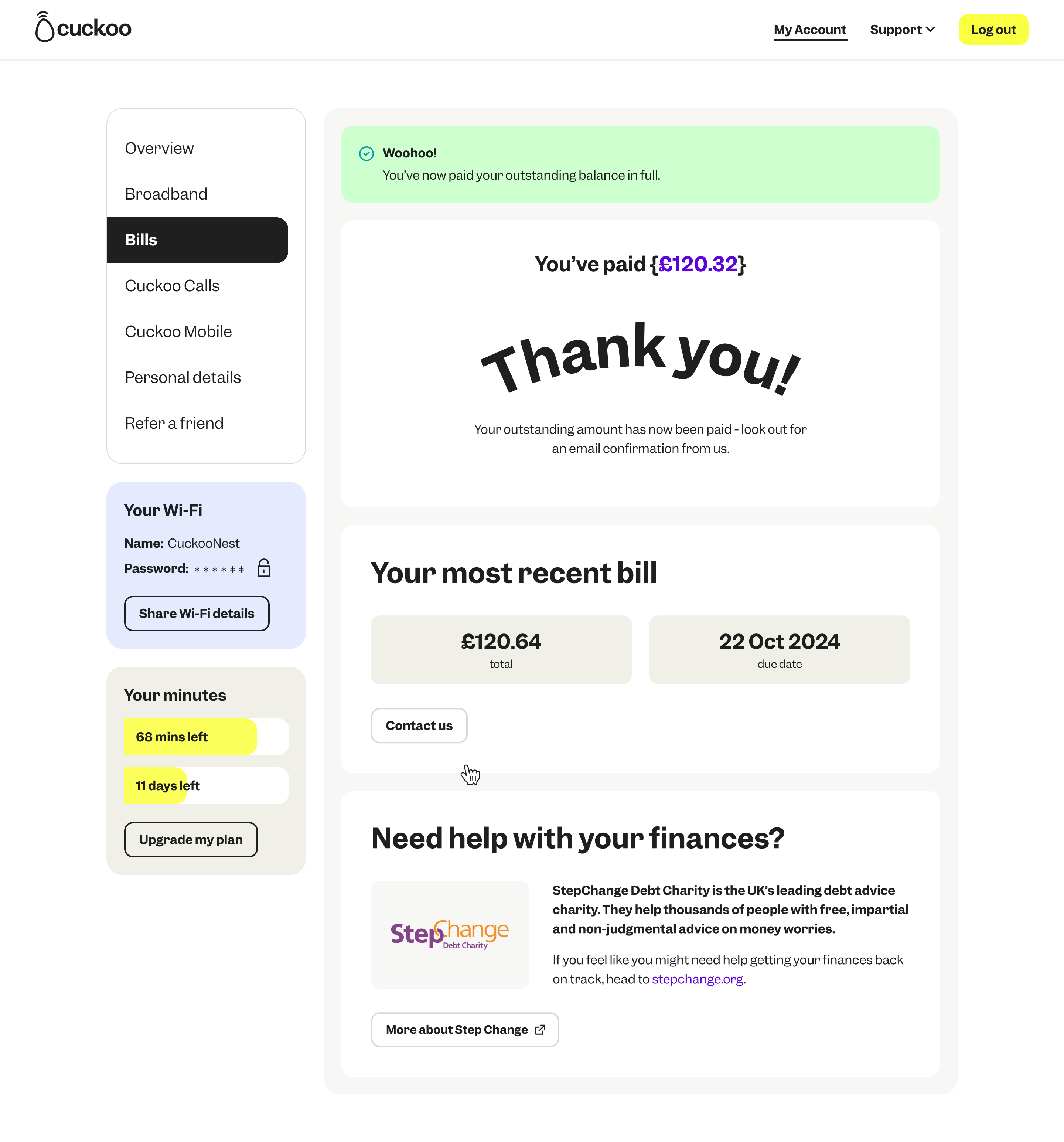
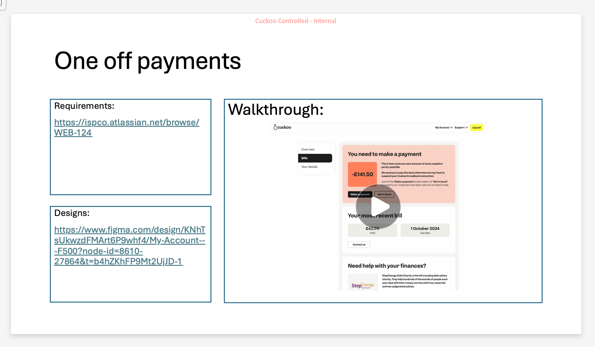
Post-Live: Billing - Making a one-off payment
Customers can make a one-off payment right from their online account. This put the power in the customer hands so they can immediately self-serve and as a result, removes the friction on wait times on calls and reduces internal support tickets raised.