
Cuckoo sign-up
Spring 2025
Team: Head of Product Designer, Senior Product Designer (me), Product Manager, Technical Delivery Manager, x4 Full Stack Engineers
The problem
The customer sign up flow caused friction at credit checks, router selection, and delivery, leading to drop offs and higher support demand. During a backend migration to improve tracking and pricing logic, I worked with the Growth squad to redesign the journey into a smoother, more intuitive experience across devices and channels.
The tension
The backend migration offered greater technical flexibility but carried a risk of disrupting the live customer journey. We used this moment to rethink the flow more broadly, aiming to reduce friction, build trust and make switching to Cuckoo simple and reassuring.
The insight & Impact
Through user research, customer feedback, and cross-team collaboration, we identified key areas for improvement. We introduced:
- A soft credit check earlier in the journey
- Clearer tools for plan and router selection
- Optimised the OTS step
- Responsive UI components built from our design system, Flock
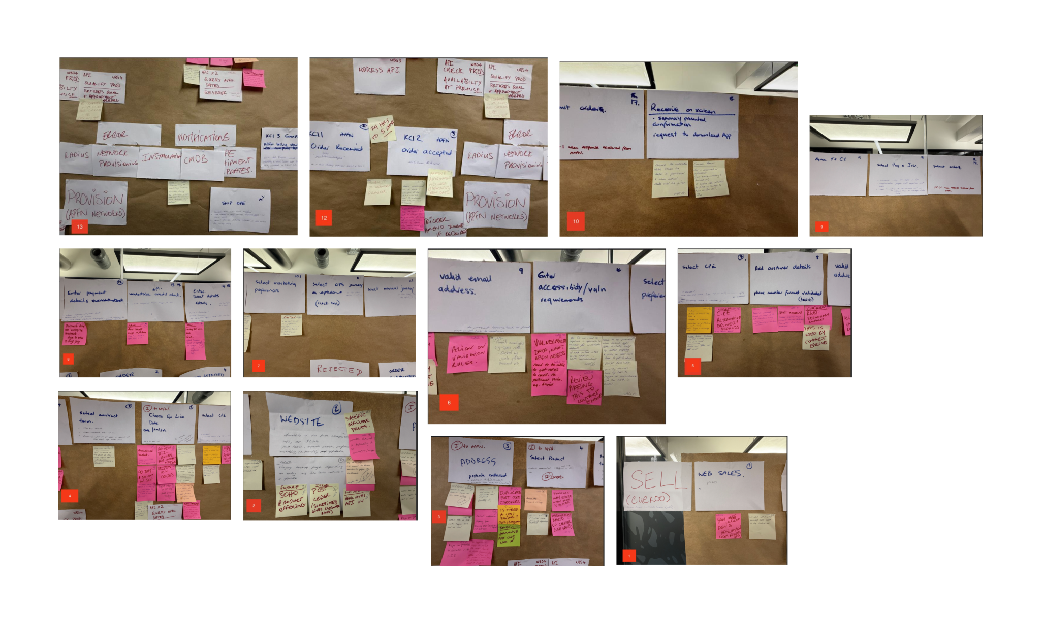
Process
From a workshop with the Growth squad, we developed a hypothesis: customers want a straightforward and reassuring sign up experience that helps them confidently complete their switch to Cuckoo.
If we redesign the join flow to be clearer, faster, and more consistent across channels, while improving backend flexibility and data capture, then we’ll see higher completion rates, fewer failed credit checks, and improved customer satisfaction.
Lean Canvas
We collaborated as a team to create a Lean Canvas that helped us align on focus areas and define the key problems to solve:
- Analyse how customers were interacting with the current sign-up flow and identified where drop-offs were happening
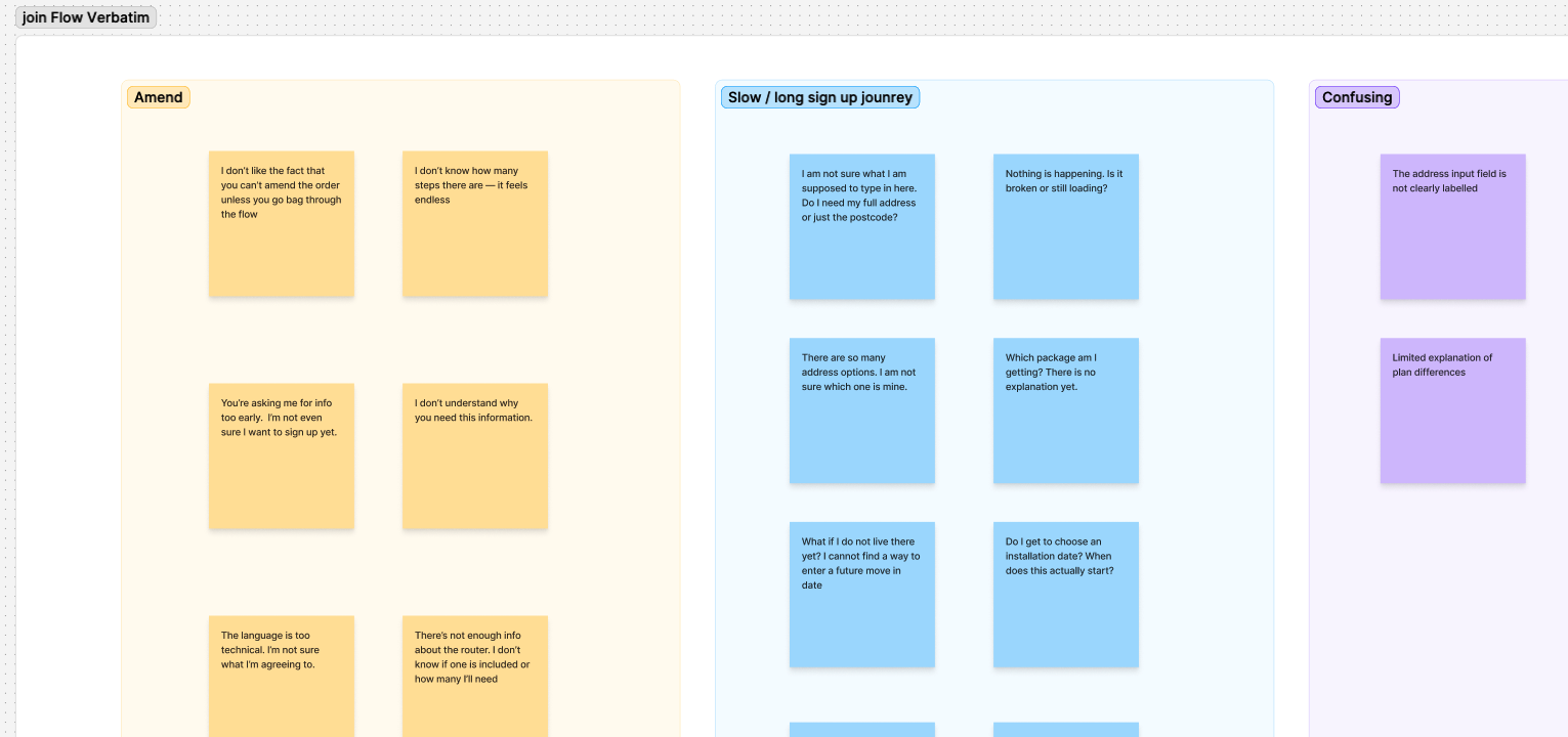
- Review customer verbatim to uncover pain points and opportunities for improvement
- Synthesise insights into an empathy map to keep the team grounded in the customer’s experience and mindset

Discovery the data on hand
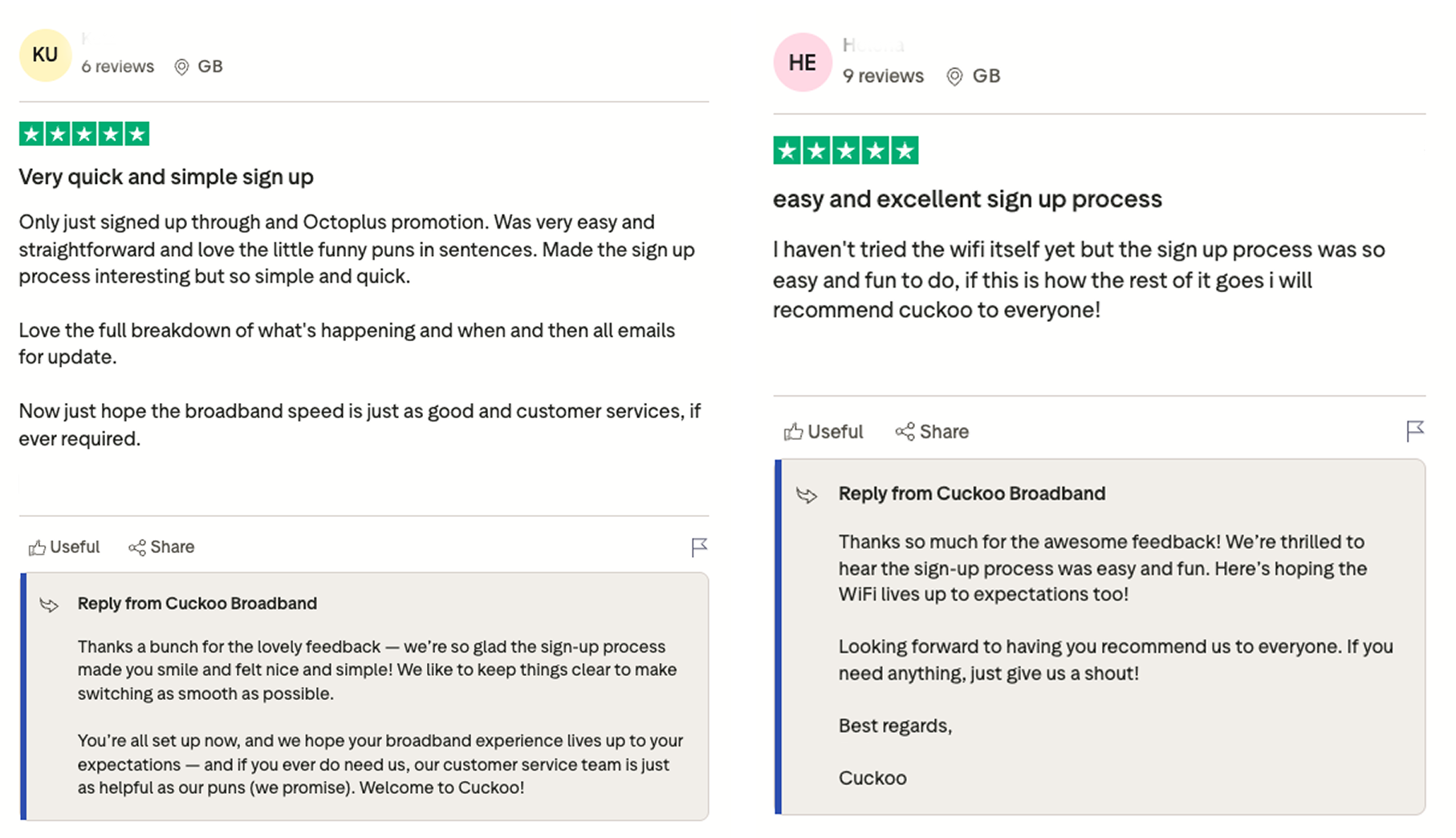
We implemented a new TrustPilot component in the existing join flow to gather data on what customer said post sign up
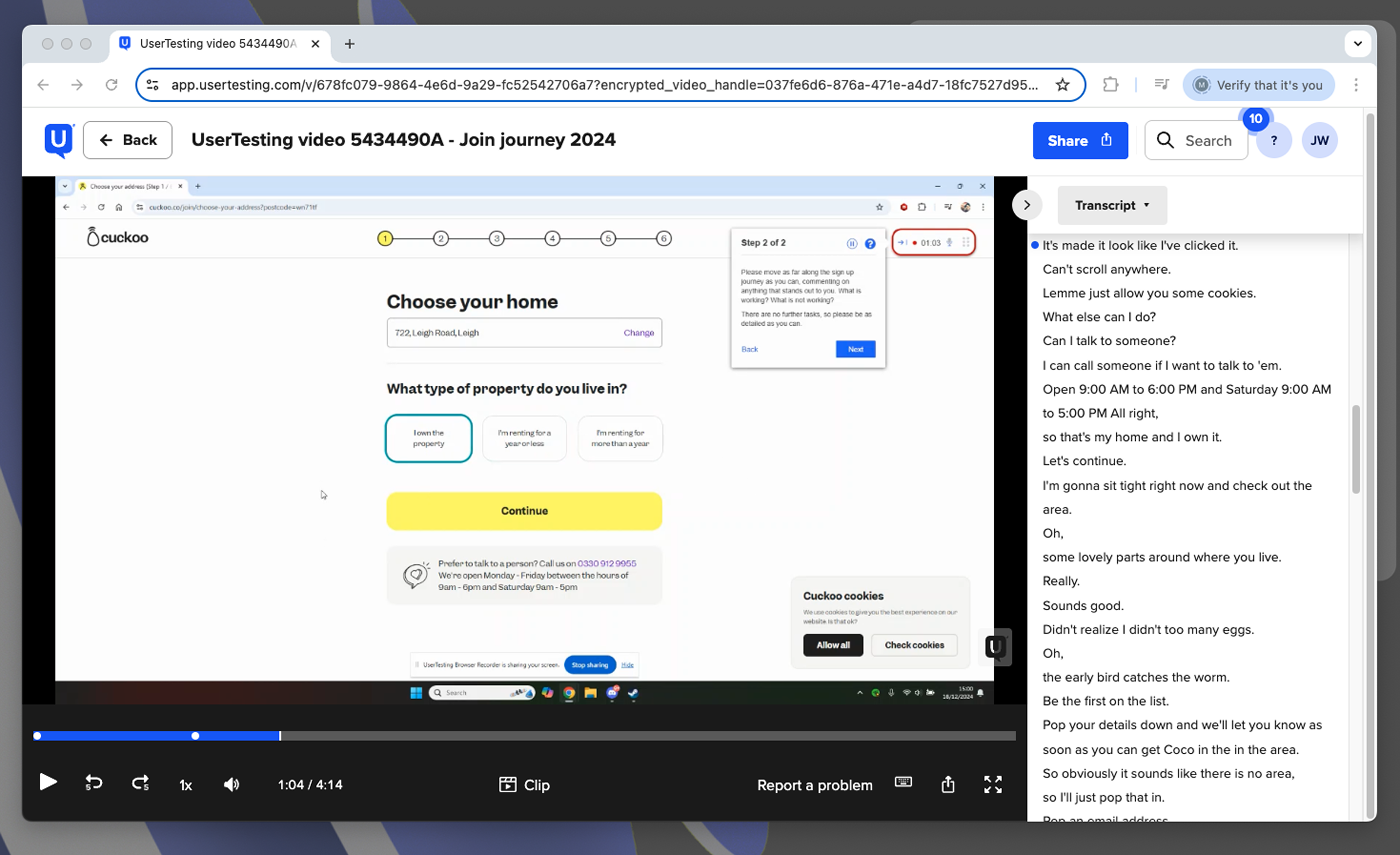
Data gathered via usertesting.com
At Cuckoo, we use UserTesting.com to validate and improve our developed experiences. We used this tool to understand user pain points on the current join flow.
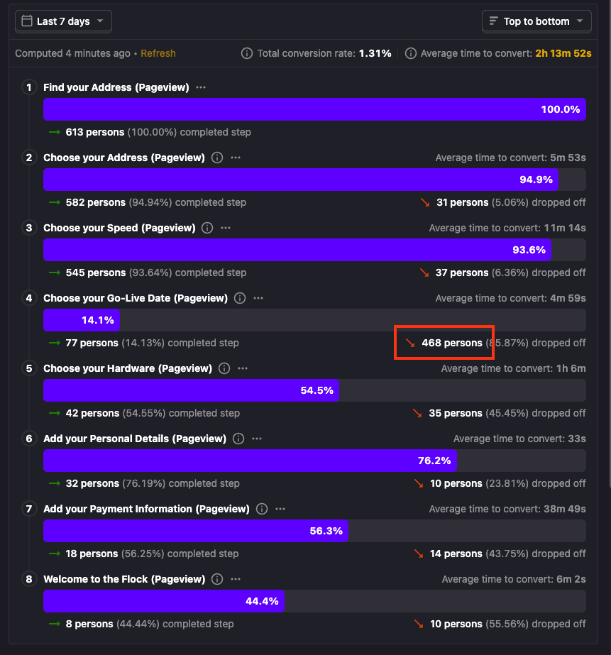
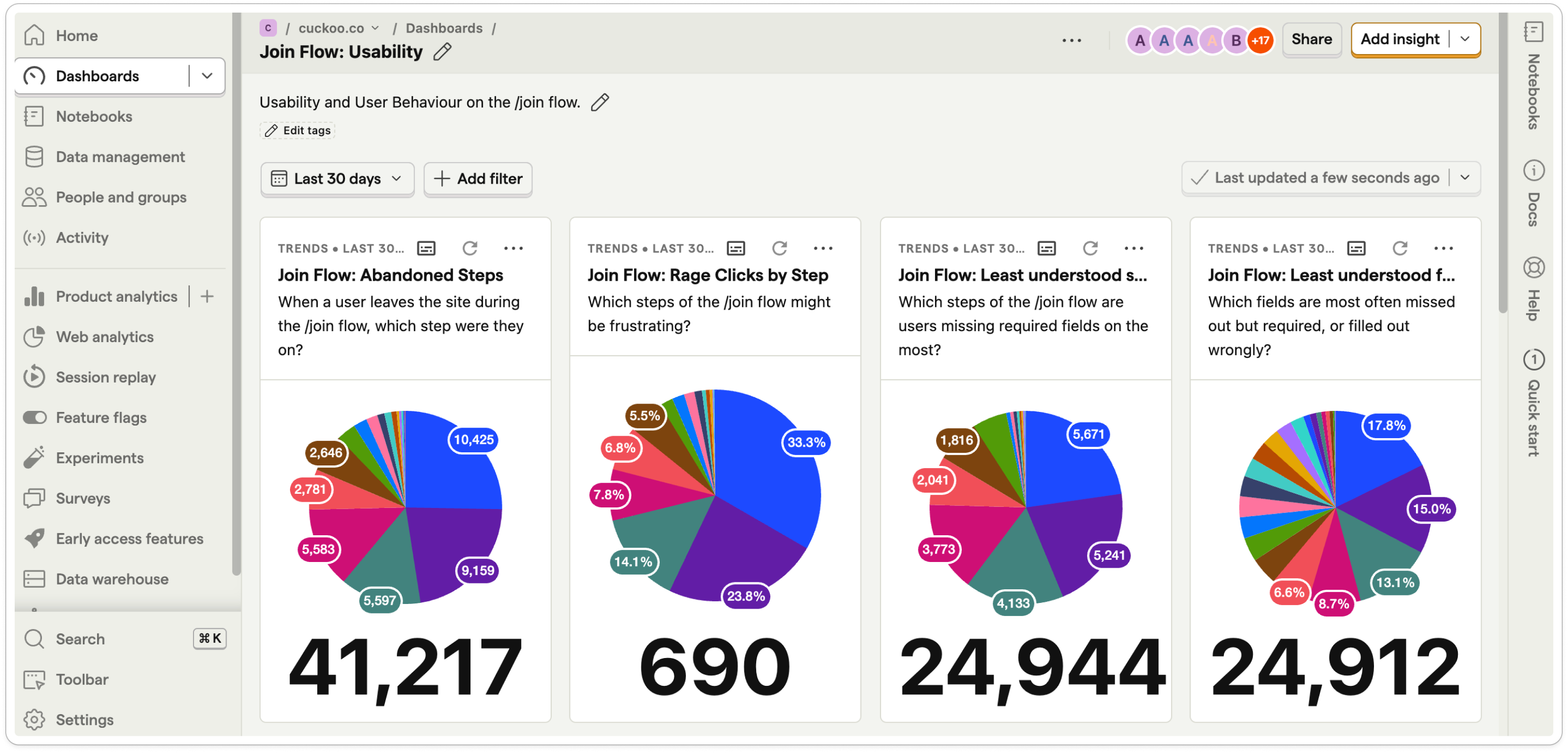
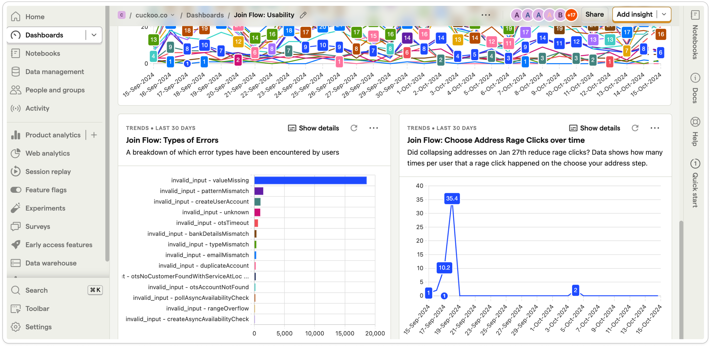
Data gathered via PostHog
We also use PostHog.com to collect event data, run product analytics (funnels, cohorts, retention, user paths), replay user sessions to observe behaviour, deploy and rollback features safely with feature flags, run A/B tests, gather feedback via surveys, integrate external data sources, use SQL queries for custom insights, and maintain full control over our data infrastructure.
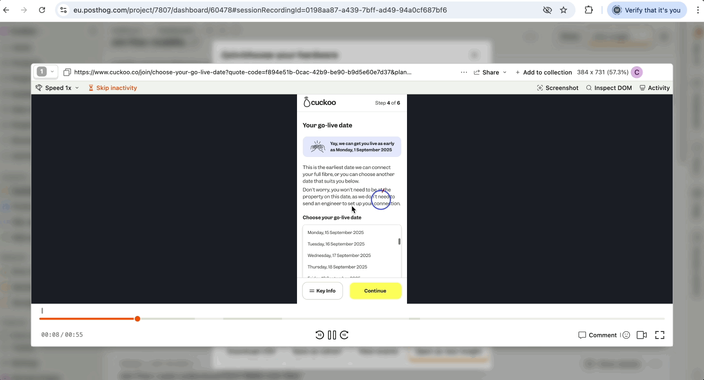
Quant research using PostHog - task completion on the current join flow
Feedback from workshop
Workshops were held with our Product, CX, marketing and sales (Field sales) teams to identify pain points teams had uncovered.
Empathy Mapping
I looked at customer verbatim to see if we could identify any pain points androom for improvement and created an empathy map.
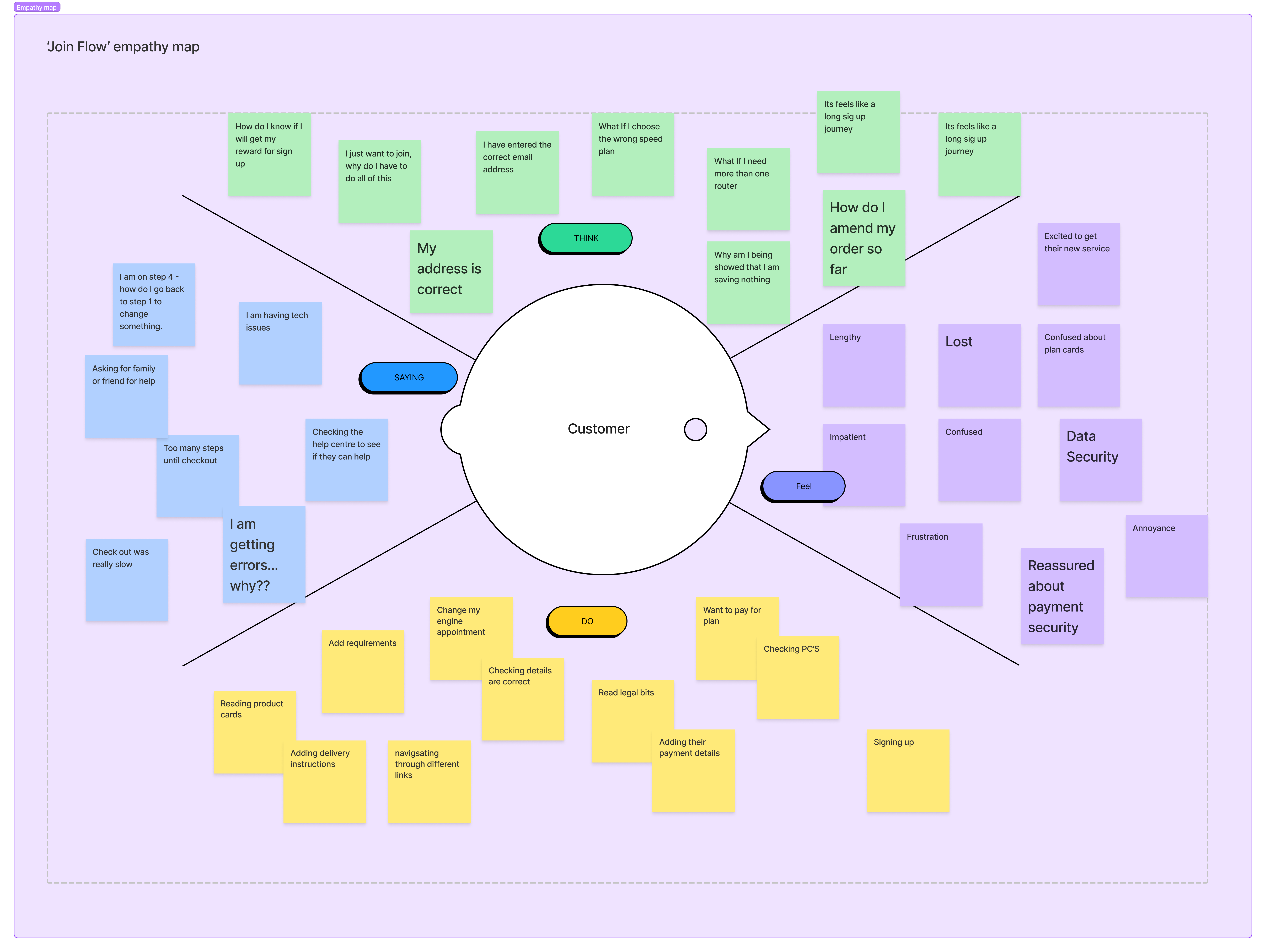
Customer verbatim
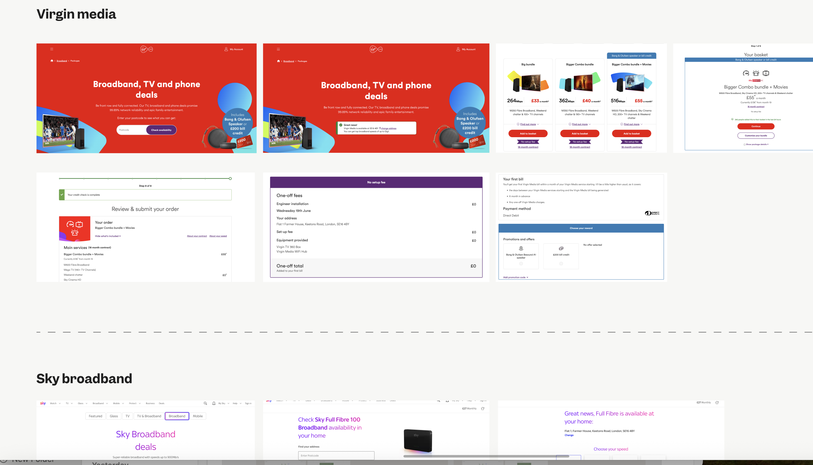
Competitive analysis
Discovery work also included exploring what our competitors offered and how we sat alongside.
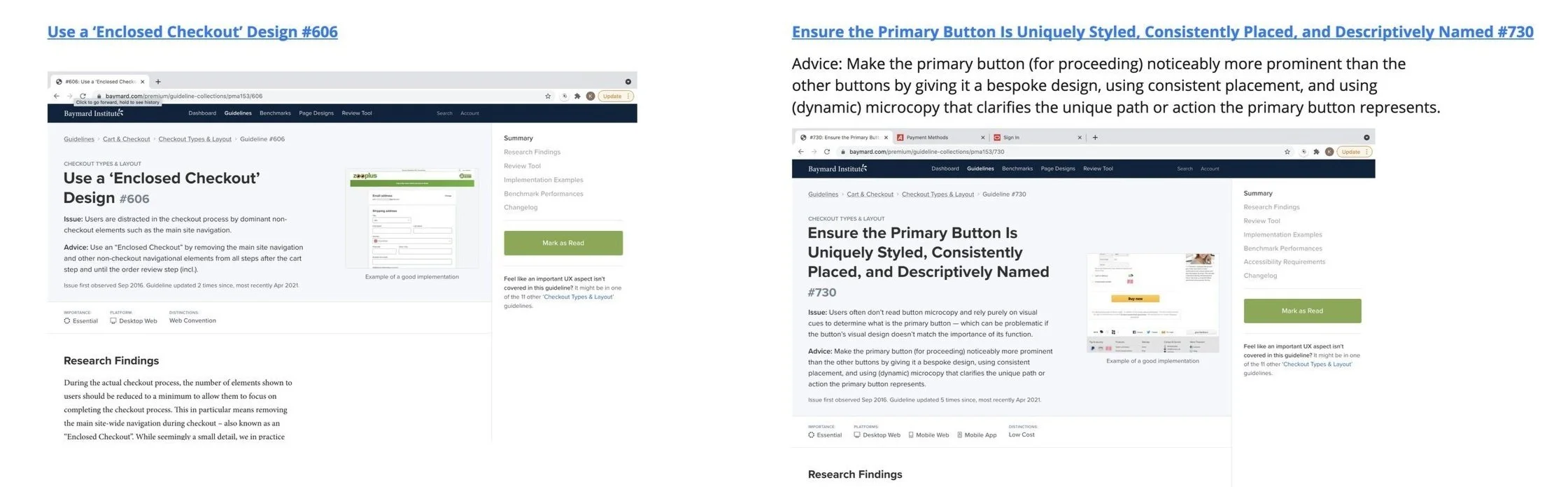
Best UX practices
I reviewed best-practice UX guidelines for signup flows, analysed how our current signups compares, and identified new patterns we could recommend or explore to enhance the design in the upcoming redesign.
Journey Mapping
We look at all the different journeys a customer might take to sign up to help us spot potential opportunities for improvement.
Defining the problem
How might we design a signup experience that is intuitive and straightforward to navigate, while building customer trust and ensuring a strong sense of security?
Through research, we uncovered key friction points:
- Unclear credit checks created anxiety and drop-offs.
- Plan selection what difficult to manage
- Customer Product Equipment (CPE) was poorly communicated, leaving users uncertain about what they need
- Customer unable to match their details when using One Touch Switch
- Lack of real-time validation and limited support access increased frustration.
This led to increased support calls, higher operational overhead, and lost conversions.
We derived at our problem statement:

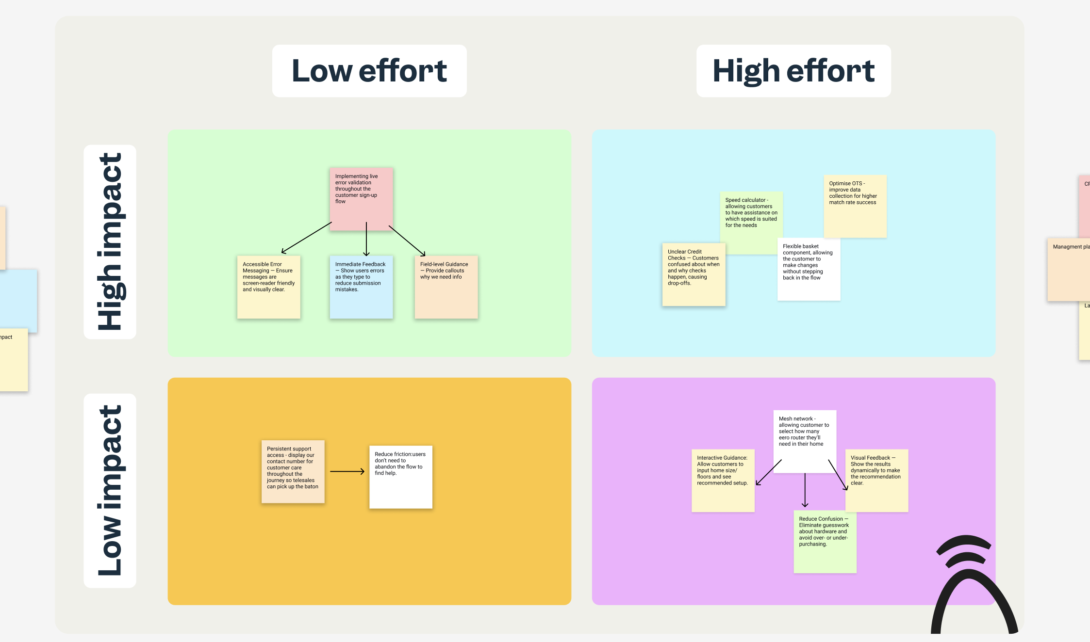
Priority framework
We created a impact vs effort matrix to decide on which improvements mattered the most:
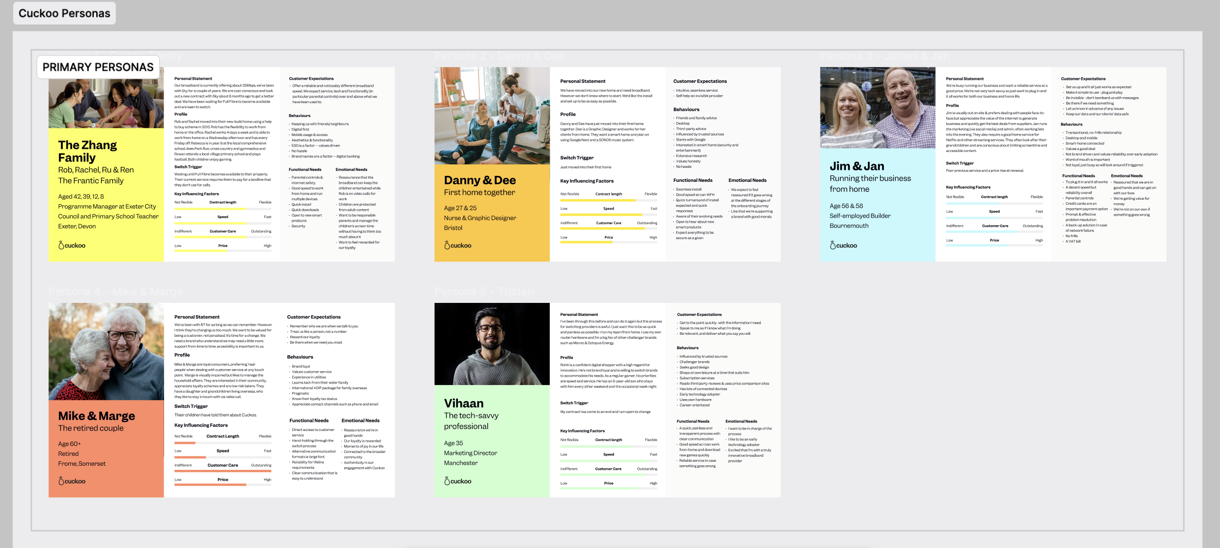
Leaning on our brand personas
To ensure our join flow redesign met real user needs, we focused on three key customer segments:By keeping these segments in mind, every improvement, from live error validation to flexible basket components, was designed to reduce friction, build trust, and improve completion rates for the right users.
- First-time Broadband Users – New customers setting up their first internet connection. They need clarity on hardware requirements, plan options, and upfront guidance to feel confident completing sign-up.
- Switchers Using One Touch Switch – Customers moving from another provider who value a seamless transition. They need accurate data collection and smooth transfer of services without manual corrections.
- Existing Customers Upgrading or Adding Services – Customers familiar with broadband who want flexibility to adjust plans or add hardware. They benefit from intuitive flows that allow easy plan changes without backtracking.
Current join flow user map
Research revealed a significant flaw in the join flow:
- Customer Frustration:
Customers were reaching the confirmation screen only to later receive an email stating they had failed the credit check. This created confusion and frustration, as the sign-up appeared successful when it wasn’t. - Business Debt Risk:
Some users provided minimal information, passed the initial check, and fraudulently received a £249 eero router along with a month of service without paying. This led to accumulated debt and unnecessary hardware losses for Cuckoo.
Current customer sign up flow:
.png)
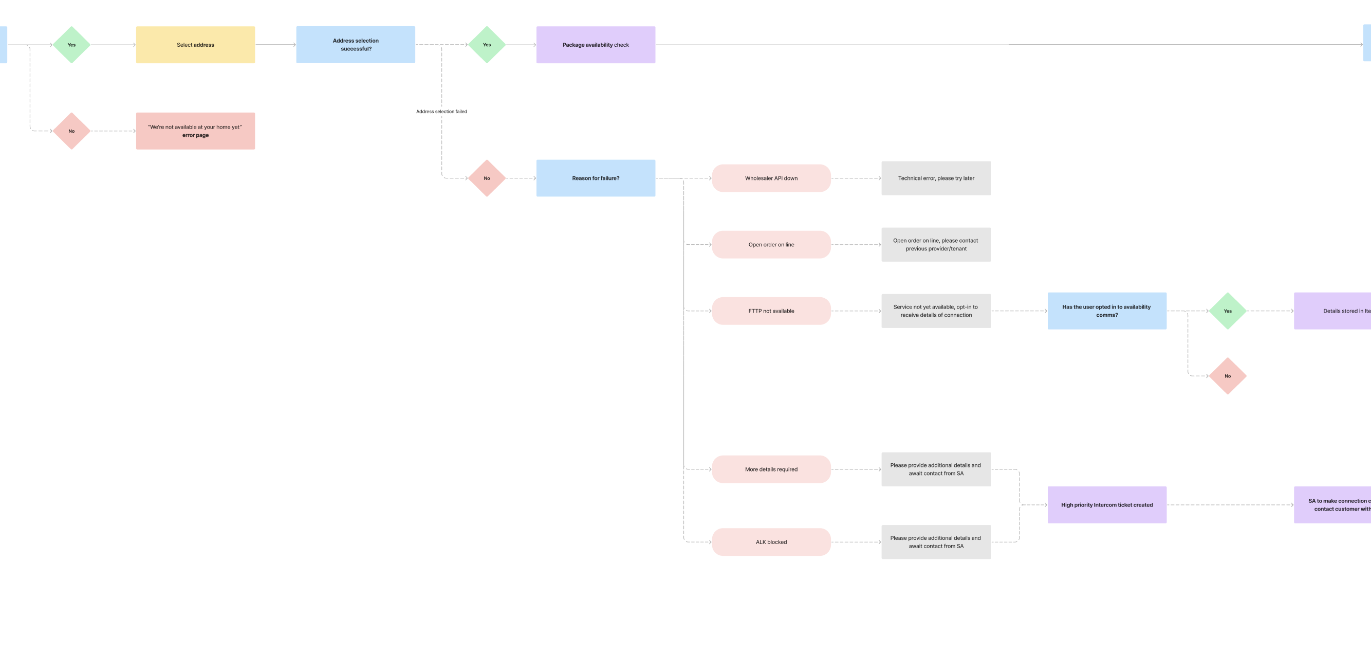
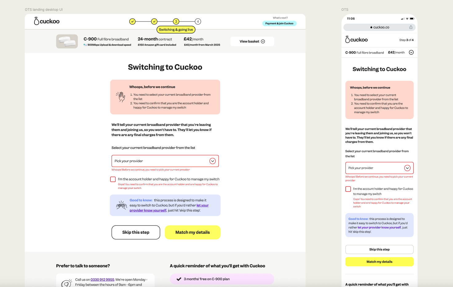
New join flow user map
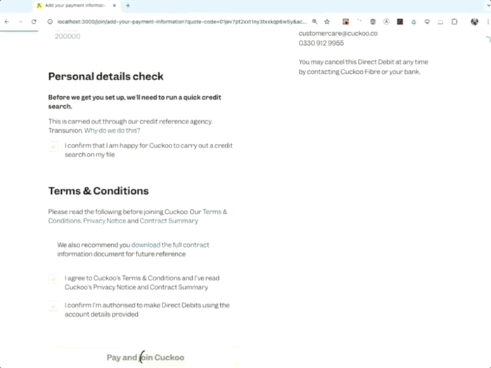
- A key change to the join flow was to move the credit check to the start of the sign up process. By collecting more specific customer details upfront, we reduced fraudulent sign-ups, prevented unnecessary hardware dispatch, and improved the customer experience by giving them an immediate pass/fail result.
- We went a step further by showing customers the reason for a failed soft credit check and providing guidance on where to learn more, helping them understand the outcome and next steps
- From a business perspective, this change reduces potential losses from hardware and unpaid services, while ensuring only eligible customers progress through the flow
New customer sign up flow - derived from a workshop:
.png)
Developing
Join flow UI and components
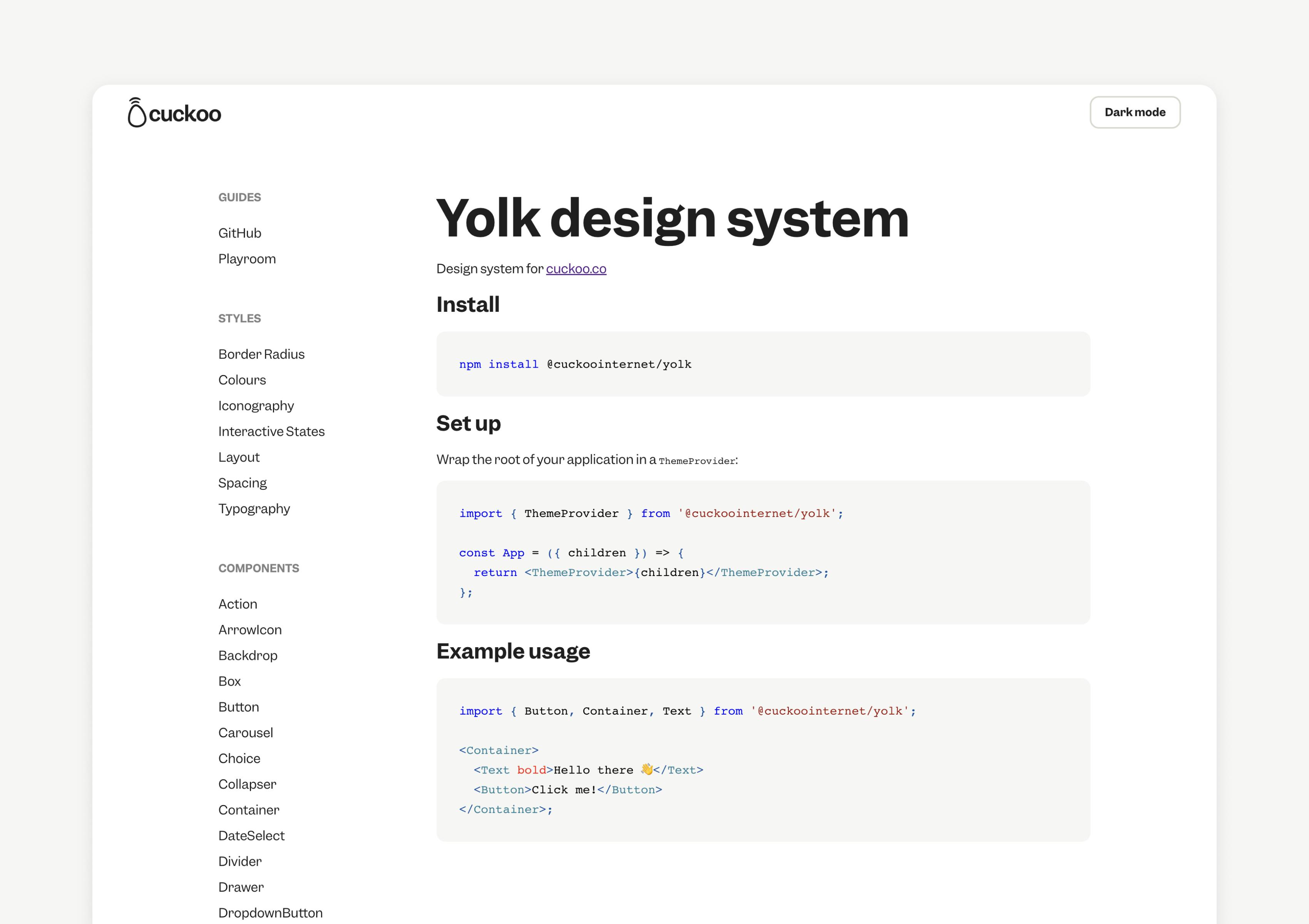
We redesigned the join flow user interface and components using an atomic design approach within our Flock design system. Each element was carefully iterated on with ongoing feedback from the squad to ensure consistency, usability, and alignment with project goals.
Yolk design system:
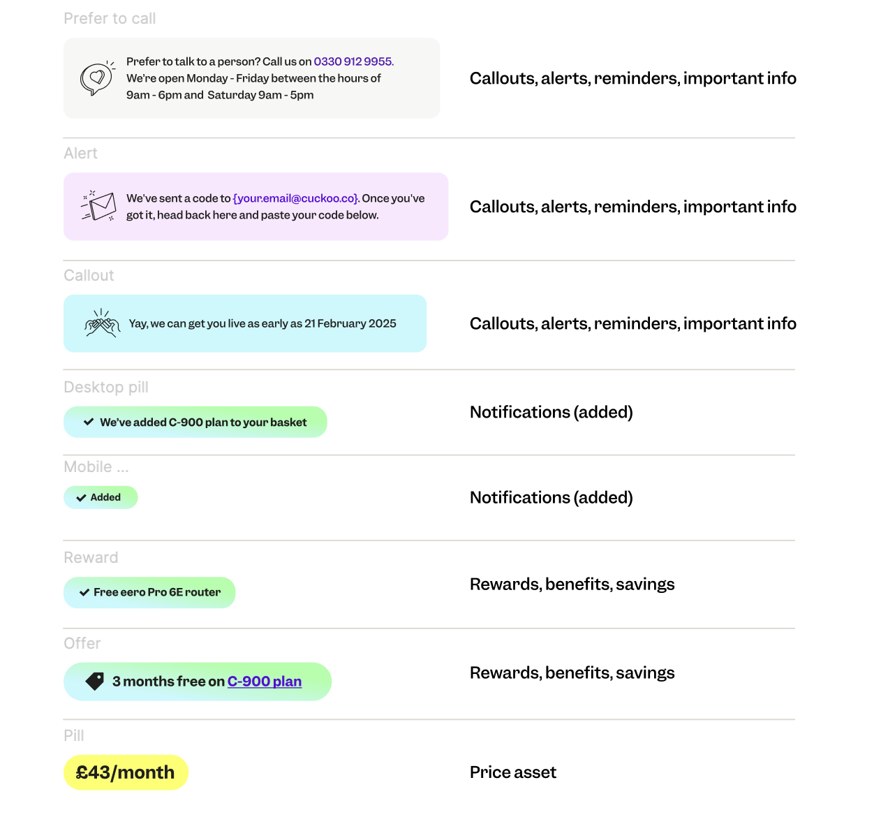
New Join Flow callouts, alerts, reminders and pills:
Collaboration during design
We collaborated with the UX copy team to deliver clear, concise messaging that builds user understanding and trust:
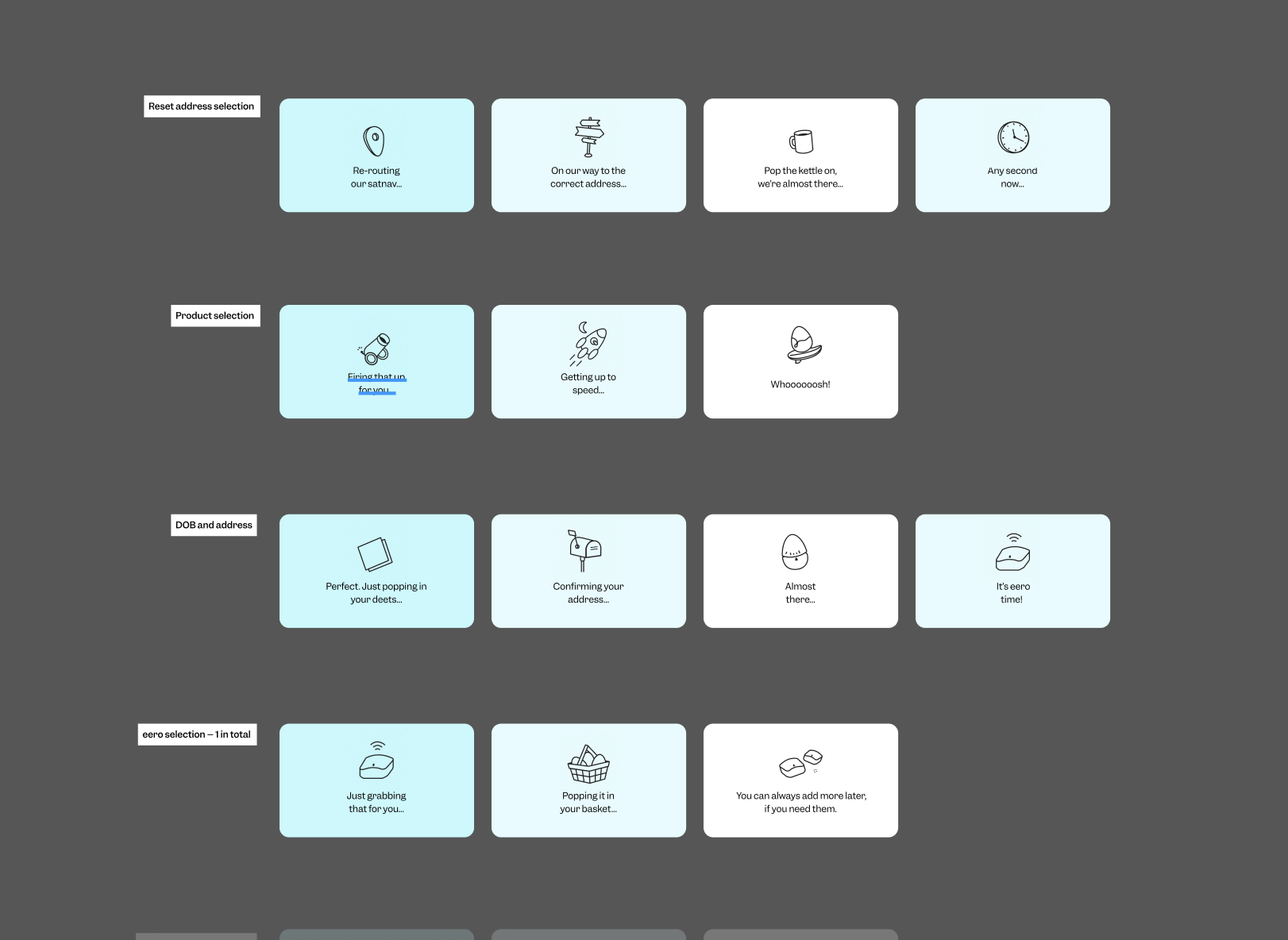
Pictogram loading states

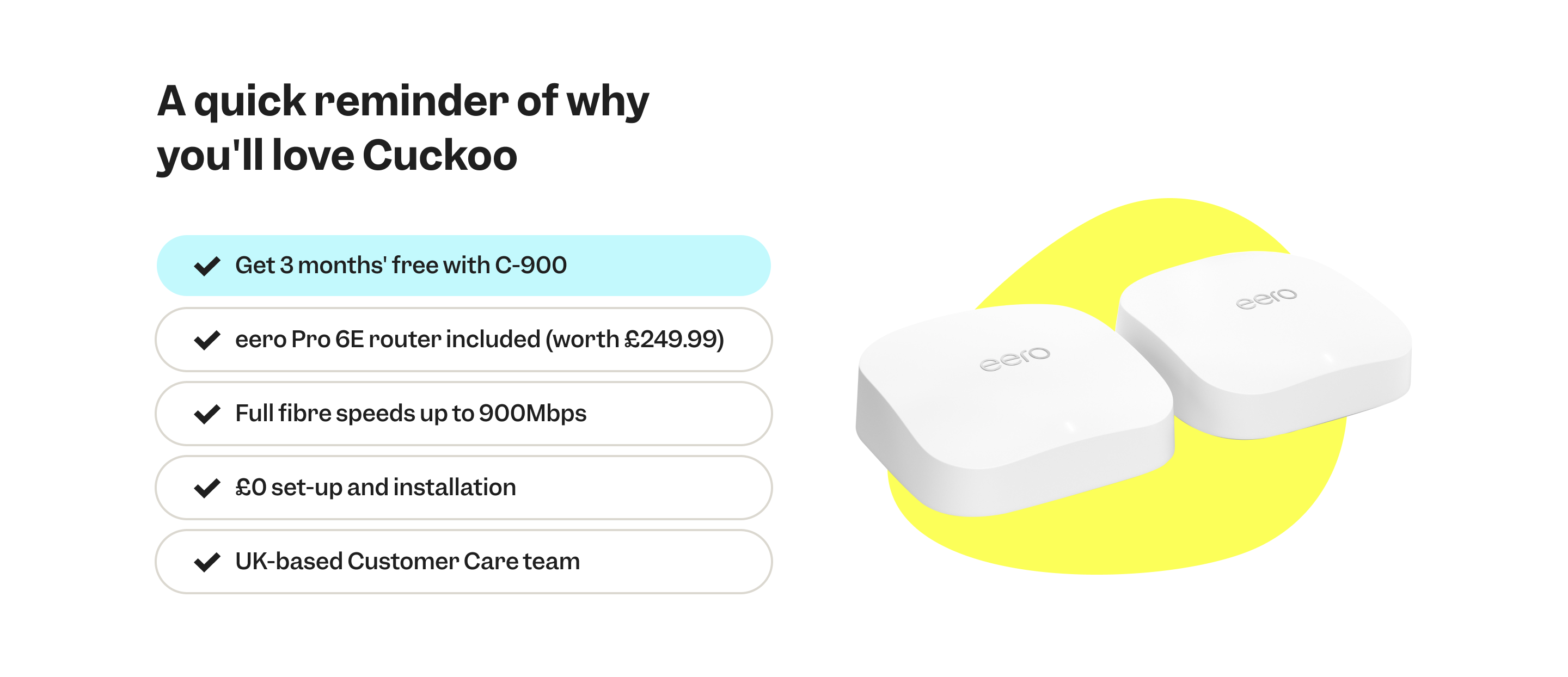
Cuckoo unique selling points (USP's)
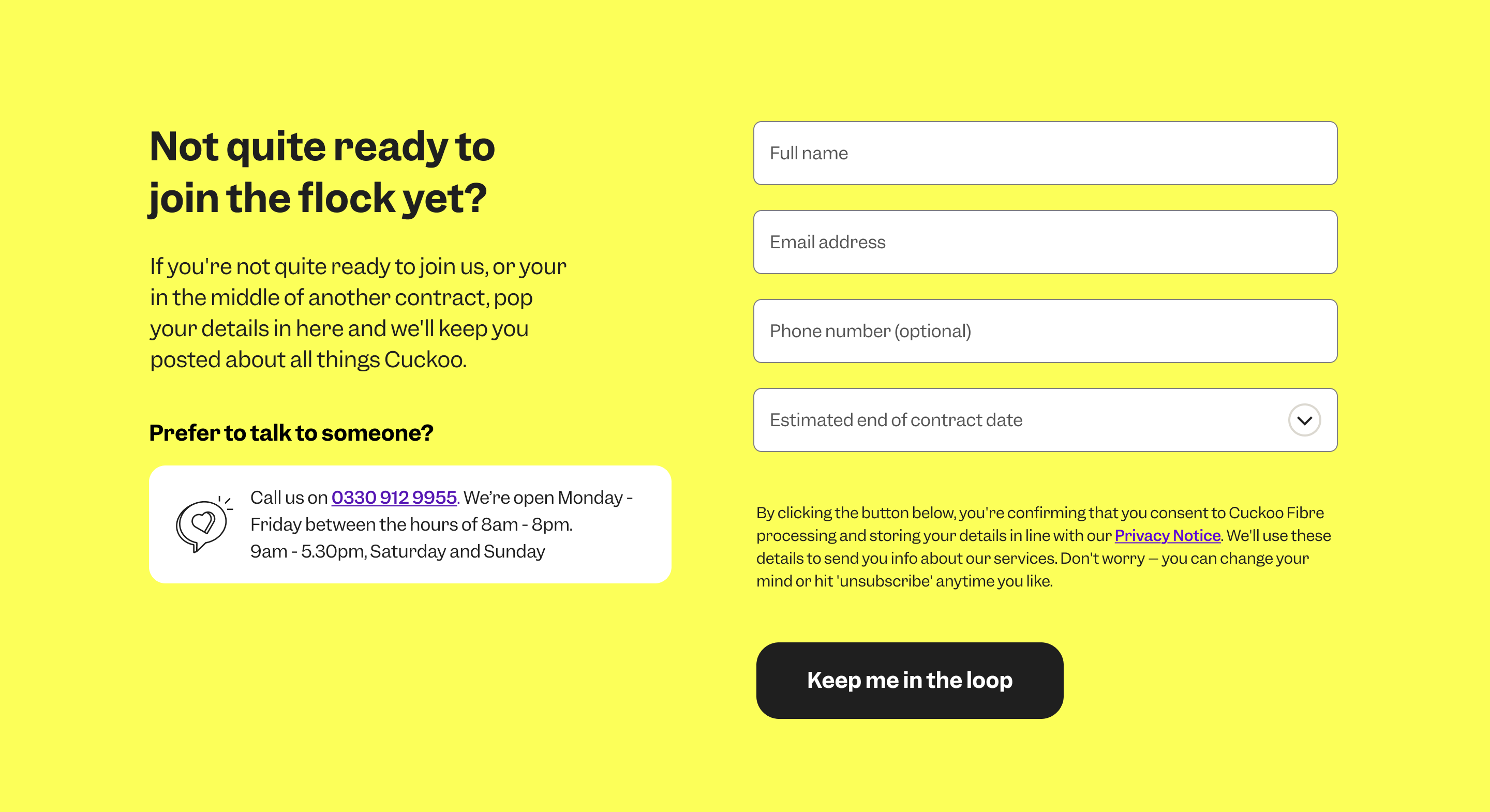
Registration of Interest (ROI):
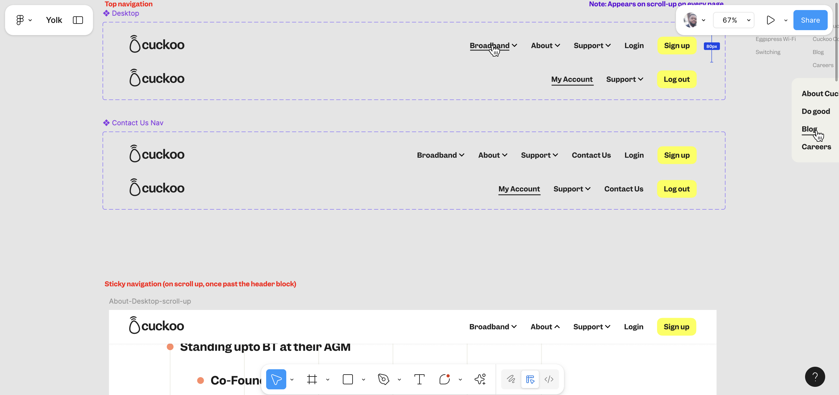
New join flow pages development:
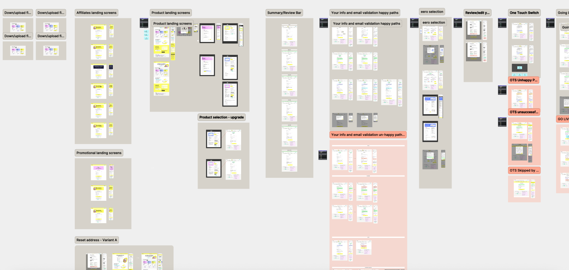
Inline error messaging development:
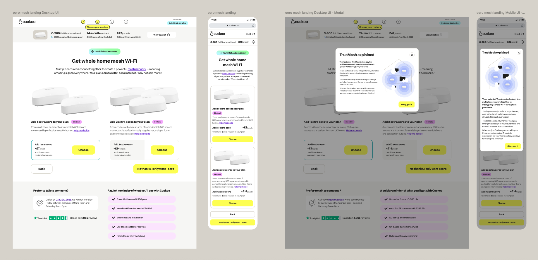
eero router selection development:
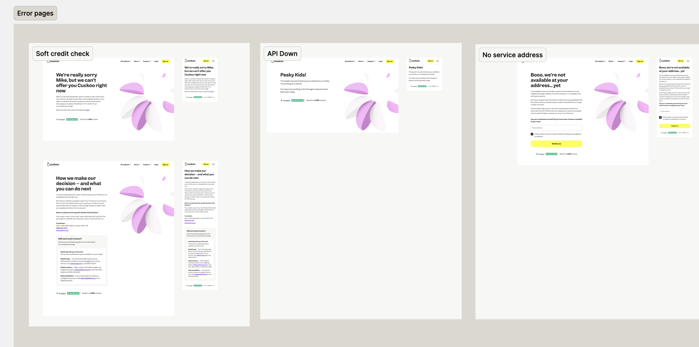
Error landing pages:
Mobile-first approach:
Accessibility in design
Accessibility was a priority- we integrated AI tools into Figma to support our design compliance and worked closely with a WCAG specialist.
Accessible annotations
Reading order details
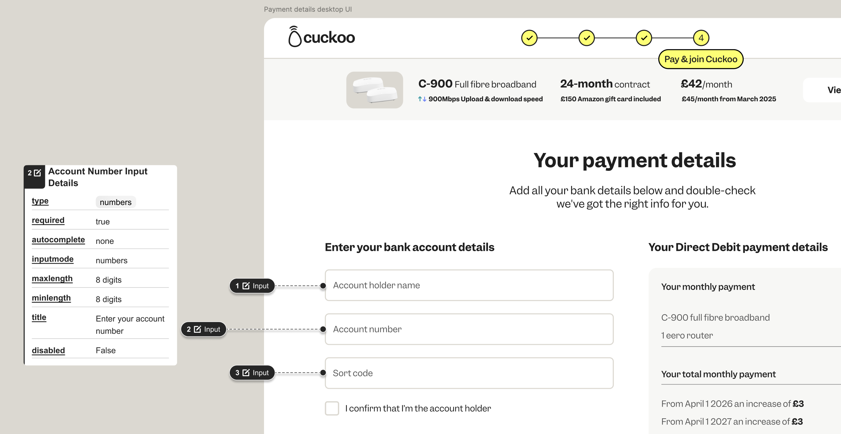
Input Details
Focused (or tab) order details
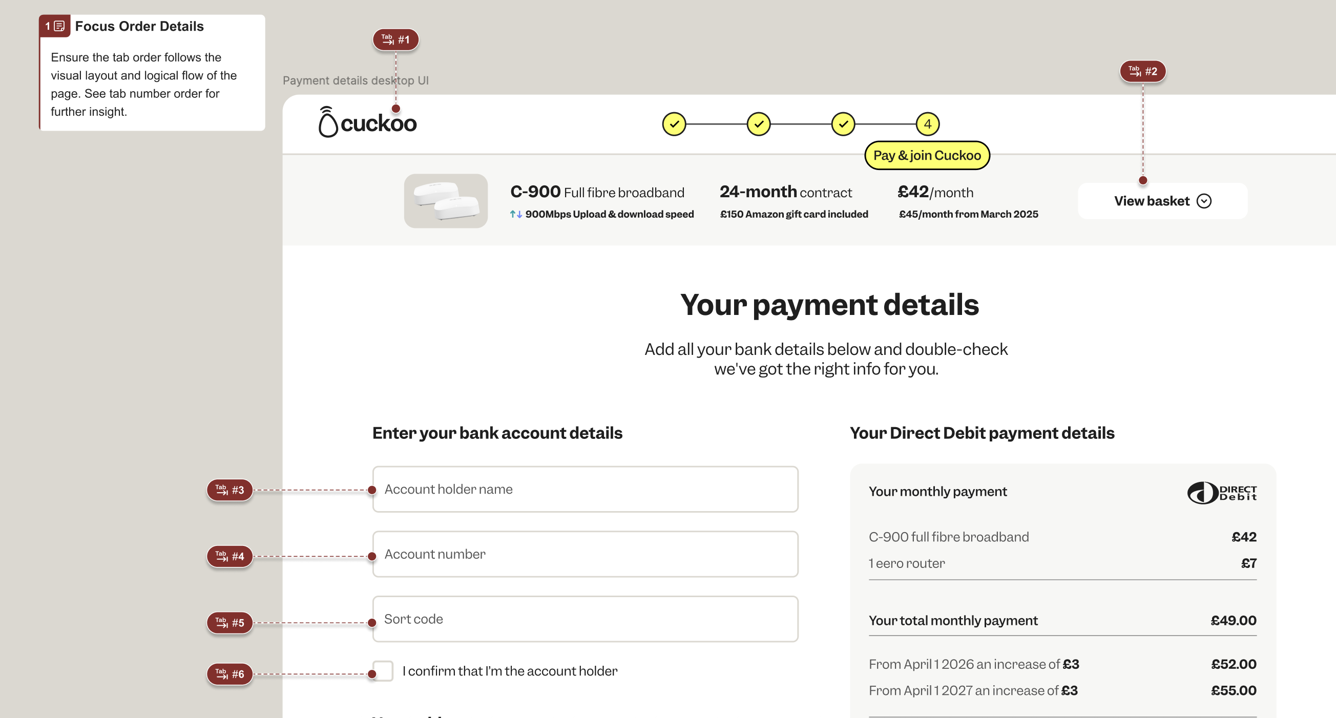
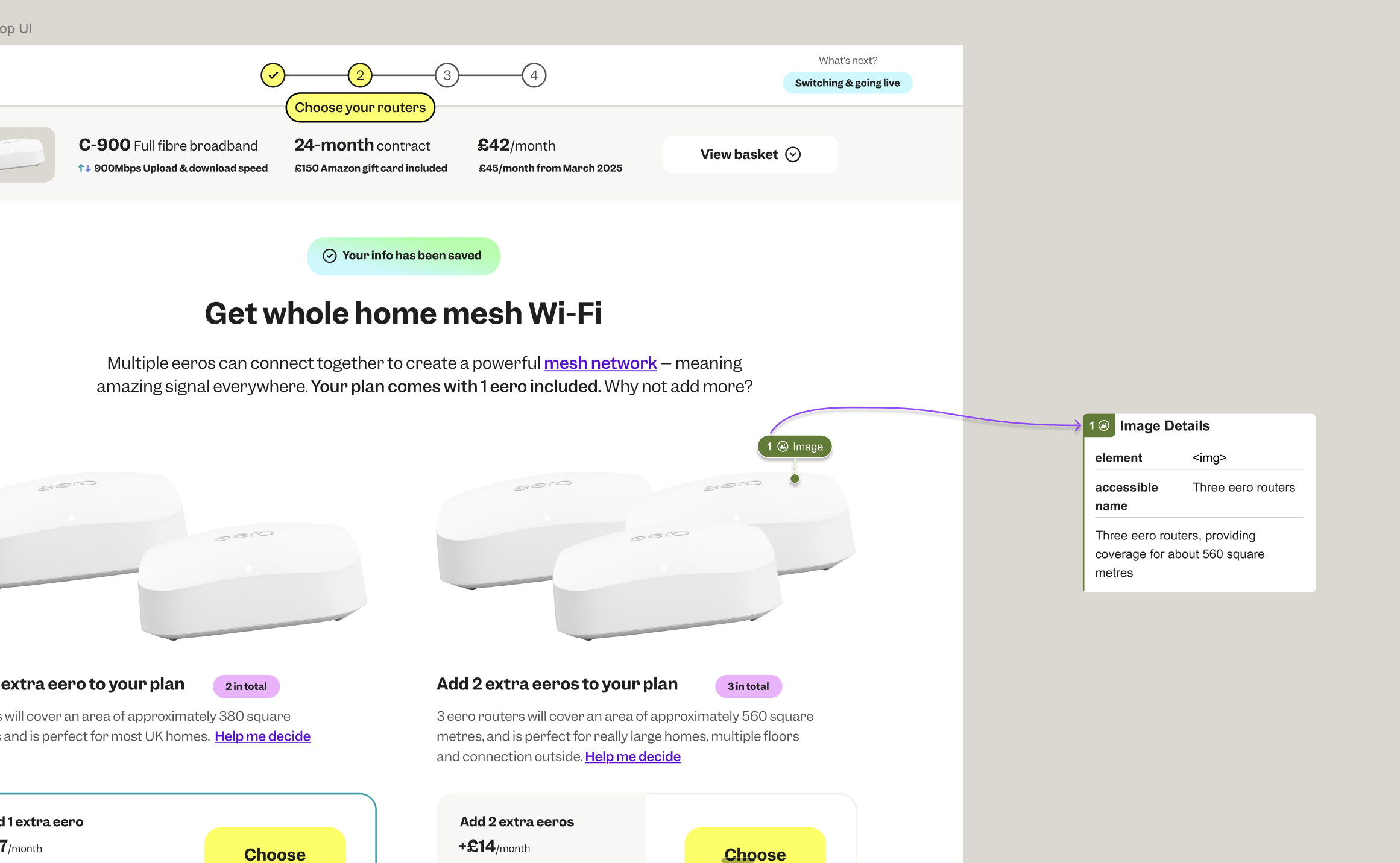
Image details
AI integration
Final UI designs
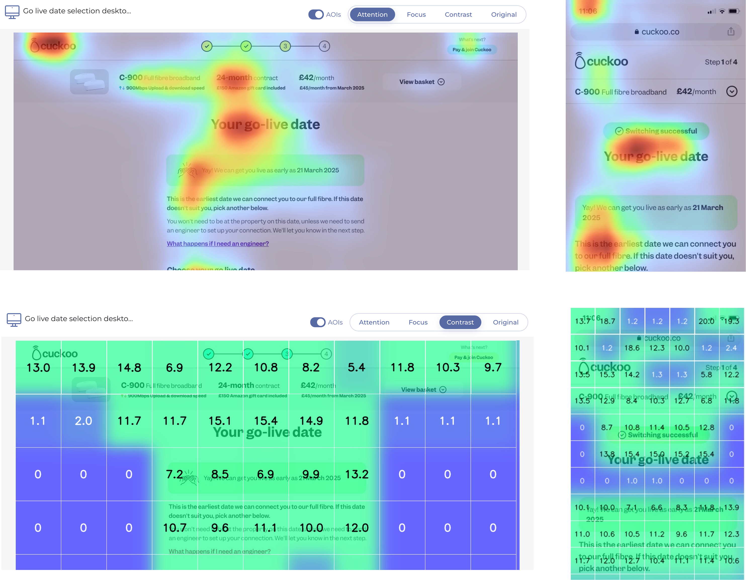
After finalising the designs, I built a high-fidelity prototype to guide user research sessions. This prototype helped validate assumptions, uncover valuable user insights, and identify opportunities for further
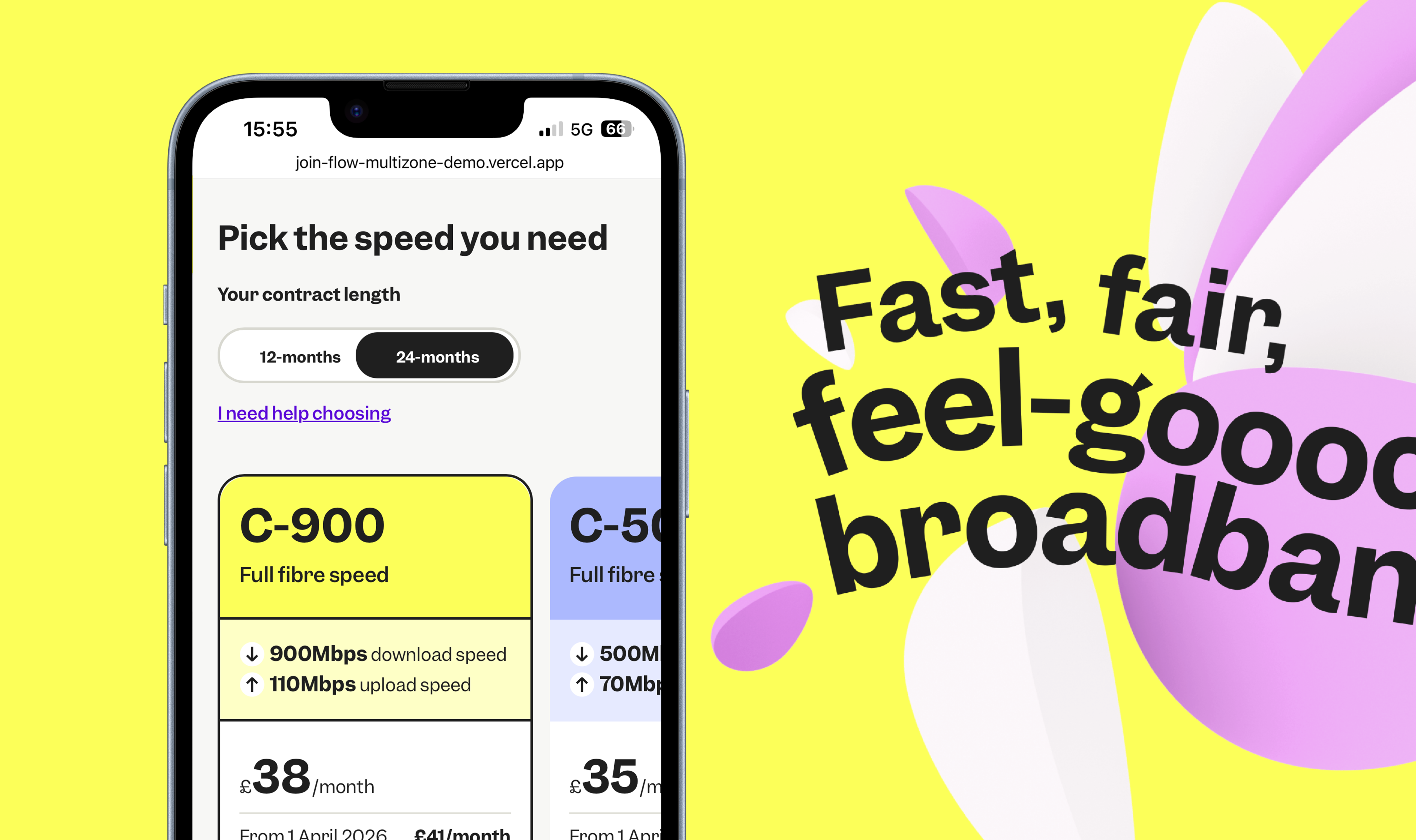
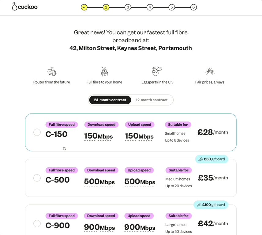
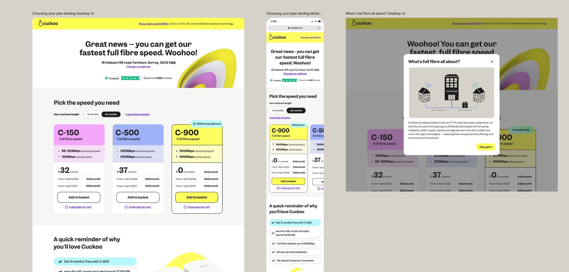
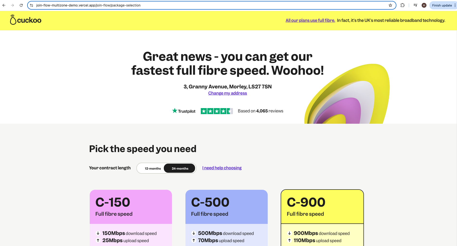
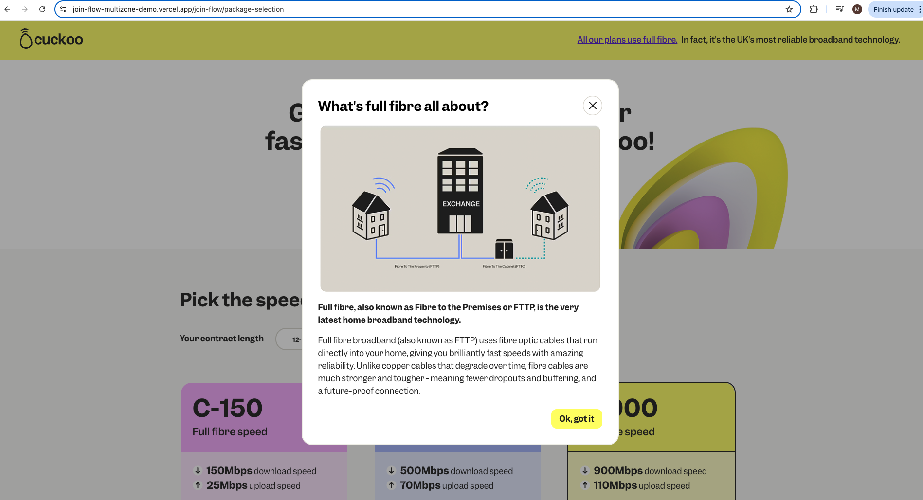
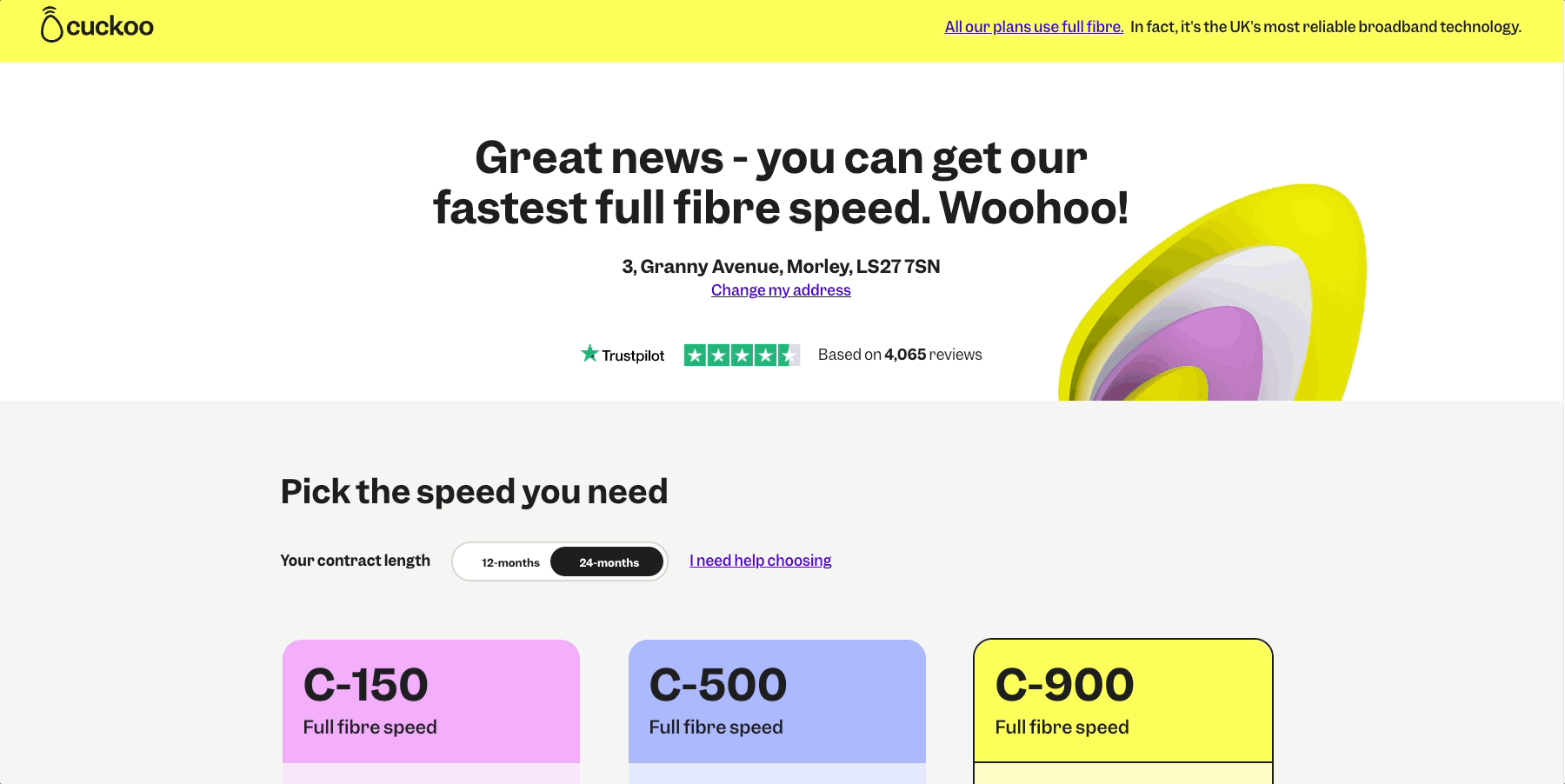
Current join flow 'select your plan' landing page:
New join flow 'select your plan' landing page UI design:
Loading states
We introduced a short loading animation using our pictograms to reassure customers and build confidence while API calls ran in the background
New speed calculator on the speed plan landing page
We added a new speed calculator that put the choice in customers’ hands, helping them select the right plan upfront and reducing support calls for regrades after sign up.
Iteration - Research approach
We worked with the Customer Experience research team to align on objectives, user types, and success metrics using a research canvas. A benchmark study was ran: two usability tests where participants completed identical sign up tasks.
One group used the live join flow, the other the new designs. This direct comparison highlighted improvements and validated design decisions with real users.
Research canvas
Tasks Given
- (Plan selection) Pick the internet speed that’s right for you.
- (Your details) Enter your personal details like your name, address, and contact info.
- (Your hardware) Choose how many eero Wi-Fi devices you want to include with your plan.
- (One Touch Switch) You’ll just need to give us a bit of info about your current provider, and then pick the date you want your new service to go live.
- (Review) Add delivery address
- (Payment) Add a new payment card
After the task we then asked the some follow up questions
- Please rate how easy or difficult the last task was for you.
- Why did you have difficulty completing the task?
- How confident are you that you completed the task successfully?
- Based on your experiences in the last task only: How would you rate your overall satisfaction with the website?
- How would you rate the severity of the problems you encountered on the last task?
- What, if anything, made the experience feel confusing or uncertain?
- Was there anything that made you feel more confident about switching?
- Is there anything you would change to make the process clearer or more reassuring?
Task card
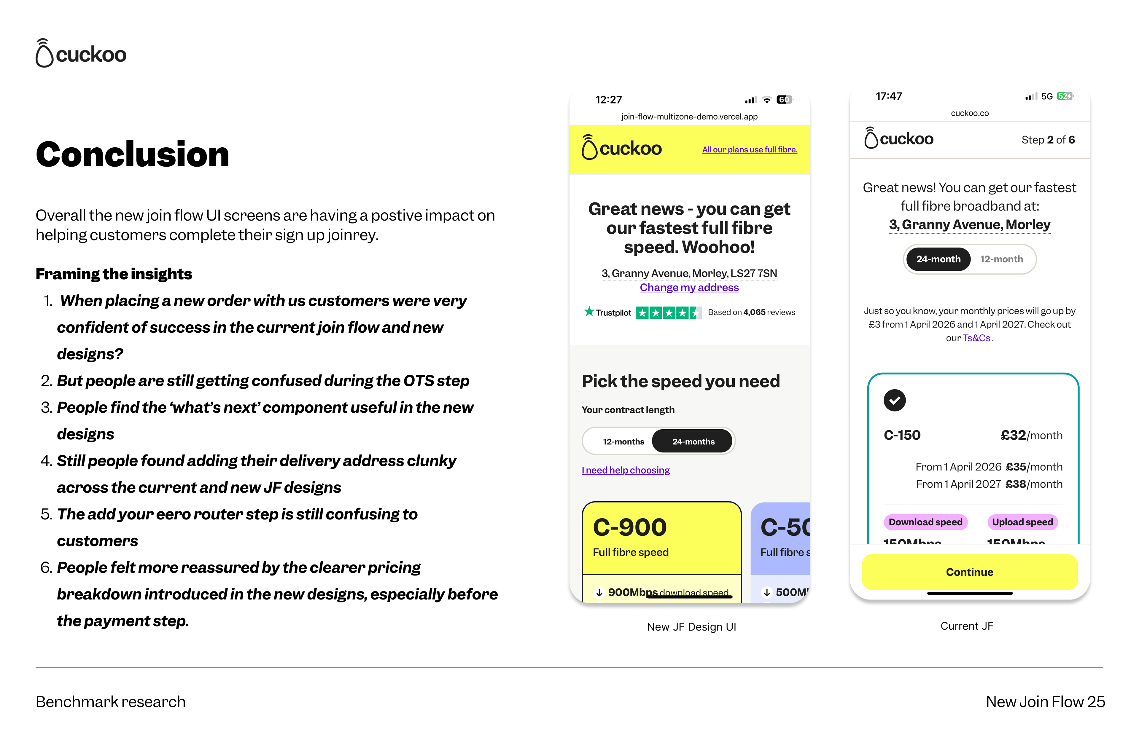
Benchmarking
Once all studies were completed we compared Group One (current JF experience) and Group Two (New JF UI designs) results looking at success rate, time of task completion and participant verbatim

Delivery
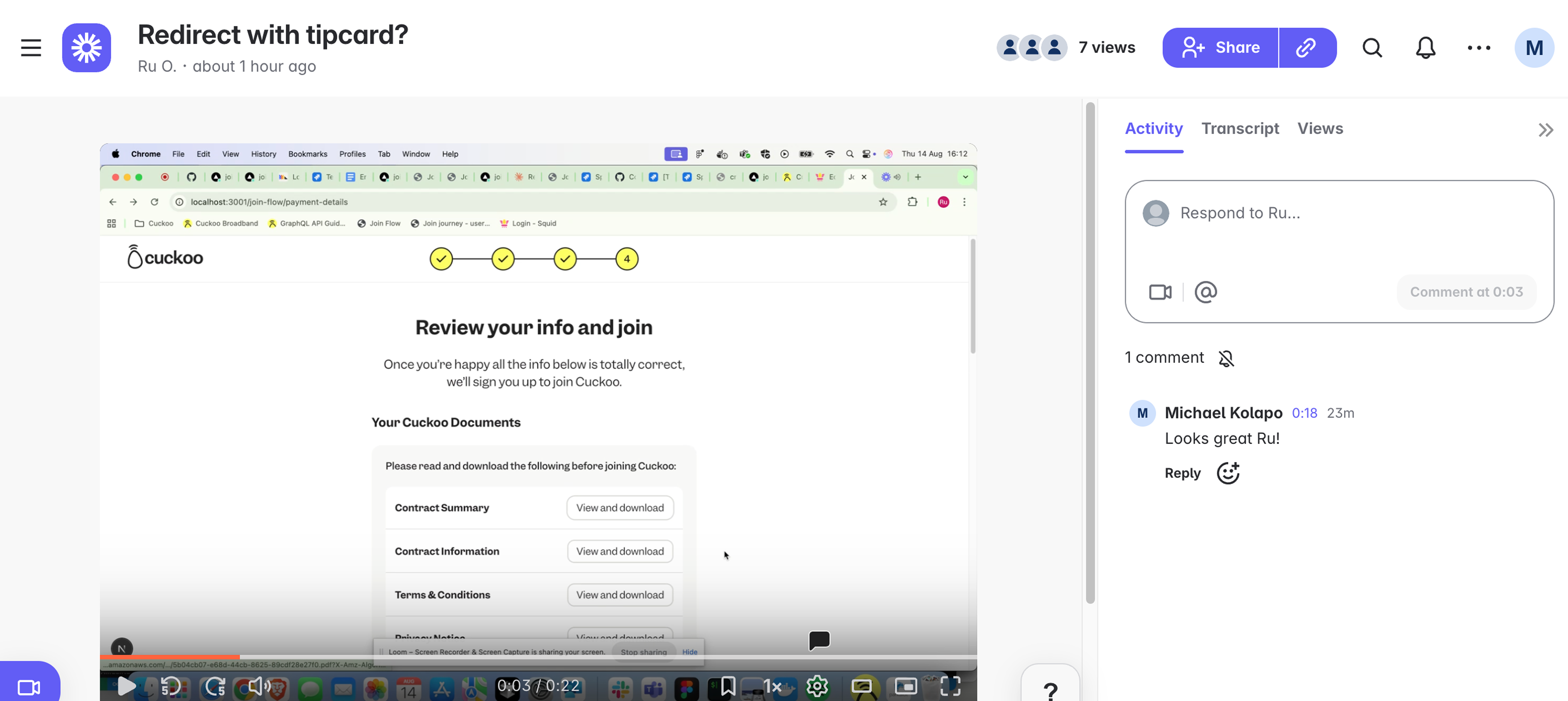
I worked closely with the development team throughout, supporting them with any design needs and providing UI feedback on all build work.
Collaboration via loom
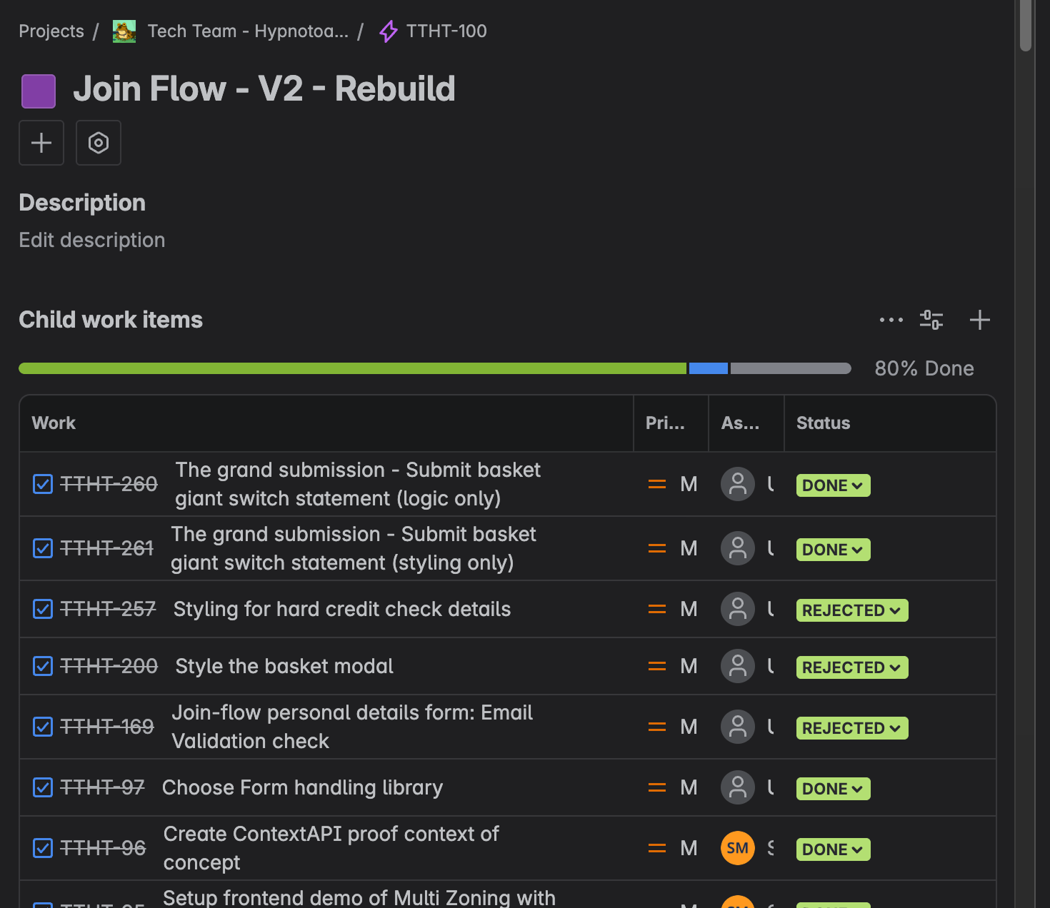
Documentation management via JIRA
I also collaborated with our Technical Delivery Manager and QA teams, both internal and external to ensure we were fully prepared for release.
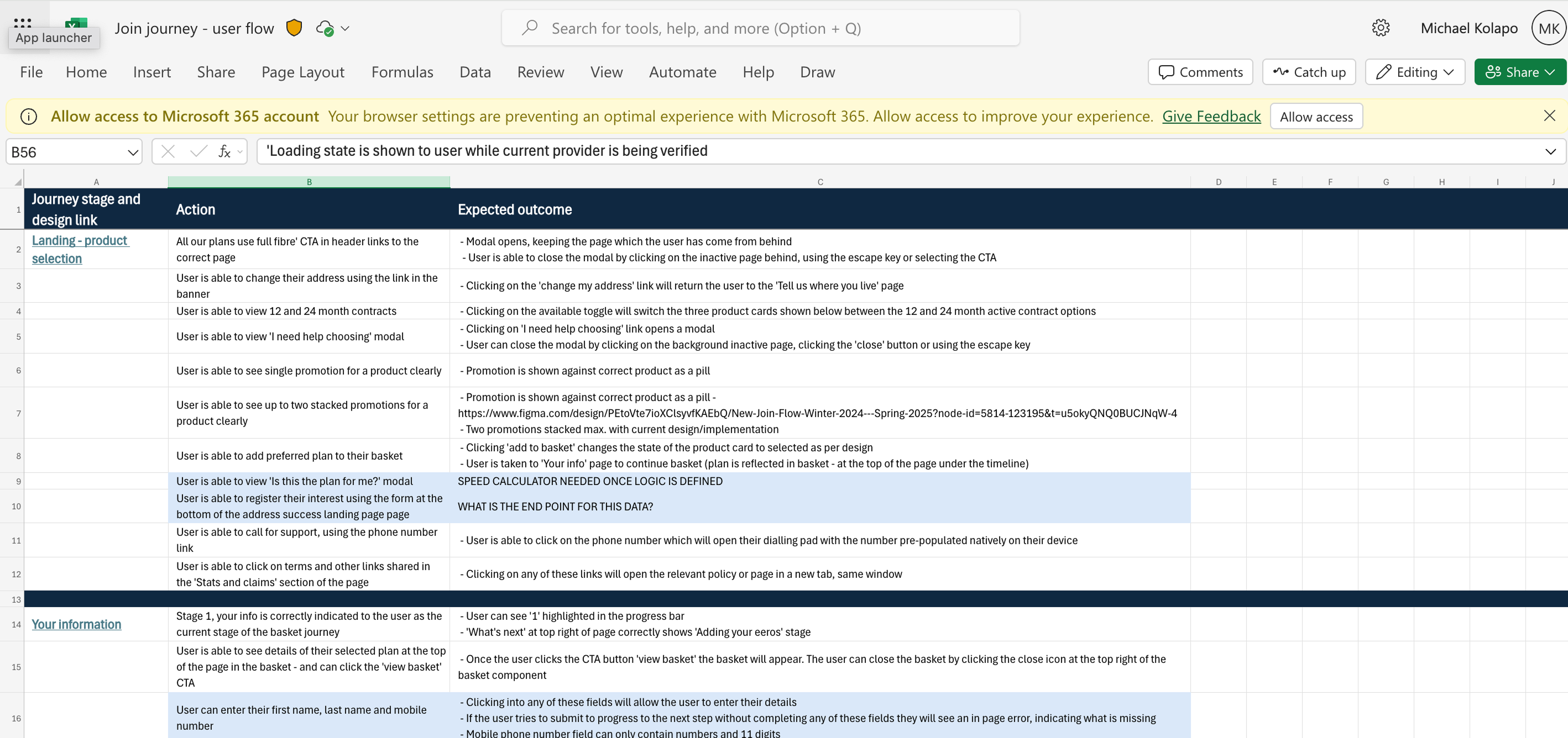
Documenting for QA teams
A/B testing
Ahead of launch, we're partnering with the analytics team to set up an A/B test and a new dashboard in PostHog to monitor performance. The A/B test will run for a few weeks until we reach statistical significance and feel confident rolling out the new join flow to all customers.
We're aiming for strong performance across key metrics, including:
- Reduced page load times
- Shorter time spent on page (indicating smoother journeys)
- Lower exit rates across join steps
- Increased conversion through the new join flow